Happiness comes in many hues. That’s what we learned when we asked leading designers for the cheeriest shades of paint that they use in their own rooms and clients’ homes.
And as we took in their recommendations, we have to say, we couldn’t help but feel upbeat. Here are the best mood elevators for your rooms Including the best neutral hues that give a glow to people’s skin and makes them look younger. This would induce happiness in anyone.
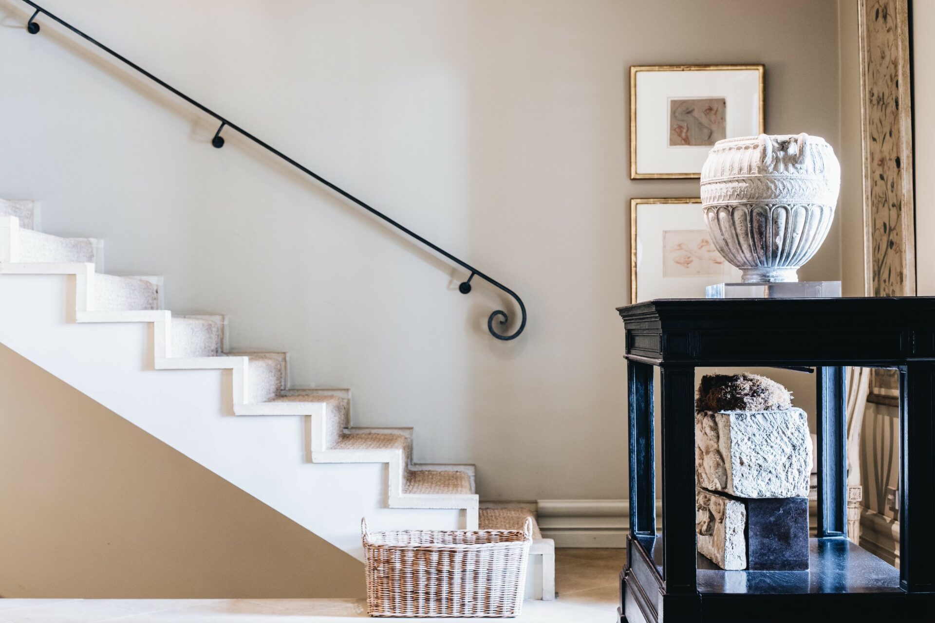
Discover the timeless neutral shade that Sydney design legend Michael Love chose more than 30 years ago, pictured, for his entry, that’s soft enough to be tranquil, yet interesting enough to be a backdrop for furnishings. And it changes with the light, which imparts a sense of joy to any room.
If you’re looking for a tried-and-true shade of white that’s not too bright or too sterile – we reached out to experts to find out which warm whites and greys they return to again and again. Because why reinvent the wheel every time you need to paint a room? You will also find a great assortment of perfect blues and greens, which are on the rise, as they physically lower the heart rate, creating a feeling of serenity and relaxation, which is what people see in these unknown times.
Here are their top paint picks according to Dulux and Porter’s Paints with cult followings that are versatile and will make you feel happy. These colours are the place to start.
Sydney design legend Michael Love chose Dulux Eagle for his entrance more than 30 years ago. “It has darkened over time, and actually got better,” says Michael Love. Photo: Abbie Melle
DULUX PAINT GO-TO’S
ANTIQUE WHITE U.S.A.
It has a cult following in the white world. Its warm undertone has a universal appeal and works well in most spaces A longtime contender on the Dulux top 20 list and our choice throughout our Sydney apartment because it has lots of light. A warm, glowing white that pairs beautifully with pretty much any colour. It has the slightest yellow undertones, like sunlight shining on a white wall. Read more, ‘Will These Paint Colours Rule 2022?’
NATURAL WHITE
A classic white according to designers such as Poppy O’Neil and Charlotte O’Neil of Poco Design and Charlotte Coote, Coote & Co, who says, “It’s one of the best warm whites around”.
QUARTER-STRENGTH LEXICON
It’s the ultimate white. So popular, it rates in the top three best-selling Dulux paints. What more can we say? The top choice for a go-to white loved by our leading designers such as Thomas Hamel, Iain Halliday, Greg Natale, Anna Spiro and Parterre owner, Richard Haigh. Read more, ‘The 20 Best Paint Colours According to Dulux.’
If it’s good enough for the award-winning boutique hotel, Halcyon House, it’s certainly good enough for us too.
VIVID WHITE
One of the best whites around, with a cult following in the white world. A bright, cool white. Big names such as Thomas Hamel, Iain Halliday, Poco Design, Anna Spiro, Charlotte Coote, (Coote & Co) and Pamela Makin, (Les Interieurs) all swear by it. It’s a bright, cool white. “It’s my favourite cool white. Half-strength for walls and quarter-strength for ceilings, woodwork, mouldings, and trims,” says Coote.A drop of umber, makes this a great white that goes with everything.
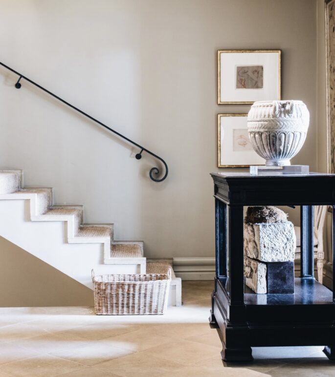
Sydney design legend Michael Love chose Dulux Eagle more than 30 years for the hallway at his timeless Sydney harbourside home, pictured, where it contines to look fresh, elegant and modern. Photo: Abbie Melle
WHISPER WHITE
The warm white of old, pre-brightened, starched linen. A favourite with big names like Thomas Hamel who used it on the bedroom featured to offset ceilings and cornice in flat, and woodwork in semi-gloss. Cameron Kimber, Walter Herman and Lynda Kerry are also big fans. Use a mix of half and quarter strength.
SNOWY MOUNTAIN
Loved by design legend Michael Love, the warm, glowing white pairs beautifully with pretty much any colour. It has the slightest yellow undertones, like sunlight shining on a white wall. This quality makes it especially perfect for areas where natural light is limited.
STOWE WHITE
“A great white, marked by its depth and resilience under shifting light conditions.
“It’s warm and crisp at the same time,” says Cameron Kimber.
HOG BRISTLE (QUARTER-STRENGTH)
A great paint colour marked by its depth and resilience under shifting light conditions.“An oldie, but a goodie, that designers still rave about. It makes everything look good,” says designer Adelaide Bragg. Lynda Kerry also swears by it. Read more, ‘Paint Colours with Cult Followings: 10 Picks.’
TERRACE WHITE
It has a tiny amount of grey and a warmth to it that moves it away from white.
TRANQUIL RETREAT
It’s a bit of a chameleon and can look warm in a sunny room or cooler in a north-facing room. It always looks elegant.
HALF-STRENGTH BEIGE ROYAL
“I use it like white paint, for everything. Everywhere,” says designer Marco Meneguzzi. Michael Love is also a big fan of the super creamy light stone-grey with a warm undertone.
Dulux Eagle paint, pictured, at designer Michael Love’s Sydney hallway 30 years after it was first applied. Photo: Abbie Melle
TIMELESS GREY
Top designers pick this out again and again and again without even meaning to. “It looks great on exteriors combined with black iron windows, bronze light fittings and a copper roof,” says designer Lynda Kerry. We like it so much, we used it for our Australian country house external doors.
WHITE DUCK
A go-to off-white (ecru) that will warm up any room with its softness. Fresh, versatile, and warm, and it works in any home, whether traditional or modern, that can be made to look more creamy if contrasted with bright whites or fresher and cleaner if contrasted with warm whites.
DIESKAU
It has a sophisticated warmth and adds a timeless elegance to any room.
WARM NEUTRAL
A light, subtle and warm hue that compliments white as well as bolder hues perfectly.It’s a warm gray with brown undertones and matches natural steel and sheet metal perfectly. Read more, ’10 Designers Weigh In On The Best White Paint Colours.’
RAKU
It is a versatile grey that goes bluer or browner, depending on the light. A lovely colour that is a great way to give a new wall a bit of depth; and matches natural steel and sheet metal perfectly.
SELF-DESTRUCT
It’s a terrible name, but the best stone shade out there. A colour you’ll want to use it again and again and again. And pick up, without meaning to.
DOMINO
The darkest colour on the list. A beautiful, rich, deep charcoal that strikes the right note every time.
It’s been a constant on Dulux’s top 20 paints for years.
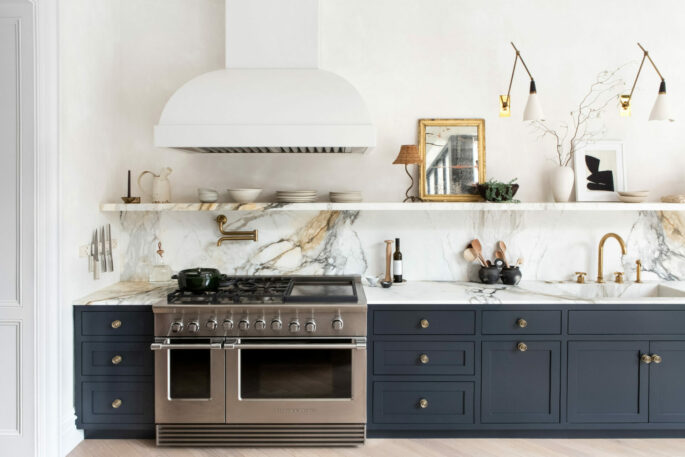
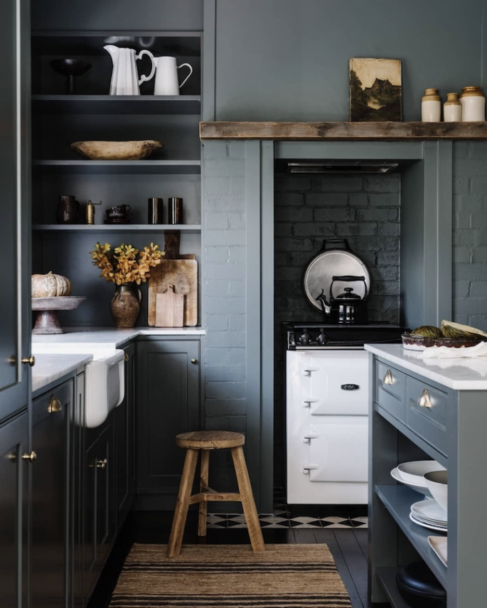
Kitchen Walls: Custom Plaster by Kamp Studios
Kitchen Cabinetry & Island: Farrow & Ball Railings in Estate Eggshell
Photo by Sarah Elliott for Eyeswoon.com
BLUE LOBELIA
It’s a beautiful, deep, rich blue that can be at once bold and understated. A newcomer on Dulux’s top 20 Paints as people turn to blues for serenity and calm in their interiors.
OLIVE LEAF
On the super-subtle end of the scale, Dulux considers this new addition to the Dulux top 20 list a favourite soft green that’s not too light or too dark in tone.
PRESCHOOL
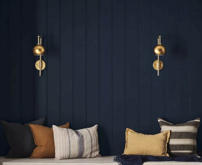
The ultimate soft grey-blue that just works, making its debut on the Dulux top 20 list this year. A shade that stands at the intersection of grey and blue. Greys and lighter blues can be difficult to get right–greys can feel dull and light blues often look too sweet but this shade is soft enough to be tranquil, yet interesting enough to be a backdrop for furnishings. And it changes with the light, which is lovely. Read more, ‘Australia’s Best Paint Colours Are.’
EAGLE
Michael Love, one of Australia’s greatest, most enduring interior designers painted the common area walls of his beautiful Sydney harbourside house this timeless soft beige more than 35 years ago, and the walls have remained unchanged.
“It has darkened over time, and actually got better,” says Michael Love.
Michael Love’s Sydney home features classic Dulux colours throughout. Photo: Abbie Melle
SILENT SAGE
It owes its freshness to a rich blue base and its warmth to soft green undertones.
DUCK EGG BLUE
When we’re stressed, our minds subconsciously seek blue tones like this soft, fresh and crisp shade, that isn’t too bold or vibrant. Dulux cites it as one of its top colours, that imparts a clear, calm sense of joy to any room.
SPANISH OLIVE
One of the more silvery grey options on this list. Mixing with a tonal green shade will result in a room full of atmosphere.
LINSEED
A go-to stone beige that will warm up any room with its softness. Fresh, versatile, and it works in any home, whether traditional or modern, that can be made to look more soft grey if contrasted with bright whites or fresher and cleaner if contrasted with warm whites.
Perfect for country kitchens.
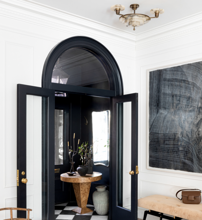
Door and Interior Windows: Farrow & Ball Off Black in Estate Eggshell and vestibule walls in Farrow & Ball Off Black in Estate Emulsion. Photo by Sarah Elliott for Eyeswoon.com
PALE SAGE
The soft shade has a cult following in the green world. Its warm undertone has a universal appeal and works well in most spaces, keeping things subdued and sophisticated.
FOLLIE
This is the soft green designers turn to when they want a warm green with beige undertones that will bring warmth to a room. A nature-inspired hue to make you and your rooms feel grounded.
PACIFIC LINE
Looking to dip your toe in the blue-paint trend? “The best blue ever, “says Lynda Kerry. On the deep and dark end of the blue scale, this is considered a designer favourite.
Ideal for Ralph Lauren fans.
VERY CHERRY
The deep red-brown is one of the strongest colours on the list with an umber undertone. Very classic looking.
Dulux paints that run the gamut from black to grey and pale stones are used to great effect throughout designer, Michael Love’s Sydney home. Photo: Abbie Melle
PORTER’S PAINTS TOP 20
WHITE SAND
“I looked everywhere for a colour like this,” says designer Lynda Kerry who is using it throughout her latest Sydney harbourside home (still under construction). It’s so neutral, not yellow-y or pink-y or green-y. I’d say it’s white with a touch of warm grey in it, It’s perfect!”
POPCORN
The popular warm off-white is chosen more often than any other by big-name Australian designers. It reads as a pure warm white in a space without turning cold.
CUMULUS
Described as “a soft, nothing beige with no yellow”, according to Cameron Kimber. “It’s been my go-to colour for the past couple of years. I love it so much, I use it everywhere. It’s subtle and warm and complements everything.”
YACHT RACE
One of the darkest shades recommended here is a rich navy shade with a hint of purple.
After seeing it in person, people become obsessed.
‘Yacht Race’ blue by Porters Paint via @porterspaint
FRENCH GREEN
The greyed-green colour designers turn to when they want to incorporate a greenish tone. It owes its freshness to a rich blue base and its warmth to soft green undertones.
BAY LEAF
The perfect shade of soft green is consistently recommended for its versatility: It goes with everything. It is sophisticated and subtle.
The pigments are earthy, smudgy, and warm, without a hint of sweetness.
VINTAGE BLUE
Among Porter’s top picks for a blue interior. which they describe as an airy, watery blue that has an undercurrent of grey.
HAMPTONS BLUE
A shade that stands at the intersection of grey and blue which can be difficult to get right. Greys can feel dull and light blues often look too sweet. This lighter blue-grey colour is both calming and versatile: it serves as a relaxing neutral for a bedroom, a soothing colour in the home office or a tranquil colour for a bathroom.
IRISH LINEN LIMEWASH
A great alternative to white with just a hint of colour, which stylist Steve Cordony is using in the latest renovation of his Australian country house.
HIGHLANDS GREY
The richness of this beautiful deep, brown-grey is instantly appealing and will result in a room that envelops you in its comfort like a warm hug.
Highland Grey by Porters Paint via @porterspaints
CHINTZ GREY
A warm contemporary grey that looks beige but goes on grey. A great colour when people want to opt-out of the all-white look, this is a great option to add another colour while keeping it neutral and warm
TIMBERLINE
It adds a nice grounding, earthy element to projects without being too heavy.
OLIVE GROVE
It’s a pale celadon that’s easy to live with and can act as a neutral. It’s beautiful in a bedroom, living room, or bathroom for a serene and fresh look.
ANISEED
Not a true black, but functions perfectly in place as one. Designer Lynda Kerry has used this paint colour for all her homes and projects where black doors have been called for as long as she’s been in business—about 25 years!
It’s got warm undertones, that are neither shiny nor matt. “It’s never been wrong.”
HAILSTORM
An airy, watery blue that has an undercurrent of grey. It changes from a stone blue to a soft-grey blue.
BYZANTINE
It’s a deep rich blue that has presence. A Cameron Kimber standby when you want a classic blue.
NEWPORT BLUE
When you want to use navy, but you don’t want it to look like a crayon colour, It’s the perfect blue that looks natural with an inky black come twilight, and with a slight gray undertone to round the color out a bit.
BLACK COCKATOO
A classic black loved by designers, stylists, and magazine editors.
Porters Paint ‘Aniseed’, a warm dense, ultra-black making a sophisticated statement. Photo: @porterspaint
