Not all white paint shades are created equal. And a number of factors come into play when deciding on the perfect white: the region (the quality of the natural light, window placement, room size, ceiling height, and more.
Artists and others who work with colour know that white isn’t one hue but many—and that some are whiter than others.
Painting a room white can make it feel open, clean, spacious, quiet, or simple, and it’s always the go-to when it comes time for us to paint our interiors. But tiny variations between white paints can give a vastly different effect on your space. Read more, ‘Australia’s Best Paint Colours Are.’

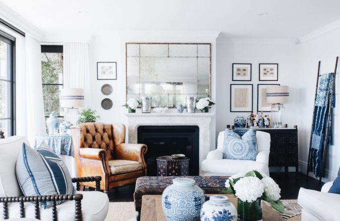
‘Double Bay Apartment’ Project by leading designer Adelaide Bragg, (adelaidebragg.com.au) who favours Resene Spanish White as her go-to white paint for clients.
White paints can come with bluish, reddish, yellowish, and even greenish undertones.
To see the variety, head to your local paint shop and ask for help spotting whites with a variety of undertones and compare them side by side. Or hold the samples against a sheet of white paper. The complexity of each colour will reveal itself to you.
That said, every designer has a favourite all-purpose, work-anywhere shade of white. We asked some of Australia’s top talents including Thomas Hamel, Adelaide Bragg, Blainey North, and Greg Natale for their go-to white paint picks. After all, it really pays to take the time to find the right white. Read more, ‘Paint Colours with Cult Followings: 10 Picks.’
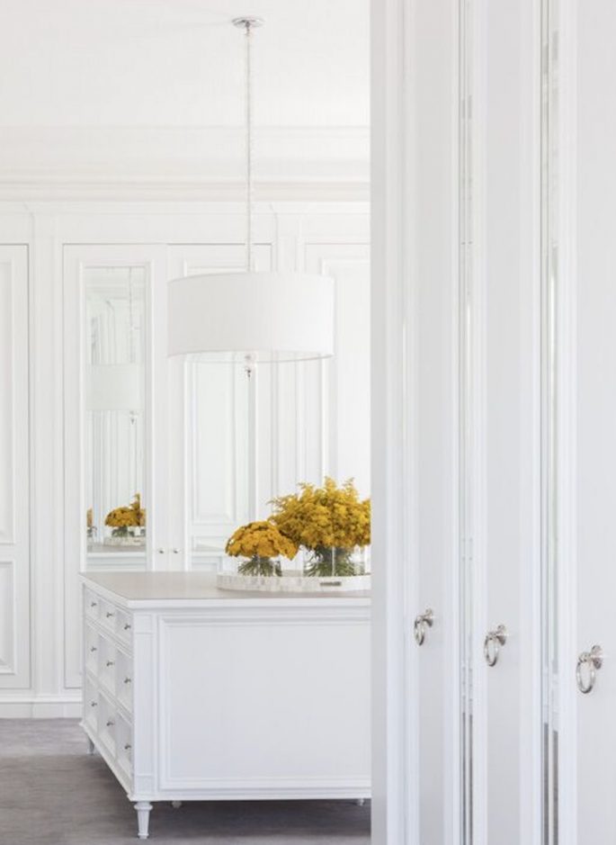
Sydney Eastern suburbs harbourside residence by Lynda Kerry featuring Dulux Whisper White.
DULUX LEXICON:
The top choice for an all-purpose white is Dulux Lexicon. Loved by our leading designers such as Thomas Hamel, Iain Halliday, Greg Natale, Parterre owner, Richard Haigh, and Anna Spiro. Use a mix of half-and-quarter-strength. If it’s good enough for the award-winning boutique hotel, Halcyon House, it’s certainly good enough for us.
Thomas Hamel says “Our current favourite ‘ go -to’ are a mix of Dulux Lexington in Half Strength or Lexington Quarter Strength.”
Make sure you are specific when ordering because Lexington Full Strength is typically way too grey/blue in appearance.” Greg Natale says, “It reasonates so well with my clients because its very clean and crisp but also warm”. Read more, ‘The 20 Best Paint Colours According to Dulux.’
DULUX VIVID WHITE:
A bright, cool white. Big names such as Decus Interiors, Iain Halliday, Poco Design, Anna Spiro, Charlotte Coote, (Coote & Co) and Pamela Makin, (Les Interieurs) all swear by it. “It’s my fave cooler white. Half-strength for walls and quarter-strength for ceilings, woodwork, mouldings, and trims,” says Coote.
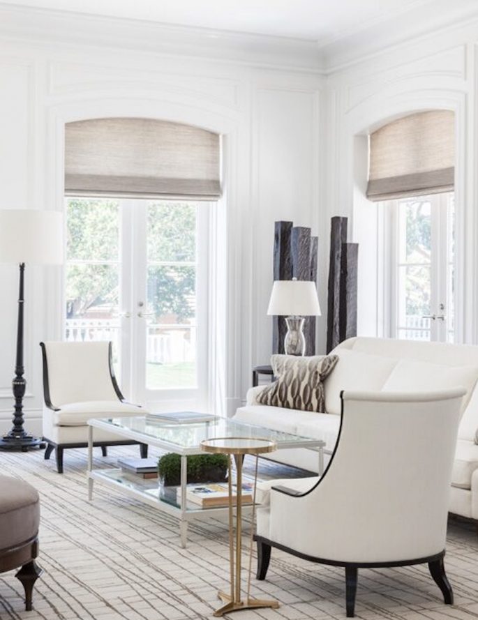
Thomas Hamel Interiors project featuring Lexicon half-strength paint – a favourite white go-to by the renowned designer.
DULUX WHISPER WHITE:
The warm white of old, pre-brightened, starched linen. A favourite with big names such as Lynda Kerry to Walter Herman. Use a mix of half and quarter strength.
FARROW & BALL STRONG WHITE:
It’s not only strong by name but strong by nature. A fave with design powerhouse Blainey North who says it is the perfect white for use in modern homes and spaces.
FARROW & BALL NEW WHITE #59:
The choice of longtime designer Darryl Gordon who says “It’s a stronger version of the brand’s famous White Tie and is called ‘New’ because it is much fresher than traditional whites. It will warm up any room with its soft illumination and can be made to look more creamy if contrasted with bright whites or fresher and cleaner when contrasted with warm whites. Perfect for country kitchens.
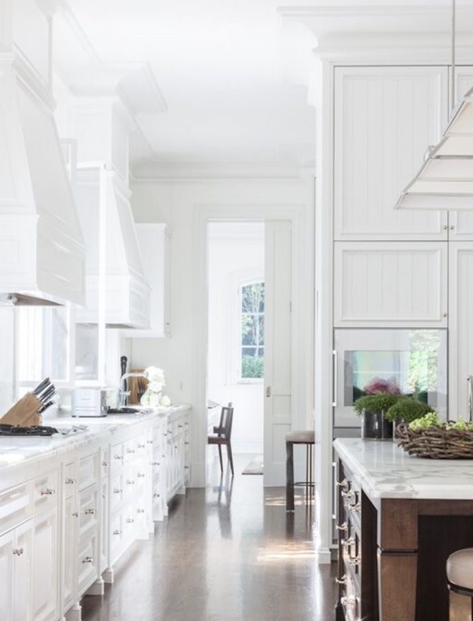
A Thomas Hamel Interiors kitchen featuring Dulux Lexicon half-strength paint, a flexible shade of white favoured by the international designer.
DULUX STOWE WHITE:
(A cream white) A Darryl Gordon classic.
DULUX NATURAL WHITE:
A classic according to designers such as Poppy O’Neil of Poco Design and Charlotte Coote, Coote & Co, who says “It’s one of the best warm whites around”.
RESENE Spanish White:
“It’s such a clever colour,’ says leading Melbourne interior designer Adelaide Bragg. “It’s fresh yet has depth. We halve it, quarter it, double it. I’ve just painted my entire house in it with some grass weave wallpaper to add some pop. Other good whites she recommends include Resene include Blanc, Parchment and Fossil.
TAUBMANS WHITE ALPACA:
is one of the best whites around says leading designer Darryl Gordon.
DULUX WHITE SATIN:
Is another hot white according to leading Melbourne architect Rob Mills who recently used it throughout pukka Sydney yoga outfit, One Hot Yoga.
Leading interior designer Thomas Hamel uses Lexicon Half-Strength or Quarter-Strength when he wants a versatile white but says, “Make sure you are specific when ordering because Lexington Full-Strength is typically way too grey/blue in appearance.”
5 THINGS TO KNOW BEFORE YOU PAINT A ROOM WHITE:
Given that spaces, lighting, moods, and personal preferences all vary, there are many factors to be considered—and also many right answers.
1. Size up what’s in the room
Before selecting a paint shade, size up the palette of everything that will be in the space. Are the colours cool or warm? If they’re warm, you’ll want to lean toward whites with warm-coloured undertones (pink, orange, red, yellow). If they’re cool, consider cool-inflected whites (with undertones of blue, purple, or green). What if the furnishings are neutral? If neutral, go with a warmer white. If there is a lot of colour, a cooler white.
2. Your furnishings will affect your perception of any paint
Sometimes getting a ‘warm’ white doesn’t actually come from the paint, it comes from the entire assembly of the space.
3. Assess the lighting
Because colour is a phenomenon of light, the amount of natural and artificial light in the room impacts the tone of the walls. A pure white looks best with a lot of natural light. With less natural light, the white can have a base with more of a pigment.
Note that geography affects light as well.
In New York, the light tends to be grey and warm. This means the best white is sympathetic to a warm grey. Ideally, it would have warm grey as the undertone.” However, in Sydney, the same colour may like it has an orange cast because the light in Sydney has pure blue filtering through it. The blue in the light will make the warm grey paint look pink.
4. Choose several whites you like
Take what you’ve learned about the furnishings and light in your room and choose a few whites. When selecting, consider these tips from the pros- A pure white reads more modern than one with some colour in the mix and the best whites aren’t really white at all. In most cases, bright white needs some tempering with colour and finally if struggling, err on the side of a neutral white, in between what you can clearly read as “warm” and “cool.”
5. Put your favourite shades to the test
Our designers insist that paint should be tested at home. A white that seemed warm on a smaller paint chip may suddenly look too pink or sallow. Or a white that looked crisp and modern may feel way too cold in a larger application. However, our designers were divided on whether to paint a sample directly on the wall or use a movable swatch: Why paint on the wall? Colours shift from ceiling to wall, wall to wall, room to room. It is all about direction of exposure, proximity to windows, and artificial light. If you’re working with a designer or contractor, he says, make sure that these tests are required as part of your contract, and even specify how many.
