Three designers, two journalists and an interiors photographer gathered at The New York Times recently to make a list of history’s most enduring and significant spaces. The most influential rooms of all time. By that we mean “influential” in its truest sense. Spaces that not only changed the way we live but also changed the way we see design. Moved us forward. Read more, ‘Melissa’s Ultimate Guide to Decorating.’
What comes first: the architecture or the design? Here are the outstanding results…
On an October afternoon, the six-person jury — Tom Delavan, the design and interiors director of T Magazine; Gabriel Hendifar, the creative director of the Manhattan-based lighting and design studio Apparatus; the architect Toshiko Mori; the architect and designer Daniel Romualdez; the veteran design journalist Suzanne Slesin; and the interiors photographer Simon Watson — assembled in a featureless conference room at The New York Times to discuss the most influential rooms of all time. We wanted the jury to identify the spaces – whether pleasing, provocative or completely novel for their eras — that not only informed the panelists’ individual practices as designers and documenters but also challenged how we all, as humans, think about beauty, strangeness, originality, décor, proportion, furnishings, art and the multivalent connections therein that define memorable rooms: ones that, above all, offer a new kind of visual lexicon.
These are rooms, in other words, that have influenced and inspired interior design throughout the decades, shaping how our mind identifies and assesses a space, any space. Read more, ‘5 Quick Tweaks Design Pros Use to Transform Rooms.’
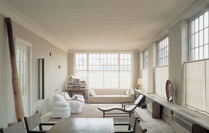
The living room at Vincent Van Duysen’s home in Antwerp, photographed in 2001. Credit: Giorgio Possenti.
No one was expecting unanimity; if taste is individual, then discord among the cohort was inevitable. And yet each had been asked to nominate their 10 to 15 favourite rooms ahead of time, which the group would whittle to a list of 25. The overlaps were obvious front-runners: Four people chose the soaring, glass-walled sitting area of Pierre Chareau’s Maison de Verre, built in Paris in 1932, while Cy Twombly’s objet-filled 1960s living room in his Roman apartment, Rem Koolhaas’s elevator-cum-office built in 1998 for a disabled client in Bordeaux and Yves Saint Laurent’s art-covered 1970s Parisian salon were also submitted by several panelists. A lively conversation ensued for nearly three hours: What’s more important, the architecture or the design? Are the best spaces dictated by the people who inhabit them? The designers who create them? The period they reflect? Or some magical alchemy of all those things? Read more, ’11 Secrets To Decorating Like The World’s Chicest Designers.’
Should public areas like hotels and restaurants be given as much weight as private, residential ones? And, actually, what is a room?
Each of the experts made arguments both concrete and philosophical about the human need to gather and connect in enclosed space, sometimes with the intimacy-creating aid of walls and ceilings, but other times not. Read more, ‘Why You Should Redecorate Until You Kick The Bucket.’
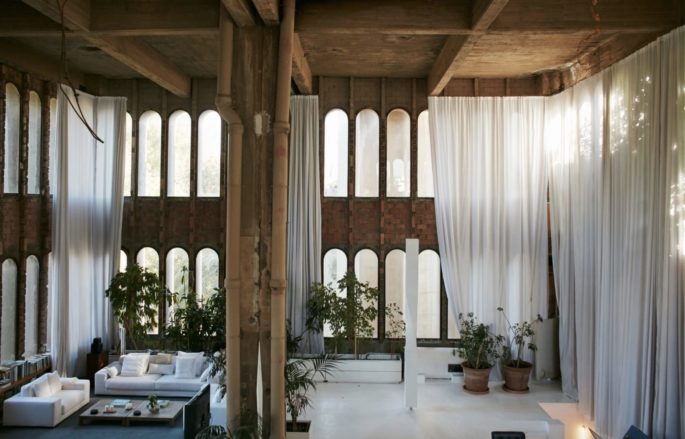
The living room at Ricardo Bofill’s La Fábrica in Sant Just Desvern, Spain, photographed in 2017. Credit: Nacho Alegre.
By the end, they had narrowed upon a mutually satisfying definition of what makes a room and a list of worthy examples, the images of which were laid out on a massive conference table, assessing them for final inclusion: Do we have too many museums and, speaking of, is the spiralling rotunda of New York’s Guggenheim more of a room or a building unto itself? Is the living room of the Finnish furniture designer Alvar Aalto a better representation of midcentury Scandinavian Modernism than that of the Danish furniture designer Finn Juhl? Where are all the female-led projects? (“We have to remember that architecture, like many industries, was male-dominated for much of history,” Delavan said).
And the field of interior design — while originally led by women, though now more evenly split between genders — is only a century or so old.
Eventually, a consensus was reached, though that doesn’t mean the list is necessarily finished or complete: The royal “we” in this story’s headline was, in many cases, applied by our panelists to their own work, the way that they think about design while largely practicing in North America and Europe, which unfortunately means that entire continents such as South America and Africa weren’t under consideration as much as they would have been with another group. There’s a heavy emphasis on contemporary projects, places that everyone had seen with their own eyes. (“Just blame it on the editors,” Romualdez joked, to which Slesin responded, “What’s amazing, if we had to do this tomorrow, is how different it would be.”) So the result that follows — which is ordered chronologically, from oldest to newest — is, at its very least, one history of design in the West on one day from one group of highly opinionated people, all of whom would probably have rather found themselves in any of the rooms below.

Stonehenge in Wiltshire, England, photographed in 2016.Credit…PA Images/Alamy
1. Stonehenge in Wiltshire, England (circa 1600 B.C., architects unknown)
It took Neolithic builders nearly 1,500 years to complete Stonehenge, the outdoor enclosure of nearly 100 enormous upright stones on Salisbury Plain in the south of England. The origin of the structure, which is thought to have been a burial ground or perhaps a place of pilgrimage — the stones are aligned to frame sunrise during summer solstice and sunset during winter solstice — defies logic: The iconic 30-foot-tall three-piece sandstone pillars that stand in the centre can be traced to local quarries, thought to have been finished around 1600 B.C., is an open-air chamber that stands as an indelible template for enclosure, space and ambitious monumentality.
2. The Pantheon in Rome (125 A.D.; architects unknown)
The Roman Pantheon is not only the world’s best-preserved classical building — but is also likely the first in which the interior, not the exterior, is the focus.
It was a precursor to the elaborate decoration of public spaces in later centuries, as well as a model of perfect balance.
While its portico, reached by wide steps of marble, was made in classically Greek-style (squared off, with granite columns) once you enter the circular part of the building, you find a shrine to the motifs and mathematical obsessions of the Roman Empire. The rotunda is 142 feet in both diameter and height — a perfect hemisphere — with a 27-foot-wide oculus at the top of the domed ceiling. The dome itself is made of a porous type of limestone, like pumice, mixed with concrete, and has five rings of 28 rectangular coffers. Altered over the eras by successive rulers, including Pope Urban VIII, who in 1626 removed the original bronze girders from the porch roof to make them into cannons, the Pantheon’s architectural and decorative influence cannot be overstated: Thomas Jefferson’s 1826 library at the University of Virginia is one of many obvious homages.
3. The Shokin-tei tea pavilion in Kyoto (circa early 17th century; architects unknown)
The Katsura Imperial Villa near Kyoto, built in the early 17th century, profoundly influenced architects such as Frank Lloyd Wright and Le Corbusier, both of whom spent time in Japan. And with good reason: The 16-acre property, with many outbuildings and exquisite gardens, is a clear expression of how Zen Buddhism’s graceful influence is woven through Japanese culture and design — and is a vivid illustration of why those aesthetic codes still feel utterly contemporary. There are several free-standing tea pavilions on the property, all made to amplify a sense of pureness, reverence and isolation (each celebrates a different season and allows the gardens to be seen from various angles), but Shokin-tei, the tribute to winter, is the one that stands out for its unexpected modernity. With a thatched roof and three sides that face the property’s large pond, it’s notable for the blue-and-white checkered handmade paper that covers a central alcove and sliding doors. The loggia is held up by three oak logs, left natural with their bark intact. Rustic and bold, the teahouse is pleasingly geometric, a hallmark of traditional Japanese architecture.
4. The parlors of Georgian homes in the United Kingdom (circa 1714-1830; various architects)
There is no perfect room, of course, but the parlor of the typical Georgian home — built throughout London and Edinburgh during the reigns of King George I through King George IV — may come close. The rooms are large, but not in the cavernous, ill-planned way of a McMansion or a billionaire’s high-rise penthouse on Central Park: They are, instead, models of proportion. Usually square, with ceilings around 16 feet high, the parlors’ symmetry was based on the Classical architecture of Rome and Greece, filtered through the lens of the Renaissance but scaled down to accommodate a single family. Unlike the neo-Gothic revival, which began as early as the mid-18th century, or the late Victorian period at the end of that century, both of which prized ornament, there was a spareness to Georgian style, which makes it feel modern today. Read more, ‘How To Design For Real Life.’
Windows, placed with mathematical precision, were large and often shuttered — Georgian builders seemed to understand that in the late afternoon, taking tea, one might want to ease gently into the dusk.
5. Pierre-François-Henri Labrouste’s reading room at the Sainte-Geneviève Library in Paris (1851)
The Sainte-Geneviève Library, in the Fifth Arrondissement, has roots dating back to the sixth-century manuscript collection of the Abbey of Sainte-Geneviève, though its soaring reading room was built over 13 years, starting in 1838, by the Beaux-Arts architect Pierre-François-Henri Labrouste, who had spent his early career mastering the use of iron in grand railway stations and thus was a virtuoso at evoking grandeur. The nearly 20,000-square-foot, two-story structure is defined by exposed cast-iron arches, suspended over iron columns like parachutes billowing above a giant classical arena. The room, which is now part of Paris’s university system, stands as one of the finest neo-Classical interiors in Europe, influencing the Gothic Revival that swept late 19th-century France as well as the innovative spirit of the architect Louis Sullivan, who at the turn of the 20th century pioneered the use of iron and reinforced concrete in the American skyscraper. Read more, ‘A Room Without Books Is Just Very Sad.’
6. The Bloomsbury Group’s studio at Charleston in Sussex, England (circa early 20th century)
Inspired by the bright, fluid figuration and sharp abstraction of Post-Impressionists including Gauguin and Matisse, who led the way to High Modernism after World War I, the visual artists of the Bloomsbury Group ran wild at Charleston, the Sussex, England, farmhouse where the married painters Vanessa and Clive Bell and Vanessa’s lover Duncan Grant lived for decades. Virtually every surface in the house, a way station for intellectual bohemians including Vanessa Bell’s sister, the novelist Virginia Woolf, is covered in joyous drawings. In the living room, barely clad classical figures dance across the hearth, and books spill out from shelves. The house, preserved after Grant’s death in 1978, is the embodiment of the revolution that shook the art and design world, its handcrafted ethos driven by the class-driven conflict that took root in England between the wars.
7. Jean-Michel Frank’s living room for Marie-Laure de Noailles’s hôtel particulier in Paris (circa 1925)
The Jazz-era Parisian arts patron Marie-Laure de Noailles blithely disregarded convention. She and her husband, Charles, underwrote the Dada-inflected films of Man Ray. Their 16th Arrondissement apartment sparked the career of Jean-Michel Frank, an interior designer who stripped away the early-18th-century mouldings from the vast rooms and squared off the giant opening between them. The walls of the apartment (which was returned to its ornate origins by the designer Philippe Starck in 2003 for the Musée Baccarat) were covered in parchment panels hung with paintings by Dalí, Picasso and Miró. And the severe living room furniture that Frank made for the couple continues to inspire contemporary design; created from lush materials including shagreen and mica, the pieces combine geometric discipline with the mark of the artisan’s hand.
8. Pierre Chareau’s salon for Jean Dalsace’s Maison de Verre in Paris (1932)
Bathed in sunlight during the day and lit at night with a phosphorescent lantern glow, the Maison de Verre may well be Paris’s most radical residence. Resembling a box made of glass blocks capped by a single traditional apartment, it was commissioned in the late 1920s by Jean Dalsace, a gynecologist who bought an 18th-century Left Bank hotel, determined to reinvent it as a Modernist mansion. Unable to evict the top-floor tenant, he built around her.
The architect, Pierre Chareau, conceived the edifice as a series of interlocking forms, with the doctor’s office on the first floor and two private levels above.
Simultaneously labyrinthine and airy, with several sets of stairs and a double-height salon behind the monumental glass wall, it has been compared in impact to Le Corbusier and Pierre Jeanneret’s Villa Savoye (1931) on the outskirts of the city. But unlike that imposing International Style monolith of reinforced concrete, the Maison de Verre possesses a lyrical delicacy owing to the work of the iron artisan Louis Dalbet, who created such touches as perforated mechanical screens to separate spaces and a rolling steel-pipe library ladder with wood inlays. Read more, ‘How To Improve Your Outdoor Space.’
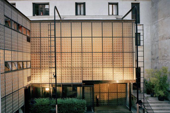
The exterior of the Maison de Verre in Paris, photographed in 2005. Credit: François Halard
9. Finn Juhl’s living room at his home in Charlottenlund, Denmark (1942)
The Danish designer Finn Juhl, along with his countryman Hans Wegner, established the vanguard of Scandinavian furniture design in the 1950s and ’60s with pared-down yet softly contoured pieces made largely of oil-rubbed walnut, maple and teak, and seats and backs covered in nubby upholstery. They were a complete break from the fussy neo-Classical style that preceded them and, because of new manufacturing processes engineered at the same time, were instantly copied. Trained as an architect, Juhl used the ultramodern house he built for his family and lived in for close to 50 years in a suburb north of Copenhagen as a laboratory, tweaking the setting to accommodate new volumes and contours. In the living room, where Juhl placed one of his Chieftain chairs and Poet sofas, the beige was intended to evoke the feeling of being under a canvas, especially when sunlight hit it.
The house had an open plan — radical for the time — and each ceiling of each room was painted a different color to create different moods.
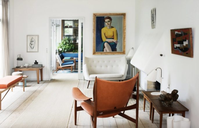
Finn Juhl’s living room in Charlottenlund, Denmark, with a Hovdingestole chair and Vilhelm Lundstrom’s “Portrait of Hanne Wilhelm Hansen” (1946), photographed in 2013. Credit: Henrik Sørensen/Ordrupgaard, Copenhagen
10. Le Corbusier’s Le Cabanon in Côte d’Azur, France (1952)
Charles-Édouard Jeanneret, the Swiss architect known as Le Corbusier, loved the Mediterranean, with its incomparable light, rough-hewn local architecture and rocky shoreline. In 1952, he built the one-room Le Cabanon for his wife, Yvonne, to use as a summer getaway. Merely 12 feet by 12 feet, it had no real bathroom, just a toilet near the bed, nor a kitchen; the couple took their meals at an adjoining cafe reached by an internal door. With an exterior that resembles a Canadian log cabin and interior plywood walls, it was constructed using Le Corbusier’s so-called Modulor principles — an anthropomorphic scale of proportions based on the movement of the human body — down to the built-in furniture, making it a diorama of the architect’s revolutionary worldview. Read more, ’10 Things The French Always Do When Decorating.’
11. Nancy Lancaster’s living room at her flat in London (1958)
Among the great paradoxes of the influential style widely known as English Country — a dotty dishevelment characterized by cozy sun-bleached chintzes, antiques from various periods and brightly hued walls — is that it was brought to Britain from the American South in the 1920s, by the Virginia-born socialite Nancy Lancaster, who owned the Mayfair design firm Colefax and Fowler. Inspired by her romanticized memories of plantation houses (including her grandfather’s) that had fallen into disrepair after the Civil War, Lancaster, who lived in England virtually all her adult life, tapped into what her biographer Robert Becker called a corresponding “abstract nostalgia” for a British way of life that had been obliterated by the wars. While she lived largely at Ditchley Park, an estate in Oxfordshire, it was the lacquered egg-yolk yellow living room of her flat above the firm’s Avery Row showroom, completed in 1958 (she died in 1994 at the age of 96) that stood — until just a few years ago, in fact, when the firm moved — as a shrine to her aesthetic, with its barrel ceiling, faux-marble baseboards, braided swags, oversize chandelier and array of comfortable seating. Read more, ‘Let’s Decorate: Best Interior Design Tips of All Time, Part 2.’
The room has been a lodestar to a generation of American collectors and designers, among them Sister Parish, Mario Buatta and Mark Hampton.
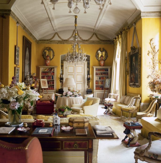
The butter-yellow living room at Nancy Lancaster’s flat in London, photographed in 1980. Credit: Derry Moore
12. Philip Johnson’s Four Seasons dining room in New York City (1959)
When the Four Seasons restaurant — the epitome of the steel-and-glass International Style, created on the ground floor of the Ludwig Mies van der Rohe-designed Seagram Building — opened in the late ’50s, it was a tourist trap. Not until the late ’70s, when, under new owners, its Grill Room (one of two dining areas connected by a corridor hung with a massive Picasso tapestry) was named the ultimate power lunch spot by Esquire, did Philip Johnson’s extraordinary feat get its due. But it is the Pool Room, now operated as a seafood restaurant called the Pool, that stands as the most vivid reminder of the architect’s commitment to tranquil austerity. Other fancy restaurants of the time were fussily French with cushy banquettes, but Johnson embraced a brash, unadorned rectangularity, with 20-foot ceilings and massive windows shaded only by curtains of rippling, undulating chains. Read more, ‘The Return of the Golden Age of Design.’
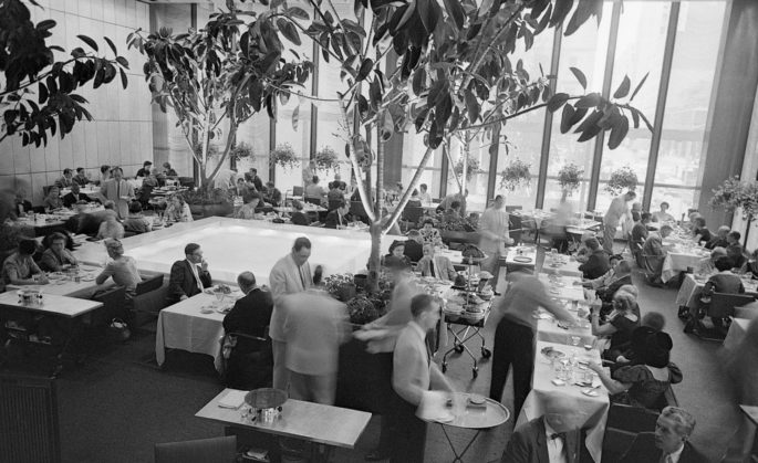
The Four Seasons dining room, in the Seagram Building on Park Avenue in New York, photographed in 1959. Credit: Bettmann/Getty Images.
13. Cy Twombly’s living room at his apartment in Rome (circa 1966)
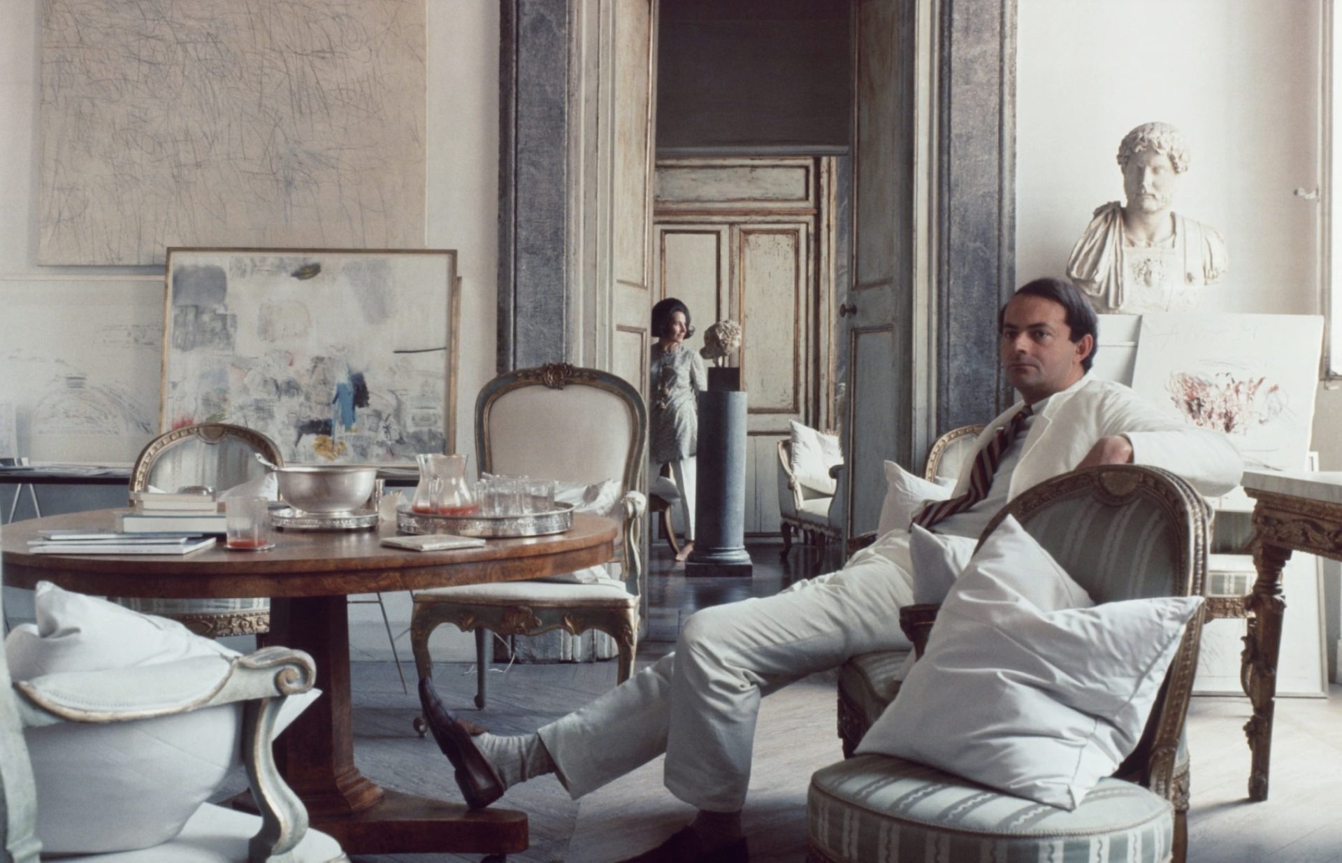
The Virginia-born abstractionist Cy Twombly came to Rome in the late 1950s, and soon after, he married the Italian portraitist Tatiana Franchetti, sister of his patron Baron Giorgio Franchetti, with whom he bought an apartment in a 17th-century palazzo on the Via di Monserrato; it had been built for the Borgias. He immediately had the place stripped of generations of old paint to reveal whitewashed walls and pale blue doors with gold moldings; the large rooms and abundant light became a perfect setting for his enormous oil paintings, with their calligraphic graffiti on pale backgrounds, punctuated with phrases from classical allegory or from poets such as John Keats. Particularly in the main sitting room, the artist had an intuitive sense of how best to punctuate the works in his home: He offhandedly mixed them with slightly run-down gilded antiques upholstered in bleached shades, plaster busts that could be found in flea markets throughout the city and bits of silver. Read more, ‘How To Get Chic Italian Style with 5 Pieces.’
The effect is ethereal yet unpretentious, airy, elegant and livable.
14. Ludwig Mies van der Rohe’s main exhibition gallery at the Neue Nationalgalerie in Berlin (1968)
As Mies van der Rohe’s last major building (he died a year after it was opened), the massive structure embodies the legendary architect’s preoccupation with open, flexible spaces with minimal enclosure — a radical notion for a museum hall at the time — and complex engineered solutions that seem virtually invisible. With a nearly six-foot-thick steel flat roof painted black (a grid ceiling inside holds lighting) and an architecturally austere presence, it comprises two distinct levels. Visitors climb three flights of stairs to the entrance and the main special exhibition gallery, a hangar-like space supported by cruciform columns on either end, where the art, mostly from the 20th century, is often hung on temporary walls and other innovative structures, revealing the space’s flexible nature. The building is currently undergoing a massive restoration by the British architect David Chipperfield.
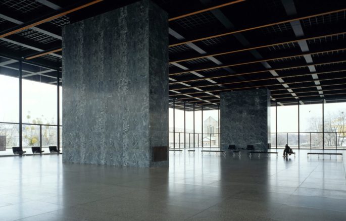
The flexible exhibition space of the Neue Nationalgalerie in Berlin, photographed in 2001. credit: © Klaus Frahm/Artur Images
15. Stanley Kubrick’s suite in “2001: A Space Odyssey” (1968)
A room does not have to be realized to be seminal: The final, indelible scene of “2001: A Space Odyssey” is set in a huge suite meant to be a luxurious zoo environment for the film’s protagonist, the wayward astronaut Dr. Dave Bowman. Stanley Kubrick, a notorious perfectionist, said it was intended to look as though created by a master race that wanted to observe Bowman in a comfortable setting through the remainder of his life: He ages, dies and is reborn in the room in a few cinematic minutes. Kubrick resisted what might have been an obvious trope of the time — making the room a neon pop palace of blobby plastic furnishings — instead positing what an alien race might consider soothing and elegant to a 20th-century human. The result is a mixture of inaccurate replicas of Louis-era French furniture and neo-Baroque statuary set into alcoves, all gently illuminated by floor tiles lit eerily from below.
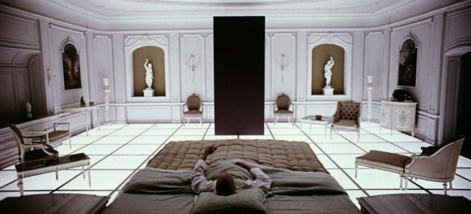
A still from Stanley Kubrick’s “2001: A Space Odyssey” (1968).Credit…MGM/Stanley Kubrick Productions/Kobal/Shutterstock
16. Donald Judd’s master bedroom at his loft in New York City (1968)
In 1968, Donald Judd, then 40 and fresh off a Whitney Museum retrospective, bought a derelict five-story SoHo factory built in 1870 to use as his home and studio. Although by the late 1970s he was spending much of his time in Marfa, Texas, he lived and worked in New York off and on until his death in 1994, punctuating the loft’s vast rooms with art and objects, creating a template for late 20th-century American Minimalism. After a restoration by the Judd Foundation, run by his son and daughter, the building — which opened to the public in 2013 — remains intact, as pristine as one of the sculptor’s welded metal boxes. Works by Dan Flavin, Claes Oldenburg, Carl Andre, Marcel Duchamp and others remain in the exact positions that Judd placed them. But the top-floor master bedroom best encapsulates the residence’s style: On the wall hangs an early Judd piece in wood, Oldenburg’s “Soft Ceiling Lights at La Coupole” (1964-72) and a John Chamberlain crushed car fragment known as “Mr. Press” (1961). The bed, on a low plinth, is counterpoised with a 19th-century Italian settee, and the angles of a Flavin fluorescent work echo the cast-iron windows overlooking Mercer Street. The neighborhood may no longer be recognizable as the postindustrial wasteland that Judd found in the ’60s, but in the fifth-floor chamber, his vision of SoHo — raw, hand-forged, radical — lives on. Read more, ‘How To Decorate a Bedroom.’
17. Yves Saint Laurent’s salon at his apartment in Paris (1970)
The couturier Yves Saint Laurent and Pierre Bergé, his partner in life and business, bought a nine-room, nearly 6,500-square-foot duplex at 55 Rue de Babylone in Paris’s Seventh Arrondissement in 1970 and spent the following decades perfecting it. The designer, who died in 2008 at age 71, layered it with Renaissance bronzes, paintings by Goya and Picasso, the severely modern furniture of Jean-Michel Frank and Eileen Gray and witty anthropomorphic sculptures by Claude and Francois-Xavier Lalanne. His eye for combining old with new — he took elements from the classically minded Rothschild clan and was inspired by the ultra-minimalist Paris hôtel particulier that Frank decorated in the 1920s — remains remarkable, especially in the before-and-after of the double-height salon, its panelled walls the colour of burnt sugar.
It’s a master class in creating a room that is beautiful from the start yet flexible enough to evolve over the years in tandem with one of the greatest collectors of all time.
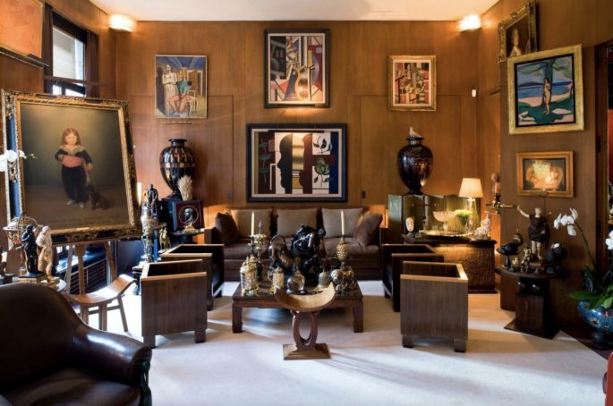
Saint Laurent’s Paris salon, after it was rehung with his art collection, photographed in 2009. Credit: Luc Castel. Artwork: © 2019 Artists Rights Society (ARS), New York
18. David Hicks’s living room at his estate in South Oxfordshire, England (1973)
The courtly, charismatic British designer David Hicks grew up amid the chintz and antiques that characterized English interiors of the early 20th century, but at the dawn of the 1960s, he shocked the system with supersaturated clashing shades (red with violet, chartreuse with deep forest), octagonal patterned carpets and a daring mix of 19th-century furniture, Asian objects and Pop abstraction. His taste quickly became synonymous with upper-class cool, and it was he who coined the now-ubiquitous term “tablescape.” In his own red-and-pink living room on his South Oxfordshire estate — which has since become an enduring influence on contemporary designers including Miles Redd, Vicente Wolf and Steven Gambrel — black lacquer accents, layered patterns and oversize objects underscore his lasting aesthetic legacy.
19. Paul Rudolph’s living room for Halston’s townhouse in New York City (1974)
If there is one photograph that conveys the essence of the 1970s — at least its louche, glamorous side — it’s the Harry Benson shot of Halston in his 32-foot-tall living room on the Upper East Side. The fashion designer’s stylishly gaunt frame may be burned into the collective memory, but it’s arguably his house — that sharp-edged, almost extraterrestrial abode — that will forever haunt us. Designed in 1966 by Paul Rudolph, who was for years the dean of Yale’s architecture school, and remodeled once Halston bought it in 1974, the 7,500-square-foot townhome was famously a locus for celebrities, including Andy Warhol, Bianca Jagger and Liza Minnelli. Rudolph, widely credited for bringing Brutalism to the United States, eschewed comfort, practicality, even safety in much of his work, opting instead for maximum minimalist drama. Although Gunter Sachs, the Swiss industrialist who was an owner of the house after Halston’s death in 1990, mitigated some of the Rudolphian details, including the ubiquitous gray industrial carpeting, the vertiginous floating staircase to the mezzanine still shocks, especially when imagining the partygoers who must have tried to descend it in stilettos: It has no handrail.
That’s just one of the defining details that the designer Tom Ford, who bought the house earlier this year, is likely to leave alone.
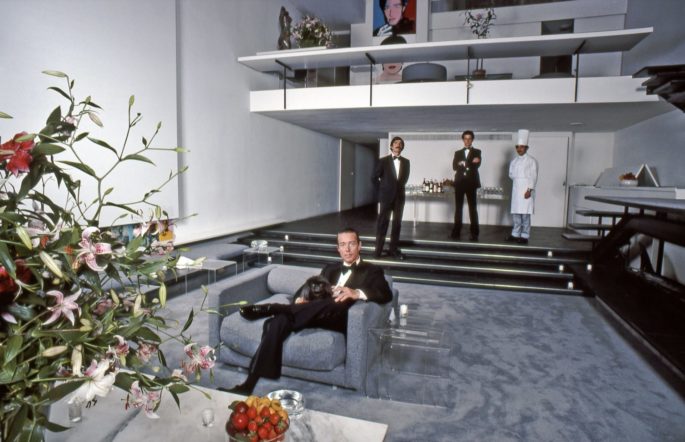
The designer Halston in his sunken living room in New York, photographed in 1978. Credit: Harry Benson
20. Ricardo Bofill’s living room at La Fábrica in Sant Just Desvern, Spain (1975)
Architectural postmodernism, which became prominent in the 1980s, combined classical elements with Brutalist materials like cement and iron, often pumping up details to cartoonish proportions. But La Fábrica, a 32,000-square-foot former cement factory outside Barcelona that Ricardo Bofill, now 80, converted into a home and office in 1975, illustrates the style at its most inspiring. With over 30 concrete silos, cavernous machine rooms and nearly 2.5 miles of underground tunnels, this reimagining of a complex that had been built during Spain’s postwar boom was a mammoth undertaking that is, after nearly 50 years, still in process. By keeping many of the original details, including massive if narrow arched windows and exterior metal staircases, Bofill — whose firm Taller de Arquitectura is known for Barcelona Airport’s Terminal 1 — has transformed the space into vast public areas, expansive libraries and cosy bedrooms, some tucked into the formerly abandoned silos. Read more, ‘The Rise of The Fashionable Concrete Interior.’
The central living room, with two stories of arches, exposed pipes, and oversize billowing white drapes, reflects the inherent dynamism of repurposed spaces.
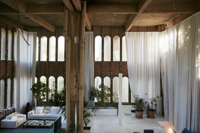
The living room at Ricardo Bofill’s La Fábrica in Sant Just Desvern, Spain, photographed in 2017. Credit Nacho Alegre
21. Andrée Putman’s office for the French Minister of Culture at the Palais-Royal in Paris (1984)
Jack Lang, who became France’s Minister of Culture under François Mitterrand during the 1980s, brought with him not merely a stylishly shaggy haircut and custom-made jewel-toned shirts that he wore beneath a well-cut suit but a fierce passion for interior design. Perhaps unsurprisingly, he hired Andrée Putman — then the doyenne of Parisian design, who had conceptualized Morgans Hotel in New York and redone the interior of the Concorde — to reconceive the ministry’s ornate offices in the 17th-century Palais-Royal in the First Arrondissement. She paired the elaborately gilded boiserie walls and outsize chandelier with a pale-hued suite of geometric postmodern furniture, including barrel chairs and a half-moon desk so aesthetically significant that it was kept by at least five successive French presidents. Her fearless mixing of styles and periods — unheard-of at the time — led the way for designers to introduce modern, even minimalist, furnishings into historic structures, weaving a new, more layered narrative
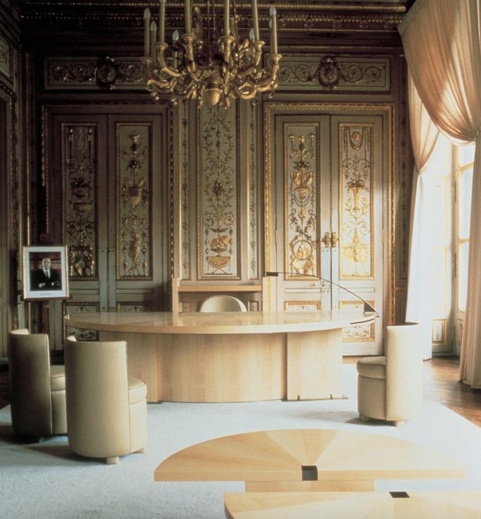
The office Andrée Putman designed for French Minister of Culture Jack Lang at the Palais-Royal in Paris, photographed in 1984. Credit: Deidi Von Schaewen/Courtesy of Studio Putman
22. Vincent Van Duysen’s living room at his house in Antwerp (1993)
Sensual minimalism might seem oxymoronic, but if there is a signature style of our era, that may be its proper sobriquet. In the 1990s, the Belgian designer Vincent Van Duysen, now 57, pioneered such environments — unfashionable at the time — which are both under-decorated and gracefully patinated. They take from early 20th-century Modernism a sense of lofty proportion and a lack of color and embellishment but avoid the coldness of steel and tempered glass. Instead, with raw, textured fabric and wood to bring out the soul in sparingly arrayed and geometrically precise furniture, Van Duysen’s interiors evoke silence and calm. Nowhere is this truer than in his own Antwerp living room, where light illuminates elemental shapes and defiantly plain bleached linens in shades of oatmeal and pure white. Read more, ’12 Ideas to Steal from a Heavenly Belgian House and Garden.’
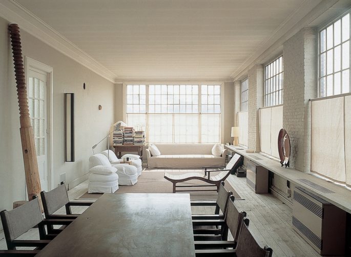
The living room at Vincent Van Duysen’s home in Antwerp, photographed in 2001. Credit Giorgio Possenti
23. Philippe Starck’s lobby for Ian Schrager’s Delano Hotel in Miami Beach (1995)
The Delano, on Collins Avenue in South Beach, was not the first boutique hotel (that title likely belongs to Morgans, also an Ian Schrager brainchild, which debuted in New York City a decade earlier), but it remains simultaneously archetypal and original. Born of a collaboration between Schrager, the Brooklyn-bred impresario of Studio 54, and Starck, the Harley Davidson-riding Parisian designer, the interior renovation of the 1947 hotel, with its historically protected pink stucco facade, was intended to, in Starck’s words, reflect the “deep elegance of a poor people who have a very clean house.” His approach contrasted vividly with the neon-adorned Art Deco hotels that were then being modernized along the strip, and helped give birth to the contemporary Miami aesthetic. The 14-story hotel currently has 194 sparsely furnished, white-on-white rooms above a cathedral-ceilinged lobby corridor with gleaming dark floors and semi-sheer floor-to-ceiling white curtains that billow in the breeze.
In niches along the way sit a Salvador Dalí chair and the iconic overscale banquette from which countless guests have started taking selfies.
24. Rem Koolhaas’s elevator office at Villa Lemoine in Bordeaux (1998)
In the late 1990s, the French publisher Jean-François Lemoine and his wife, Hélène, were in the midst of planning a hyper-modernist family villa overlooking the city of Bordeaux when he was in a car crash that left him partially paralyzed. Undeterred, they hired the Dutch architect Rem Koolhaas, whose firm OMA built them an elaborately engineered house to enable Lemoine unparalleled mobility without sacrificing the couple’s desire to push beyond conventional volumes. Instead of keeping things on a single elevation with openings wide enough for a wheelchair, Koolhaas created three levels partly wedged into the hill, centered around a 10-foot-by-11-foot elevator platform set up as an office for Lemoine. Powered by a hydraulic lift, the platform moves freely between the floors. It can hover between, lending spectacular unobstructed views, or become flush to the kitchen at the base or disappear into the glassed-in center-level living area; at night, it rises to become a corner of the cantilevered top floor expanse that holds the bedrooms, which have porthole-like windows punched through weathered metal cladding. Lemoine died in 2001, and the house remains in the hands of Hélène. Their daughter, Alice, and her husband, Benjamin Paulin, son of the legendary furniture designer Pierre Paulin, have recently transformed the home into a temporary exhibition space showing Pierre Paulin’s furniture.
25. Ryue Nishizawa’s Teshima Art Museum in Teshima, Japan (2010)
The Japanese island of Teshima, about an hour and a half south of Okayama in the Seto Inland Sea, is a place with chaste beauty, a population of barely 1,000 and, since 2010, a nonpareil one-artwork museum. Shaped like a flattened droplet of water straining to return to the sea, the Teshima, designed by the Pritzker-winning architect Nishizawa (co-founder of the Tokyo-based firm SANAA) is rendered in pale concrete, with no structural pillars, just curved walls that slope to meet the canopy of ceiling and two elliptical openings that allow in the elements. But as you stand in the vast space in your bare feet (shoes must be removed at the door), it’s the interaction of the structure with the subtle and strange environmental sculpture, “The Matrix” (2010), by the elusive artist Rei Naito, that makes the room seem so otherworldly. Water trickles down from a ribbon dangling from the rim of one of the apertures; at first, you think that this alone is creating the small pools on the floor.
This is an excerpt from the original article that appeared in New York Times T Magazine.

