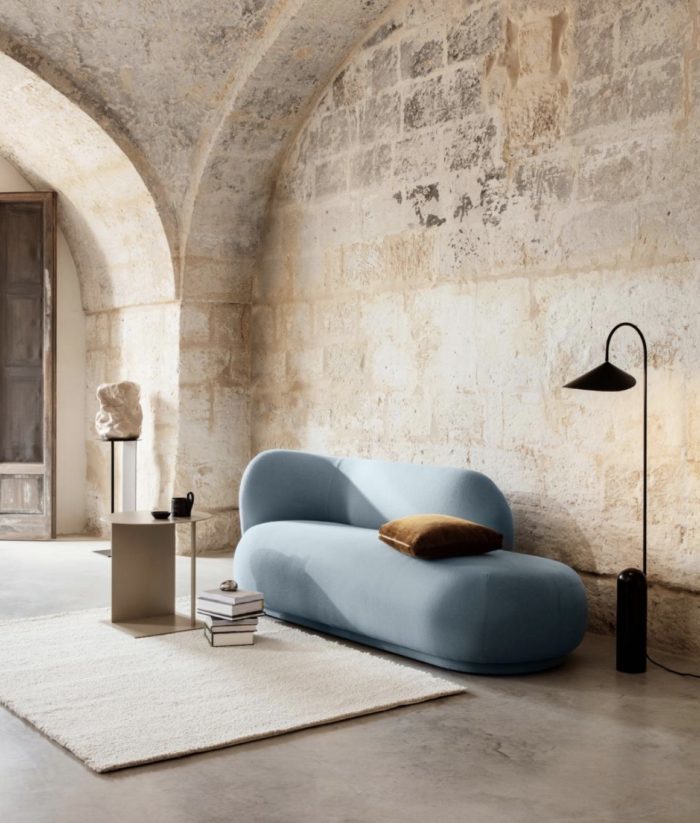
The emotive power of colour is long documented: it’s one of the most vital and highly contested elements of interior design. Can’t settle on a colour scheme for your home or even a room? Here, we outline a step-by-step guide for identifying—and decorating with—the hues that make you happy. This is how to get your colours right, first go. And lift your mood everyday because the shades you choose have the power to affect your wellbeing. Read more, ‘These Are The Colours Everyone is Talking About’.
A splash of yellow to brighten your day or a cooling blue to calm your mood – whatever your favourite hue, we have the decorating tips to help you make it work at your pad.
When it comes to using colour, the biggest hurdle is thinking you don’t know what you like or where to begin, but everyone has a personal palette that resonates with them. The trick is learning to slow down and notice it. Read more, ‘What the Colour of Your Front Door Says About You.’
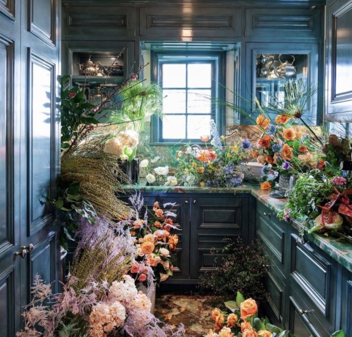
Colour is the spice of life. It’s a mood changer. The shades you choose may be different in a powder room than a living room or kitchen such as this powerful Kelly Wearstler design, pictured.
Step back and look at your rooms, in particular how the colours co-ordinate. Don’t focus on the walls, look at the small things such as lamp bases and shades, side tables, painting, cushions and even magazines. It’s in the accessories that most problems lie. Every object in a room adds its colour ‘noise’. Most lived-in houses, with their random accumulation of colours are a cacophony. Look and listen to yours. Decide on an accent colour for each area. It might be suggested by a rug or painting. Try to echo that tone in flashes everywhere: a vase, a pile of books, a cushion, a tablecloth. Keep other colours to a minimum, so that your accent colour strikes its note. What could be more chic than a room with white plaster walls, white timber shelves piled with white china, white muslin curtains, a white linen slip-covered sofa, and a basket of red apples. Colour is the easiest way to update a room. By changing key components, you can give the illusion of redecoration.
Indeed, New York textile designer Rebecca Atwood, a favourite with decorators who have a keen eye for colour has a new guidebook, reports WSJ recently, “Living With Colour” (Clarkson Potter) that explains how to really look at your rooms from a colour perspective. “Offering a peek inside chic, vivid interiors and outlining the simple fundamentals of colour theory, the manual leads readers through all aspects of designing with colour, from understanding the electromagnetic spectrum to picking out cushions.”
At the heart of it all, though, is the concept that everyone can—and should—develop their unique set of colours: a layered foundation of hues that spark an emotional response and can be applied, in different proportions and approaches, throughout your home. Think of the palette as ‘your colours,’ but the way you use them can vary from space to space. So, how do you get there? Follow these easy four easy steps:
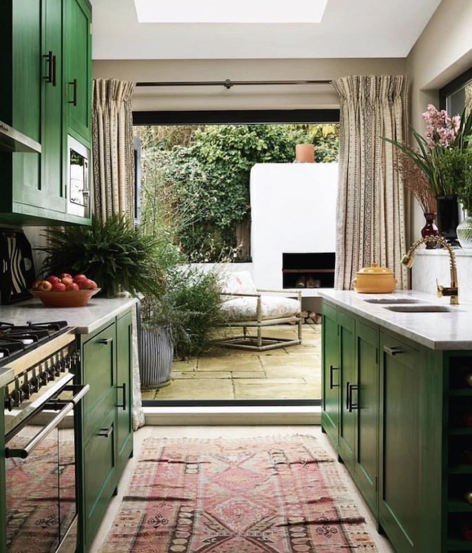
When it came to her garden, decorator Sarah Vanrenen added a feature fireplace as the focal point for summer nights. She kept the garden neutral – full of greens and stone – to maximise the space.
1. Go on a colour hunt
To start, all you have to do is open your eyes and pay attention. Think about a place where you really feel wonderful or at ease, whether it’s somewhere in nature or in your grandmother’s house…Next, find—or take—a picture of the space, so you can begin to dissect the colours closely. What are the colours that you might not immediately notice but that help build that environment and tell its story? You rarely see just a wide, flat colour. There could be 20 different greens in one meadow. Read more, ‘Paint Mistakes: The 9 Colour Mistakes You Should Never Make.’
And don’t forget neutrals, paying attention to their undertones. Greys and whites, for example, can skew cool-blue or warmer-pink.
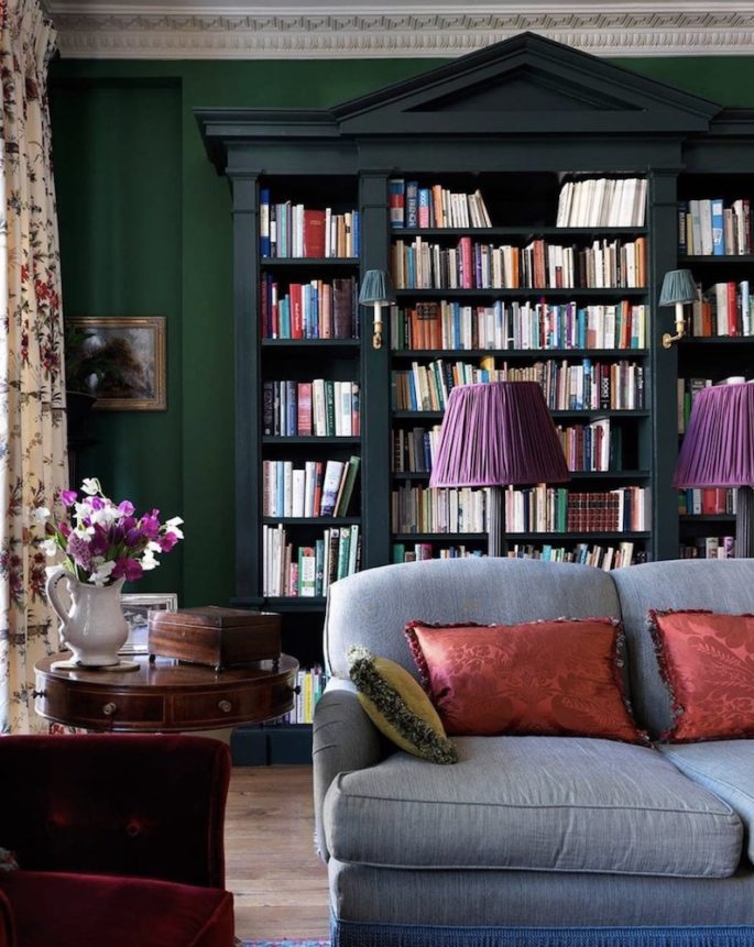
Everyone can develop their unique set of colours: a layered foundation of hues that spark an emotional response and can be applied, in different proportions and approaches. Image via House and Garden UK.
2. Create your colour wheel
Once you begin identifying colours that resonate with you, start collecting physical versions of them—paint chips, fabric scraps, even leaves—and arranging them loosely in the format of a classic colour wheel (easily found online) so you can see the relationships between them.
It’s about the idea of connector colours—those that bridge the neutrals and more dominant colours on your wheel.
These linking colours might be lighter versions of your dominant colours or be complementary colours, which sit on the opposite side of your or the standard colour wheel. Read more, ‘Australia’s Best Paint Colours Are.’
Melissa’s personal palette at her home is dominated by eggshell, latte, oyster, butterscotch, khaki, coffee, grey, brown, chocolate and black that complement accents of aquamarine, French blues, teal and greens in art, furniture and ceramics that are not on her original colour wheel—but add a jolt of energy and connect to some of the room’s wood elements. Read more,‘Melissa’s Ultimate Guide to Decorating.’
You don’t always have to design with neutrals and ‘pops’ of colour. You can make rich connections using more mid-tones.
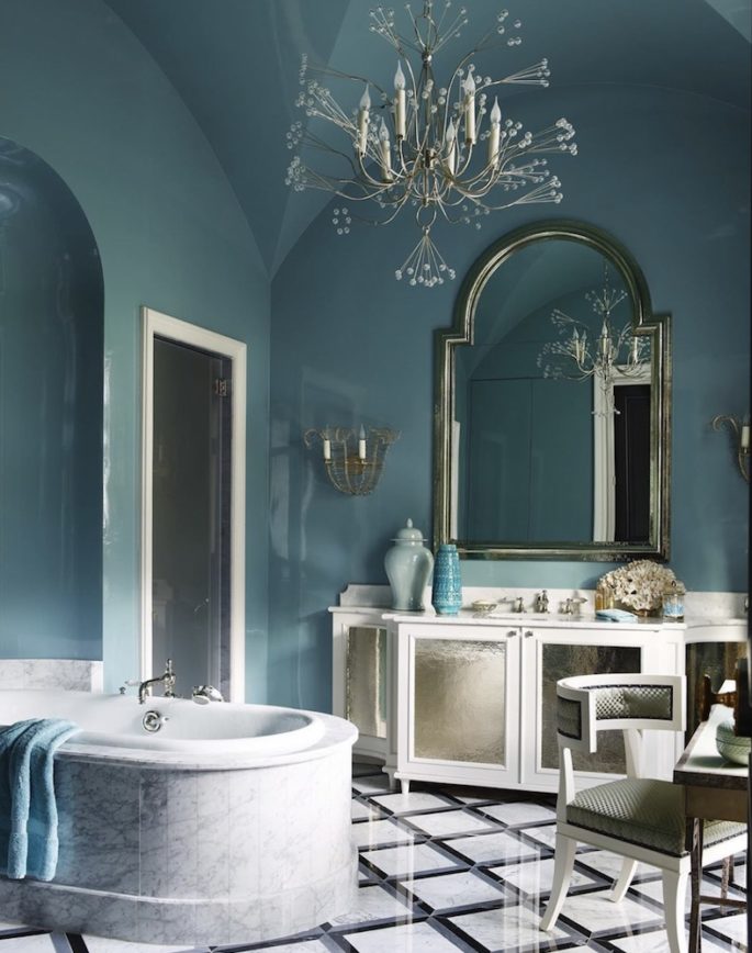
Lighter colours feel airier, mid-tones add cosiness, dark tones feel moodier. Image via Elle Decor.
3. Put it into practice
Find a project—a room, a window treatment—that lets you experiment. Proportion is key. The colours you focus on may be different in a powder room than a living room. Lighter colours feel airier, mid-tones add cosiness, dark tones feel moodier.
To create a sultry powder room, for instance, you might lean more heavily on the inky indigos in a palette.
Others might prefer a tomato-orange red, navy, peach and rosy-purple taupe. If you were doing a bedroom you might play up the blues because they’re restorative, and use the tomato colour sparingly, on a lamp shade or cushion. And you would use peach as well, since, as a lighter version of the tomato-red, it complements and tempers it.
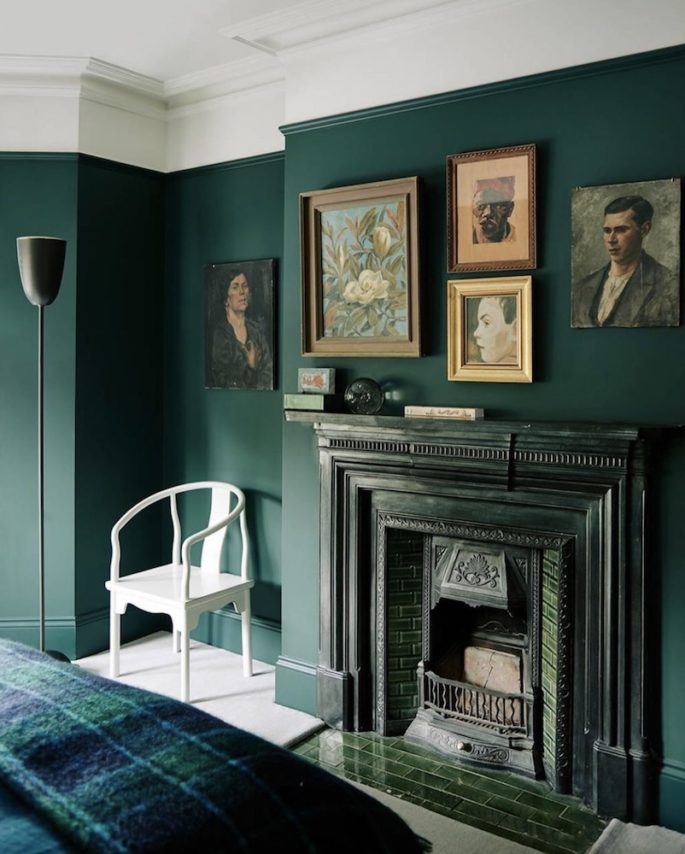
Image via House and Garden UK
4. Fine-tune
Once you have your space set up, playing with small objects—books, vases or other curios—to explore how new layers of colour change in a room. You might layer gold or mother of pearl accents.
Start with a plan, but know it will evolve, because you can use a basic palette in a million different ways.
Personal preference always counts when choosing colours, but for the common areas of a serene home, a good rule of thumb is to choose subdued colours that don’t demand attention. Read more, ‘The 20 Best Paint Colours According to Dulux.’ If you really want to make a room calm, keep it fairly light toned and all the parts and pieces of that room in the same colour family will create a soothing visual experience. Many people react well to “really quiet, soft greys,” while others prefer very pale blues. Colours that feel almost shadowy.
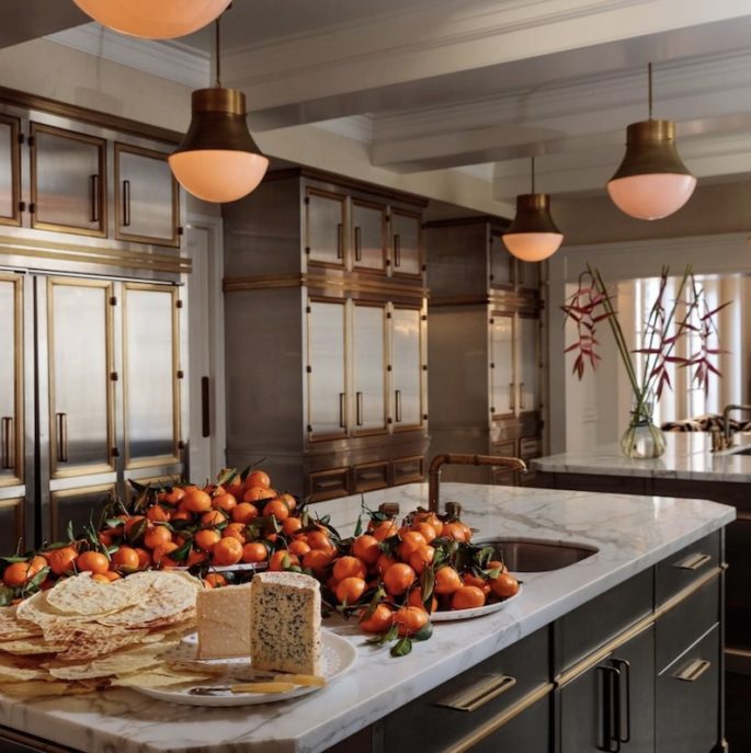
You might layer gold or mother of pearl accents. Image via Kelly Wearstler
Pink
Over the past two decades, pink has given colour to all objects, and continues to invade interiors, spreading its seductive aura. We are now seeing the colour take over walls, floors, paints and paper, to immerse people in a rosy environment that exceeds all expectations. The sense of wellbeing and happiness this hue communicates must be the reason for its success.
Yellow
A zest of lemon or a dash of champagne, few colours are as good at projecting luminosity, sunny warmth and optimism – which is good news as we will see the mellow yellow trend go bananas this year. The nectar hues will continue their comeback, creating places where ochre velvets, and amber silks embrace warm woods and brass, and an array of yellow radiates lively energy. The vast array of hues available mean it is possible to create a spectrum of different moods with just this colour. Muted, golden shades can feel timelessly elegant, while splashes of acid yellow signal sharp modernity.
Green
Lush green covered walls are big news for 2020, representing verdancy, growth, and redolent of healthy living. Symbolically, this colour is associated with luck, money, regeneration and cleanliness; and most importantly, green evokes pastoral landscapes beyond the urban limits. Pale, easy on the eye shades have been perennials since the Georgians. For something bolder and more modern, try bottle, emerald and jungle greens.
Blue
Optimistic, melancholic, masculine, feminine – this is a colour with many faces. Clear blues feel thoughtful and dreamy, reminding us of summer skies and seas. Blue rooms feel large and airy. And, like green, blue has a hygienic reputation: it was often used in Victorian kitchens and colonial verandas, because it was believed to deter flies.
White
It is a myth, too, that white is somehow easy and works with everything. Like every colour, it deserves consideration. A well-chosen white will make a palette sing. Make sure you choose a white that reads as neither overly cool nor warm. Complex colours, edged diplomatically with pallid woodwork and punctuated with pale doors, are tamed and made liveable.
11 Top Design Talents Share Expert Advice on How to Incorporate Colour:
Late designer, Mario Buatta
“Colour is the spice of life. It’s a mood-changer. You change the colour from room to room to create a new mood. Yellow makes you happy. Pink is pretty if done right. Brown is nice, but not a picker-upper. When I introduce clients to colour it transforms their lives.”
William Georgis
“White is far too overused. I’m a sensualist who doesn’t condone aesthetic deprivation. Using a strong colour in small spaces makes them meaningful and memorable. Kitchens and baths done in traditional white are often antiseptic and clinical.’’
Bunny Williams
“It’s important to choose colours that are easy to live with, which means ignoring trends. What’s timeless is to invent your own colour schemes. But I frequently get the best ideas from looking at antique rugs, which incorporate colours in such unique ways.”
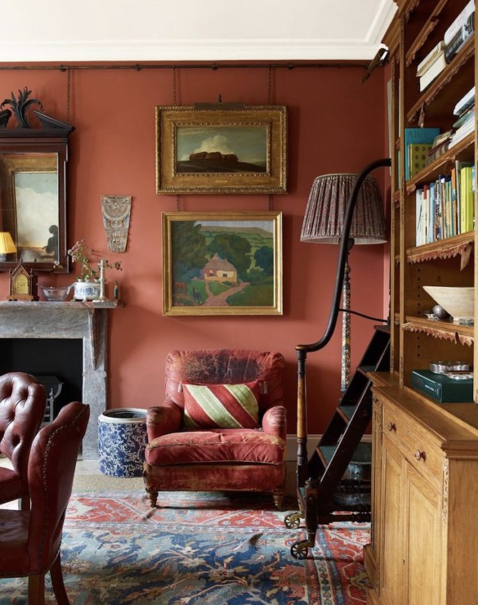
You can make rich connections using more mid-tone colours. Think about a place where you really feel wonderful or at ease, so you can begin to dissect the colours closely. Image via House and Garden UK.
Miles Redd
“Blue and yellow is a common colour combination, but it’s generally pale blue and butter-yellow. I love disparate rich colours paired next to each other—like taxicab yellow and indigo. The tension that they make on the colour wheel is dazzling. Each colour makes the other more vibrant than when they stand alone.”
Kelly Wearstler
“Pink-and-black is confident and chic. I always love to play up the sexy tension between masculine and feminine elements in design. This combination has an edgy sophistication that is classic yet distinctive.”
Brian J. McCarthy
“Dining rooms need to work well in the evening, create a golden glow, and work well with a variety of tabletop settings. Orange lacquer with gold flecking is a colour combination that doesn’t prevent you from using a range of other palettes.”
Steven Gambrel
Kitchens now act as a part of a house’s public space, so colour is an ideal way to meld the room with the more decorated parts of the house. It’s important that the kitchen feel as warm and friendly as a sitting room. I like using coloured tiles with glazed finishes, and a Lacanche oven range in red adds a hit of visual interest.”
William Sofield
“White is far too overused. I’m a sensualist who doesn’t condone aesthetic deprivation. Using strong colour in small spaces makes them meaningful and memorable. Kitchens and baths done in traditional white are often antiseptic and clinical.
Timothy Corrigan
“I find it important to create homes that serve as our places of sanctuary from the outside world, so I often use green in a prominent role. It’s a colour that represents harmony and balance, and you can’t help but feel a little bit calmer after spending time in a room surrounded by green.”
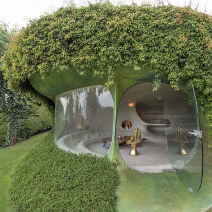
Green is a colour that represents harmony and balance, and you can’t help but feel a little bit calmer after spending time surrounded by green. Image via Kelly Wearstler.
Jeffrey Bilhuber
“Ebony lacquer is a universal foundation. It will be as successful in Marrakesh as Minneapolis. At first glance it almost reads as beige. The black ebonized walls recede and you notice the other colours that comes forward. You’re establishing a saturated, neutral background.”
Muriel Brandolini
“I’ve always been drawn to greens. I believe my colour sense has been greatly influenced by my childhood in Vietnam and memories of the lush landscape. Military green, moss green, apple green. It’s almost impossible to give names to all the endless shades within this mesmerizing colour.”
Colour of the Year
The people at Pantone know that times are hard. “Many of us,” the colour company said in a recent presentation, feel anxious, “completely overloaded and perpetually stressed.”
The antidote, according to Pantone’s swatch psychologists? Blue.
Specifically: Classic Blue.
For the 21st consecutive year, Pantone has named a colour of the year, a trend-forecasting stunt as closely watched by the news media as it is by the industries — marketing, fashion, design — that actually traffic in visual trends.
The blue of 2020 is not Cerulean (the company’s first pick, back in 2000), Aqua Sky (2003), Blue Turquoise (2005), Blue Iris (2008) nor Serenity (which shared the 2016 title with Rose Quartz). It’s Classic Blue, a darker, more familiar shade than its cyanic siblings.
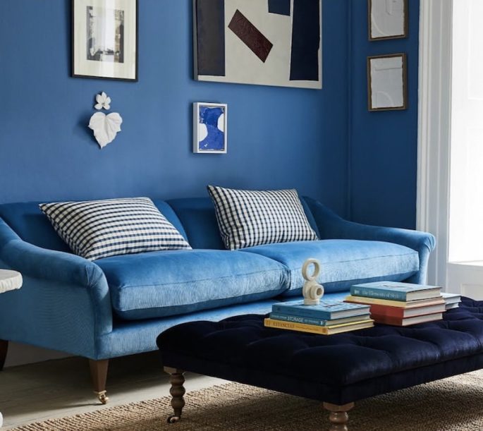
The antidote to feeling perpetually stressed is the colour Classic Blue, according to Pantone. Image via House and Garden UK.
Classic Blue is the colour of blueberries, a Pepsi can and the sky when it’s “that beautiful colour at the end of the day,” said Leatrice Eiseman, the executive director of the Pantone Color Institute, which researches and advises companies on human responses to colour. In choosing Classic Blue, the organisation said it first examined what was going on in the world.
“We’re living in this time now where things seem to be, around the world, a little bit, I don’t want to use the word unstable, but let’s just say a little shaky,” said Laurie Pressman, the vice president of the Pantone Color Institute. “Nothing is absolutely certain from one moment to the next.”
Pantone wouldn’t get too specific about why people feel “shaky.” Political unrest seemed an obvious source of the tremors, but, Ms. Pressman said, “we weren’t looking at this as a political message but has has pinned the world’s anxiety and stress on a more common enemy: technology.
“It has sped things up to the point where we can’t necessarily handle all that’s coming in,” Ms. Eiseman said. Classic Blue “provides a refuge,” according to Pantone, fulfilling a “desire for a dependable, stable foundation.” Classic Blue is “nonaggressive,” “easily relatable” and “honest.” We’re down.

