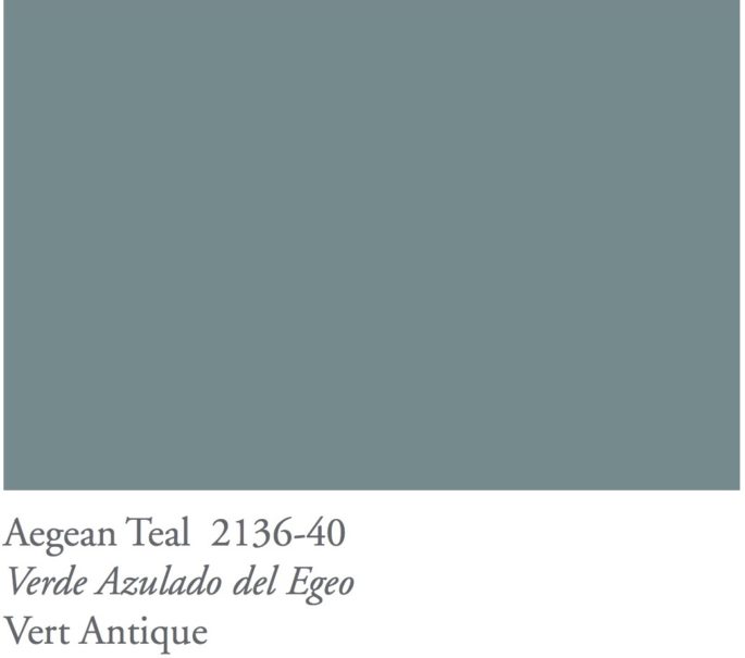
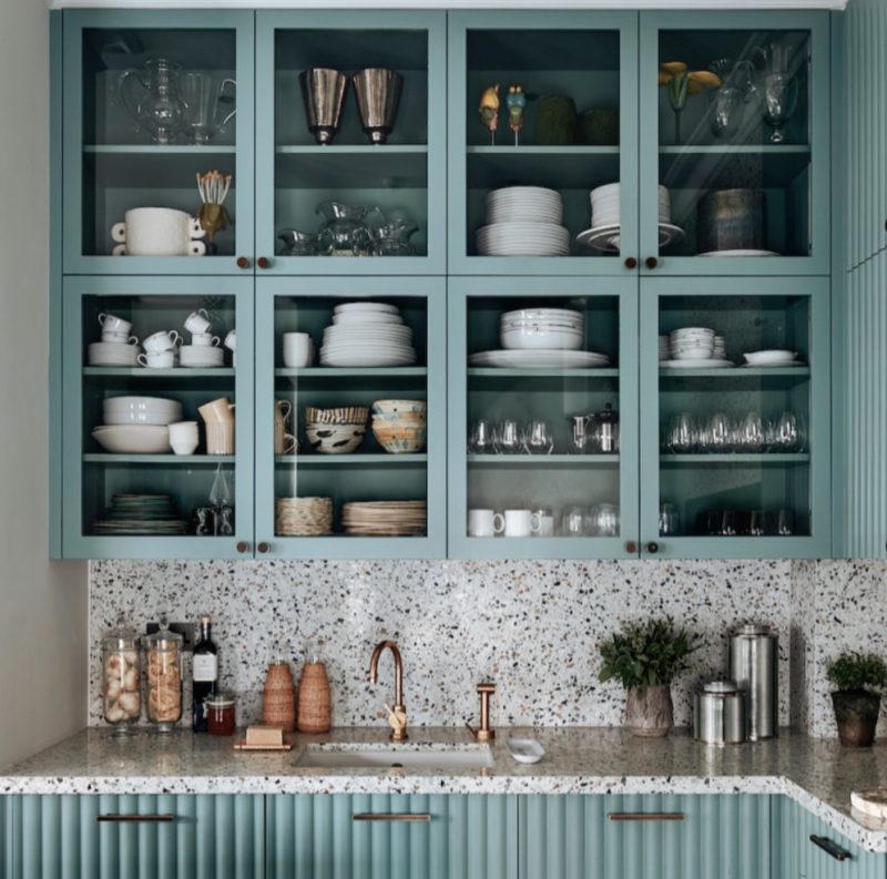
The colour Aegean teal is being unveiled this month by American paint giant, Benjamin Moore as the next colour of the year. The annual colour proclamation is closely followed by the design industry, and the versatile shade speaks to this current moment, as well as the year ahead, in that we are looking at things from a different perspective as we find joy in simple moments throughout the day. Discover the other hues making a splash for 2021, and how to get your colours right, first go. Plus, lift your mood every day because the shades you choose have the power to affect your wellbeing. Read more, ‘The 20 Best Paint Colours According to Dulux.’
As we spend more time at home, it’s important to create a space that feels warm and welcoming. This year’s Colour of the Year is a balanced and soothing hue, softened with a touch of grey to create spaces with casual elegance.
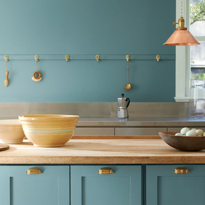
Colour of the year: Agean Teal by Benjamin Moore, www.benjaminmoore.com
The Colour Trend palette of 12 earthy tones and rich neutrals radiate wellbeing and emotion – our homes are a space of flexibility and multifunctionality, and this palette correlates to that. On the warmer side of the colour wheel, the colours have an organic synergy and are reminiscent of faded rumpled linen sheets in the morning and perfectly ripened fruits on the windowsill. Read more, ‘Paint Colours With Cult Followings: 10 Picks.’
These are colours that make your home feel even more like home, so settle in and connect.
If you’re planning on redecorating in 2021, it might be a good time to think about adding shades that radiate wellbeing, promote tranquillity and create a sense of balance in your space.
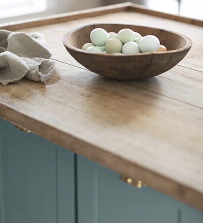
Colour of the year: Agean Teal by Benjamin Moore, www.benjaminmoore.com
These hues relate to the amazing power of colour to create a backdrop that sets a particular mood or is a means of personal expression. The emotive power of colour is long documented. Colour is one of the most vital and highly contested elements of interior design. Can’t settle on a colour scheme for your home or even a room? Here, we outline a step-by-step guide for identifying—and decorating with colour: ‘These Are The Colours Everyone is Talking About’.
Also in the Trends 2021 Palette are rosy rust tones, soft sage shades and accents of natural muslin and charcoal. When choosing the 12 hues selected for next year’s forecast —ranging from the soft creamy tones of Foggy Morning 2106-70 to the rich, purple-brown of Amazon Soil 2115-30 and the warmth of Rosy Peach 2089-20, the idea is to look for colours with a lived-in quality. It’s about the emotional connections between the home and the colours we surround ourselves with to create a particular mood.
The palette has a soothing yet upbeat quality, with a casual elegance that is enveloping and welcoming, making it very appropriate as the home takes centre stage.
A splash of rosy peach to warm your day or a cooling blue to calm your mood – whatever your favourite hue, we have the decorating tips to help you make it work at your pad. Read more on this in, “Decorating with Colour: A 4-Step Guide.”
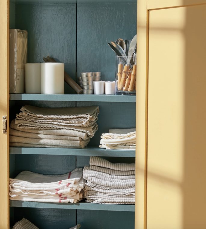
Colour of the year: Agean Teal by Benjamin Moore, www.benjaminmoore.com
When it comes to using colour, the biggest hurdle is thinking you don’t know what you like or where to begin, but everyone has a personal palette that resonates with them. The trick is learning to slow down and notice it. Read more, ‘What the Colour of Your Front Door Says About You.’
Part of Aegean Teal’s appeal is its versatility, which makes a statement without being loud. Aegean Teal is a great front door colour and it is a beautiful choice for millwork and cabinetry. When choosing the 12 hues selected for the 2021 palette—ranging from the soft creamy tones of Foggy Morning 2106-70 to the rich, purple-brown of Amazon Soil 2115-30 and the warmth of Rosy Peach 2089-20, the idea is to look for colours with a lived-in quality. Read more, ’10 Designers Weigh In On The Best White Paint Colours.’
It’s about the emotional connections between the home and the colours we surround ourselves with that creates a particular mood.
The palette has a soothing yet upbeat quality, with a casual elegance that is enveloping and welcoming, making it very appropriate as the home takes centre stage. NB* Lead image is London kitchen, custom-designed by Hubert Zandberg, photography by Ingrid Rasmussen.
