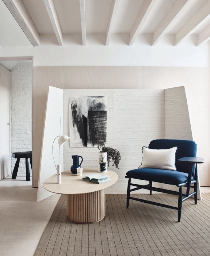
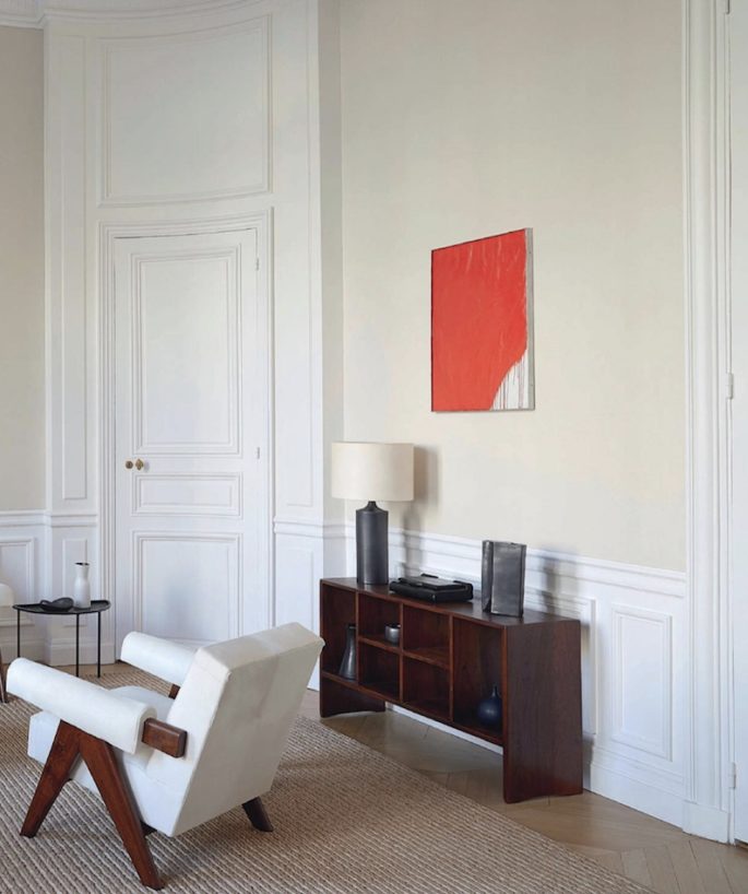
Whatever type of space you’re decorating, there’s nothing more important than creating a home that engages the senses and reflects your personality. Hot on the success of The 50 Best Decorating Tips of All Time we share Part 2 our fave interior tips to help you make sense of what good design really means. If you’re open to mastering a few basic decorating principles and putting your creativity to the test, you’ll enjoy an interior that looks and feels like home, speaks to you, and boosts your confidence and happiness.
FIRST IMPRESSIONS
Always make a great first impression. You’ll never reclaim the lost ground if you don’t. It’s one of the most effective things you can do. Make sure your entry looks welcoming.
The mistake most people make when doing their own designing is…Scale.
People tend to do the safe thing in terms of colour and scale, whether it’s doorways, mouldings or furniture. They’re usually afraid and very timid about scale, but you have to be willing to push the envelope and go a little larger to create an exciting backdrop.
THE PLAN
Define your space and do the finishes; furniture plans, lighting plans; then colour and fabrics.
TAKE EVERYTHING OUT OF A ROOM
Then decide what goes back in, which can give you a fresh start without starting from scratch.
A BIG LOOK ON A SMALL BUDGET
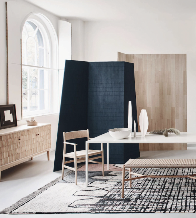
Colour doesn’t cost anything. Choose colours that engage the senses, reflect your personality – to create home that is more than a place – it’s a feeling. Unity of colour is important (the idea is to pick a palette and work within it, using different textures in the same colour family to give the room a complete feeling). Read our story Australia’s Best Paint Colours.
HIGH DRAMA
When you see a room for the first time, your blood pressure should go up. Try to create an emotional experience. A well-designed space doesn’t give out its secrets right away. It should never bore you or feel dated.
TAKE IT SLOWLY
It takes a lifetime of collecting to finish a room. The most successful interiors evolve over time. Collect pieces as you come across them – that way you can buy items that you truly love rather than settling for whatever you see in-store or online the minute, you need them. Read our story on How To Display Your Collections.
INTERIOR DESIGN IS A GAME
Decorating is like a three-dimensional game of chess- You have to think about space both vertically and horizontally. People who build big houses are often sorry later. The living room feels too large, and you have enough space to roller-skate in the kitchen. You have to break down these rooms and create spaces with a human scale. Use furniture to section off a space. In an expansive room, establish multiple seating areas; carve out a seating nook with a high-back sofa and folding screens.
EDIT, EDIT, EDIT
If you look at it and you question it – put it away.
NEUTRAL POWER
The building blocks of most decorating schemes, get them right, and your rooms will look magically larger and brighter – think of them as tonal families. Layer different variations of the same hue together and you’ll create something with more depth and interest. See The 20 Best Paint Colours According to Dulux.
CONSULT A THIRD PARTY
Struggling to balance some of your preferences? The years of hand-me-downs and Ikea furniture? Need a fresh look to go with a new place?
Ask friends with taste and no agenda over to see what you should discard or display.
GET INTO THE MOOD
Find your personal style, by collecting images that speak to how you live, then hone in on images that strike a chord – when you see it all together, you will find common themes.
GET HAPPY
Think of things that make you happy – a travel destination, a colour, a favourite restaurant. That will give you a great starting point as your style evolves.
CHOOSE ONE PIECE OF ARTWORK TO ANCHOR THE ROOM
A great, bold artwork (from an unknown or known artist) can be a great focal point in a room, something that sparks thoughts and conversations. Rooms that are entirely colour coordinated feel wrong. In fact many great paintings have a tiny dot of discordant colour somewhere. Well, so can your room.
DO THE RUB TEST
Never have anything that doesn’t feel good – towels, sheets rugs, glasses and plates all have to pass the rub test. Pick things up and check the weight and the way they feel.
EVOCATIVE SCENTS
Think of things that put you in a good mood – the smell of lavender on a Spring day, the scent of jasmine, or orange blossom that transports you to the South of France.
Your surroundings should make you feel equally good – give your rooms a daily spritz of something sweet smelling.
INVEST IN LIGHTING
Lighting can really make or break an interior. It really steals the show. The right lamp, chandelier, or sconce can really transform a room from no to woah. Lighting is one of the most important elements in any space. It has the ability to make a major statement and be the focal point of the room. Read about The Essential Guide to Lighting.
BLINDNESS
People often fail to see what is good and bad in their homes. Blame sentimentality, or sheer force of habit. Work on developing a good strong eye.
COLLABORATE
Two pairs of eyes are better than one. Ask your most stylish friend to pick out the things that are worth displaying.
COSY THINGS UP
Fabrics dress our rooms, but many people have forgotten the comfort and beauty they bring to our lives. Curtains, blinds, upholstery add to the physical warmth of a room and insulate against cold and noise. It’s also an important source of texture, colour, and pattern. Read more at our Directory of Upholsterers.
EXPAND A ROOM WITH RUGS
The bigger the area rug, the bigger the room will feel.
THE FABRIC RULES
Go for contrasts: mix big and small patterns. Same size patterns together look wrong.
Opposites are also attractive, team stripes and checks, florals and plains. Old with new. Smooth with rough.
KEEP BEDROOM FABRICS SIMPLE
People should be the ones adding the pattern and texture to a bedroom –not the fabrics.
CONTRAST TEXTURES
Put cotton with silk, linen with velvet, and canvas with cashmere. Opposites attract. Mix incongruous elements: a pedestal-based Ikea round table with an antique timber library chair.
WORK ON THAT LIVED-IN LOOK
A house that has been decorated overnight says “We’ve arrived!” The best never look spanking new, but rather comfortable, at ease, gently broken in.
COLLECT
Collect what you love looking at. That’s far better than buying something that you don’t like as an investment.
GROUP ANTIQUES BY COLOUR
There’s a fine line between kitschy and curated. Blend vintage and new pieces by grouping them by colour.
UPHOLSTER ANTIQUE FURNITURE WITH MODERN FABRIC
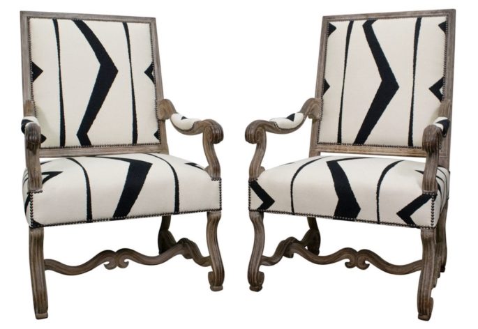
Make what’s old new again by invigorating antique pieces with colourful fabric from the 21st century. Take, for example, the two 18th-century French bergère chairs The Vault Sydney currently stocks upholstered in a youthful Kelly Wearstler fabric. Don’t underestimate the power of it – you can do the same. See our recommendations for The Best Upholsterers.
MAINTAIN YOUR STANDARDS
Prune your wardrobe seasonally, bin chipped china and glassware, toss stained linen, hang those pictures, file and frame photos, reupholster that tattered sofa. Throw out everything that’s broken. More at The Ultimate Decluttering Guide.
TO LIVE WELL
You have to do more than fantasise about cleaning. If you can’t embrace it, outsource it. However, you’ll still need a quick lesson, so you can show the cleaner you have high standards. More at A Harvard Professor Says Buying Time Promotes Happiness.
BE INVOLVED
Call in the professionals. But remember it’s your house, not the designers or the architects. Don’t end up with a house that has no soul. You’ve got to live in your house. Be true to yourself.
LOOK AT THE BIGGER PICTURE
Looking at your home from a holistic perspective—seeing how each room works in balance against the others – can help craft a welcome variety in your spaces.
DON’T TILE EVERYTHING IN SIGHT
The world’s hardiest surface can be overdone, so keep tiles to areas where their practicality is a clear winner. They are unforgiving to dropped glasses and bare feet, and in a large area, cold, bleak and hard to cosy up.
GO BOLD IN SMALL SPACES
Don’t let small rooms restrict your imagination: Graphic wallpaper prints can have a major impact in small spaces such as a powder room.
A TOUCH OF KITSCH OFTEN HELPS
Because it makes a room individual.
SAME, SAME, SAME
A big mistake people make when decorating is that they feel everything needs to match or be in the same aesthetic. Try going in the opposite direction: use furniture pieces from different design periods, eras, styles – layer in fabrics and textiles that are varied in pattern.
The ultimate goal in designing is to have a space that feels curated and personal.
USE YOUR WALLS AS A CANVAS
Rather than art, a high-impact wallpaper can give a subdued room some wow-factor. You can depict everything from an Italian bucolic landscape with architectural features to concrete, wood panels, pretty much anything with new-generation of quality faux wallcoverings that are almost impossible to tell from the real thing. More on Wallpaper: The Ultimate Guide to Transforming Your Walls.
SCARED OF DARK COLOUR, DON’T BE
If you tend to be more reserved when it comes to colour choices, step outside of your comfort zone by choosing a bold hue, like espresso, for a hallway. It’s unexpected and can be a chic backdrop for showcasing an art collection.
GO DARK IN DIM PLACES
Paint a room that doesn’t get a lot of natural light a saturated color. Adding some pigment makes the space feel intentionally moody and romantic.
ANCHOR YOUR ROOM WITH A CLASSIC
Bringing a touch of the old world into the mix creates a home that will never feel dated. For example, old fireplaces, doors, flooring or even a knockout antique chandelier in an otherwise modern dining room.
INVITE NATURE INDOORS
The best way to balance out sleek lines and contemporary furniture is by adding a natural from driftwood to greenery. Read more on The Best Plant to Buy For Every Room In Your House.
INSTALLING SHIPLAP? GO HORIZONTAL (USUALLY)
Try installing the boards horizontally rather than vertically. They feel more contemporary and can really expand a space, making it feel larger than vertical boards. Vertical boards, however, can be ideal for rooms with high ceilings.
DON’T SACRIFICE COMFORT
You might want the most modern, chic sofa in the showroom. But your back may not. It’s better to test out seating and take the time to look at the dimensions.
ALWAYS SHOP FOR A RUG IN PERSON
This is not the time for e-shopping, people. The texture of the rug may be totally different than what you were expecting.
ADD FAUX FUR
Faux fur has quickly become a luxurious way to add depth and texture to a space. If everything is neat, tidy and clean, the luscious texture of faux fur will instantly transform the feeling.
DEVELOP YOUR EYE
If you’re not sure of your taste, start learning. If you can’t afford to buy at the best places in town, wind shop there to see what it’s all about. Bone up on great proportions, fabrics, finishes, and stitching. Trust your eye, not the price or price tag.
ADD SOMETHING UNEXPECTED
There’s so much beauty in imperfections and an offbeat accent can become the one defining element that makes a space really come alive. ”
SPRINKLE SENTIMENTAL OBJECTS
If there’s one essential design element every room should have, it’s nostalgia.
Sentimental objects are key to making your space feel personal and warm. It’s a simple touch that makes the home feel lived-in and brings a space to life.
YOUR CHAIRS DON’T HAVE TO MATCH
Select a large-scale lead chair at your dining chair to up the drama. Then pick a style that’s complementary to the side chairs to really wow guests.
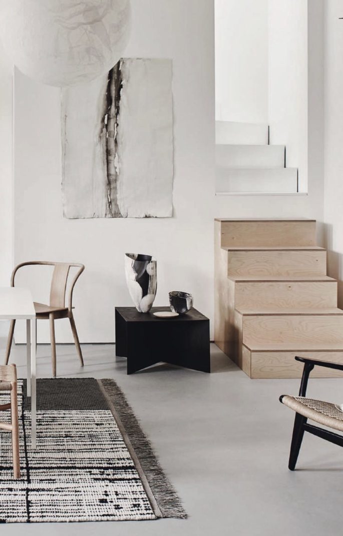
CENTRE YOUR FURNITURE ON A RUG
If you’re setting furniture–like a dining table –in the middle of the room, your rug should be big enough so that all the furniture, including chairs, fits comfortably on top, In large living rooms, however, it’s alright to have just the front legs on the rug.
DON’T FOLLOW TRENDS
If your neighbours are doing it, you probably shouldn’t. You can use plenty of traditional pieces as the core, but always intentionally do something that throws it off just a bit!” Read more on What Interior Designers Hate to See on Instagram.
DIM THE LIGHTS
One lighting rule we never break? Keep the lighting low. Read more on Lighting A Room, Simplified.
KEEP CURTAINS SIMPLE
Hang full-length curtains on either side of a window to create the illusion of a wider wall.
MASTER THE ART OF THE MIX
An antique, a piece of modern art, and an unexpected touch of whimsy will pull any room together.
FIND BALANCE
Don’t mistake eclectic style for anything goes. Put a cap on the number of contrasting styles in each room to avoid a cluttered feeling.
REMEMBER THAT NEWER ISN’T ALWAYS BETTER
Seek out vintage pieces –which offer more interesting texture and a wider range of nuanced colours–over new ones.
LANDSCAPE
Get totally involved in the landscaping of your house. There’s no such thing as bad siting. Use design to manipulate perceptions. A group of trees can act like curtains, framing a beautiful view, a glimpse of the ocean, or a patch of green in the middle of the city.
PLAY WITH TEXTURE
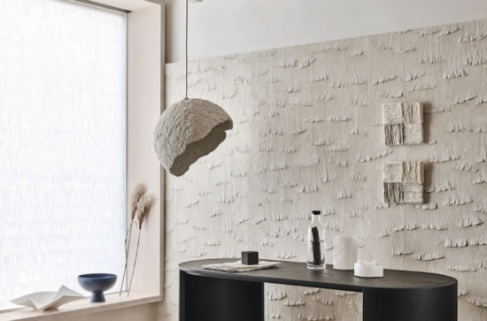
It’s easy to gravitate toward the usual suspects like wood and leather when trying to craft a textural living space but branch outside of your comfort zone and try patterns you’re attracted to: rough plaster walls, concrete, metal, cork, paper.
MIX ANTIQUES WITH MODERN
Humble with rare. Decorate with chewed-up Oriental rugs – don’t be afraid that people will think they are rags. Just because something is old doesn’t mean it needs to be discarded.

