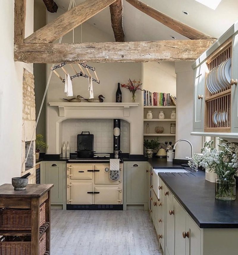
With restaurants only now slowly reopening, the pandemic has presented an opportunity to get reacquainted with our kitchens.
The pesky drawer that doesn’t fully close, the rumble of the fridge on a hot day. And more acutely, the same white cabinets, the same white walls, and the same white benchtops. Read more, ‘How To Renovate Your Kitchen and Not End Up In Tears.’
The whitewashed look that once seemed so fresh now feels bland—not to mention less crisp thanks to constant use. It’s no wonder homeowners are clamouring to update the hardest working room in the house. Here’s how to steer clear of cabinet chaos and kitchen-island excesses. Plus, the silliest flubs ever. Read more, ‘Kitchen Design Ideas: Inspiration For The Heart of the House.’
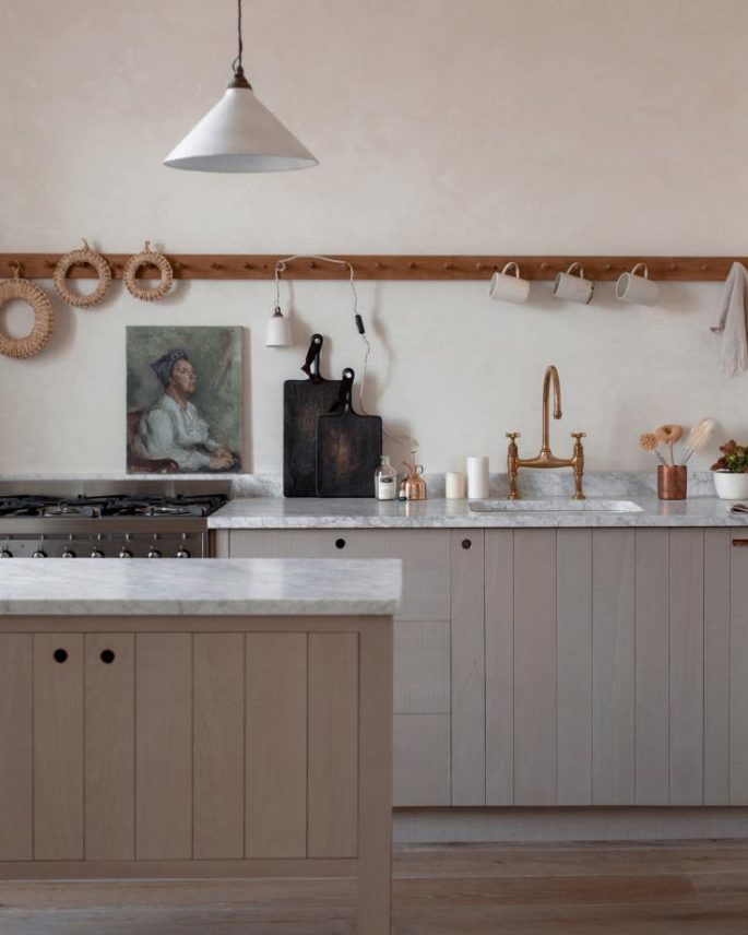
The Sebastian Cox Kitchen by deVOL Kitchens, devolkitchens.co.uk
Scattered Appliances
Benchtop gear—coffee maker, toaster, blender, juicer —might be essential to getting your three squares, but they don’t look so hot spread out over every usable surface. Read more, ’10 Tricks To Declutter Your Kitchen.’
Instead: Gather your gadget diaspora behind an accordion-doored ‘appliance garage’ (think: a built-in bread box for your blender, etc). This allows easy access to contraptions while hiding them. To ensure your juicer stays juiced, plan around an electrical outlet. Pullout drawers in lower cabinets, too, can be hidy-holes for lesser-used appliances.
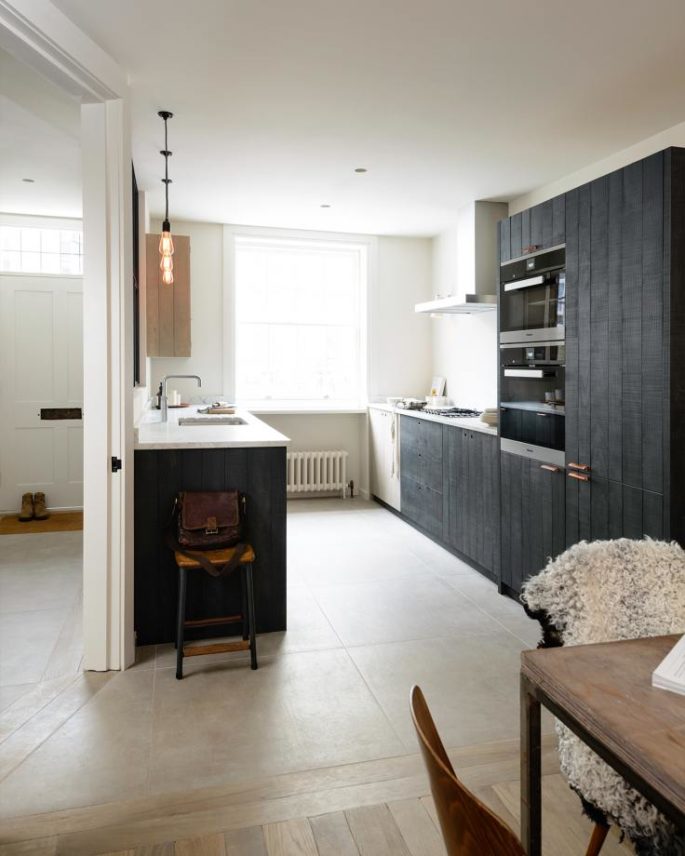
Marylebone Kitchen by deVOL Kitchens, devolkitchens.co.uk
Unintelligent Benchtops
Along with other silly 1970s ideas like water beds, renounce tiled work surfaces. Their uneven surfaces and unsanitary grout lines don’t work. Even perfectly flat tiles installed tightly can pose a challenge. Any individual tile is more susceptible to chips and cracks than unified slabs of natural stone. That said, porous natural stone can add anxiety to food prep, too. One big stone no-no: mixing natural marble with engineered-quartz marble. Read more, ‘Inside Some of the Worlds’ Best Kitchens And Everything To Steal Their Style.’
Two different but veined materials in the room force the eye to choose a favourite and Mother Nature wins every time.
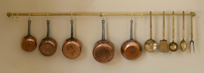
Rails, Hooks & Brackets from deVOL Kitchens, devolkitchens.co.uk
Instead: When homeowners want a worry-free marbled look, most architects and designers recommends porcelain faux-marble slabs, which have come a long way in recent years. A favourite is Corian benchtops as an alternative to natural stone, especially paired with integrated sinks to create a very sleek and seamless look.
Equally good are solid quartz for prep surfaces with natural stone applied only to walls, where it can be seen but not damaged.
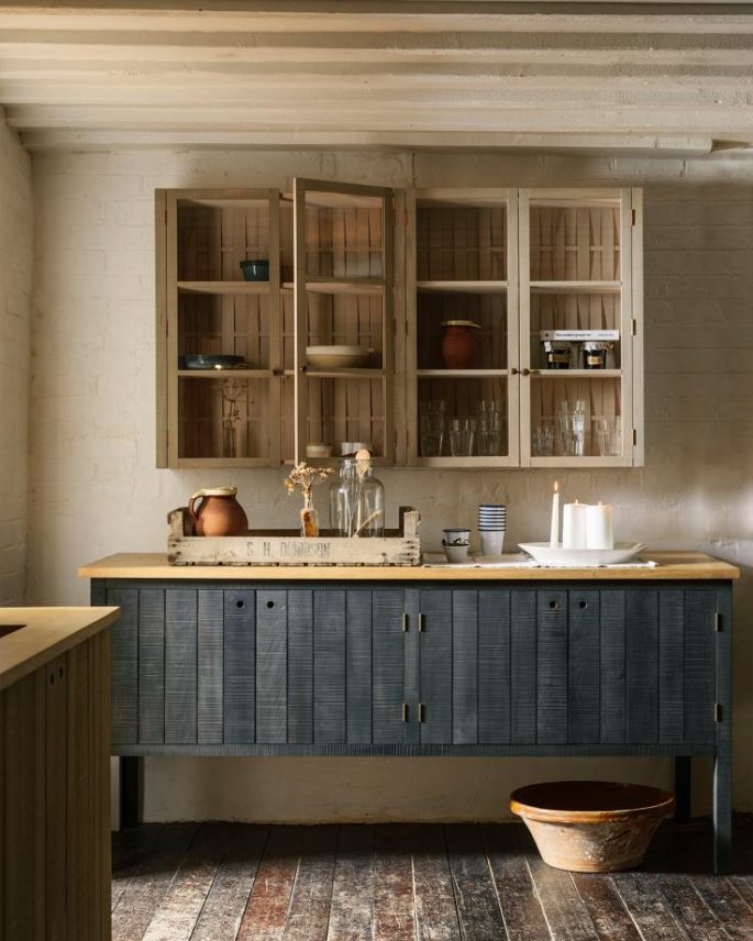
Cotes Deb Cox Kitchen by deVOL Kitchens, devolkitchens.co.uk
Truncated Backsplashes
A stovetop backsplash that ends mid-wall at the bottom of the vent hood or in line with the bottom of the upper cabinets can look like you ran out of money for the project and couldn’t finish the job properly. Another common head-scratcher: benchtop material that extends 7 centimetres up the wall. It reminds us of a doctor’s office and presumes that food doesn’t splatter any higher.
Instead: Try extending the backsplash behind the stove to the ceiling. It’s a perfect opportunity for a wow moment. To avoid the “doctor’s office” look, continuing the benchtop material all the way up the wall.
For a less costly backsplash in general, fix a piece of glass over the painted wall.
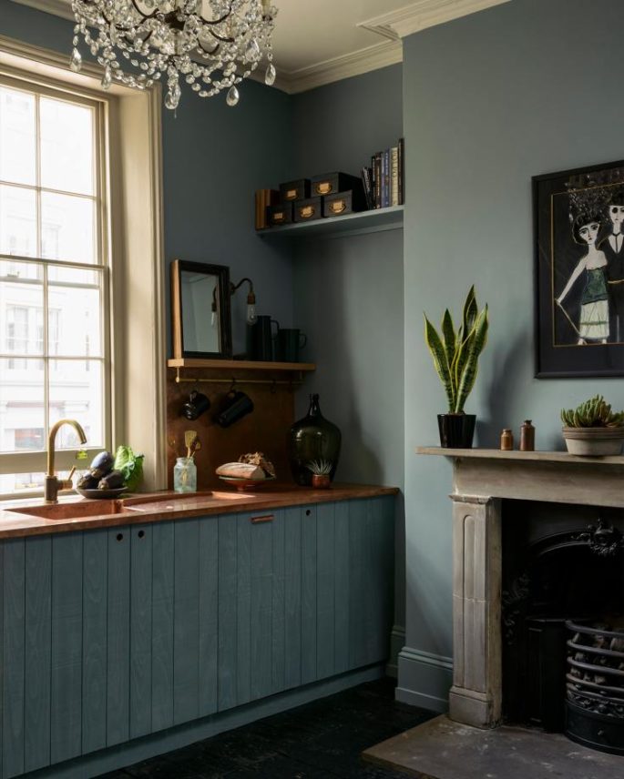
St John Seb Cox Kitchen by deVOL Kitchens, devolkitchens.co.uk
Island Takeovers
We’ve seen kitchen islands so enormous the homeowner had to climb on top of it to clean the centre. Another sign your island is too massive? You can’t circulate around it freely anytime an appliance is open. And don’t even think about putting a cooktop in the island. A vent hood hanging mid-ceiling looks like an industrial exhaust that’s escaped the factory. Read more, ‘Why Kitchen Islands Are Ruining Today’s Kitchens.’
Instead: In lieu of an island, expand work surfaces or seating by extending the benchtop to form an L shape. If storage is the goal, a caddie at the end of a counter can hold silverware and dishes.
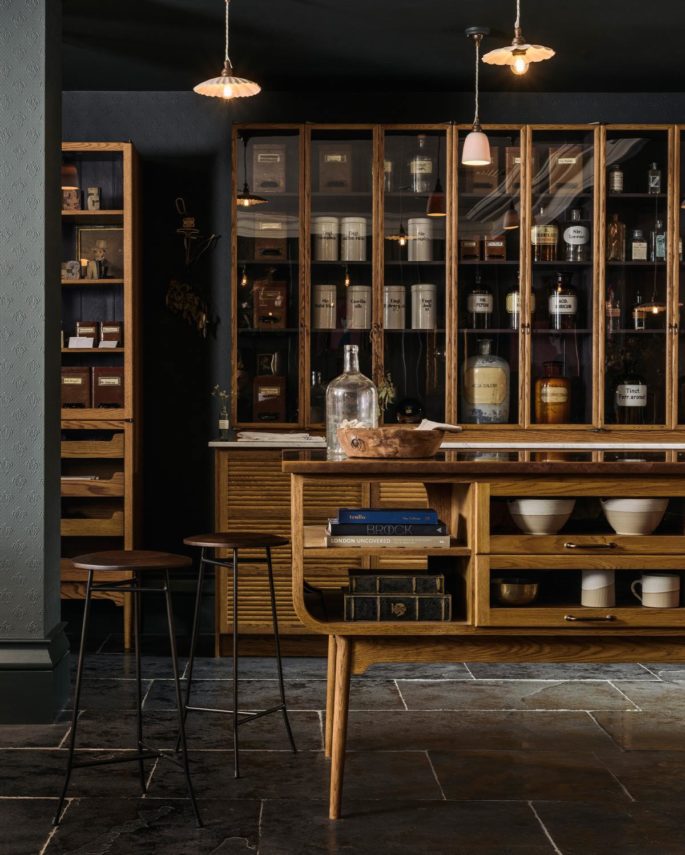
The Haberdasher’s Kitchen by deVOL Kitchens, devolkitchens.co.uk
Unconnected Cabinets
The no man’s land above upper cabinets that don’t reach the ceiling is a source of frustration for many designers. The break creates an unwelcome horizontal line and the gap collects dust and grease. Why not just go that extra way? The trend of mismatched upper and lower cabinets strikes us as similarly disjointed- they should visually act as a single unit in a single colour to give the feeling of harmony and space. Read more, ‘What’s Hot and What’s Not in Kitchen Design.’
Instead: If new cabinets aren’t in the budget, try filling the breach with a flat panel and crown moulding to create the illusion of ceiling-high cabinets. For people who like the look of two tones in the kitchen, you can paint the island in an accent colour and keep all woodwork attached to the walls the same hue.
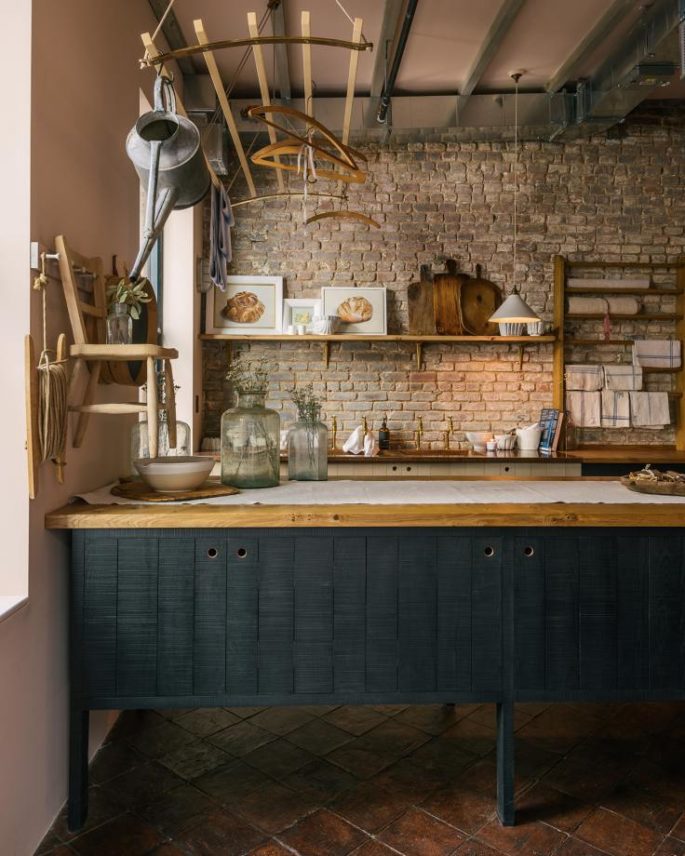
Bond Street Kitchen by deVOL Kitchens, devolkitchens.co.uk
Why white?
The all-white kitchen came into vogue after the 80s and 90s, which featured stained wood cabinets and dark granite benchtops. It was a palate cleanser. Whitewashed interiors also offered sensory relief from the often chaotic world outside the home. But when you have to be there 24 hours a day for six months, you realise that you’re missing the things that really excited you and invoked feelings.
People are going to the opposite end of the spectrum with black cabinets, balanced with butcher block benchtops or a subway tile backsplash.
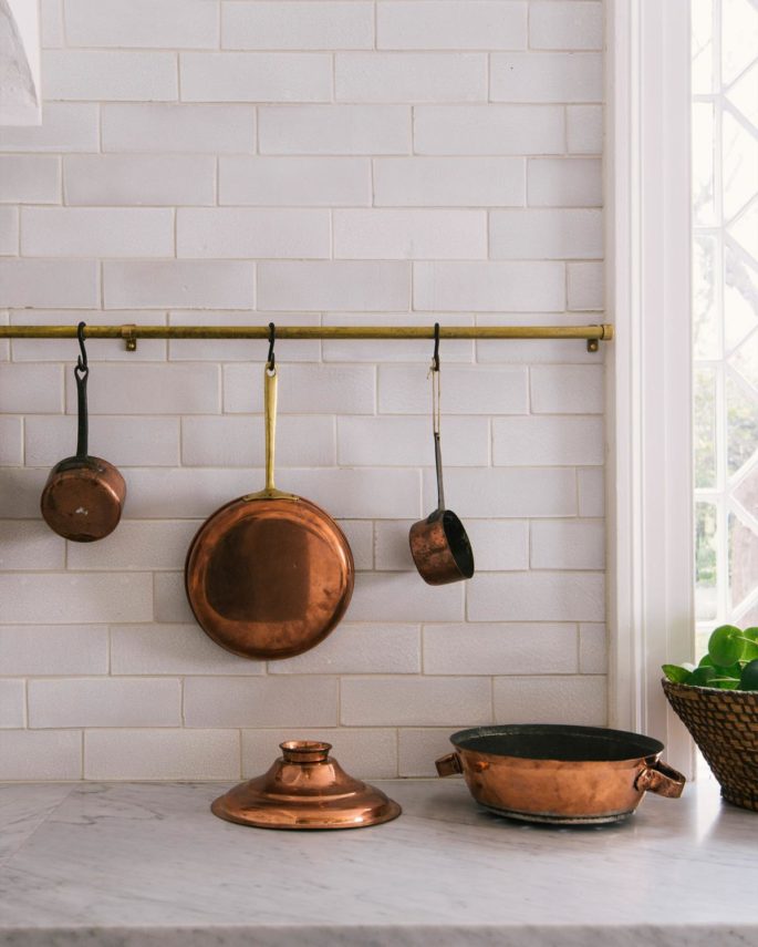
Rails, Hooks & Brackets from deVOL Kitchens, devolkitchens.co.uk
Spicing things up
Colour choices are skewing to blues and warm greys, with many homeowners opting for a two-toned look or a colourful island. Read more, ‘What’s Popular in Kitchen Design Right Now.’
Some homeowners are focusing on fixtures, furniture, and decor as a way to incorporate colour without making a full commitment.
“Accessories bring in a lot,” said Mrs. Finley. “You can throw a red Le Creuset pot into an all-white kitchen and it turns into a completely different space. That’s an easy way to do it if you’re not renovating.”
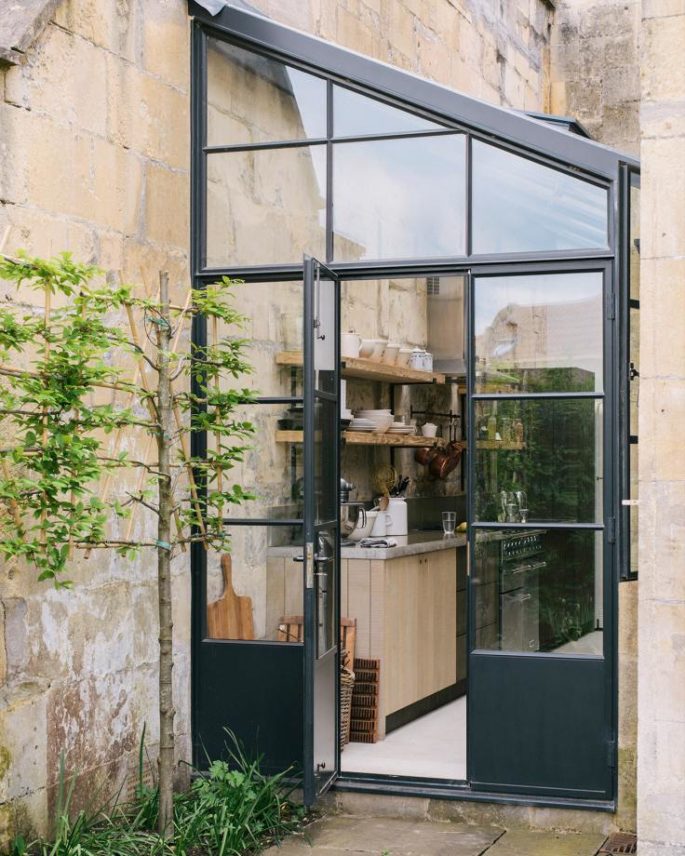
Bath Larkhall Kitchen by deVOL Kitchens, devolkitchens.co.uk
The new neutral
Blues and greys are being read as neutral, but a lot more designed and interesting than white. It looks richer. Black and deep navy have also been popular choices with darker hues in the kitchen disguising stains and everyday wear and tear.
People get messy in the kitchen – black and navy are more elevated and sophisticated than white, but still, work as a neutral.
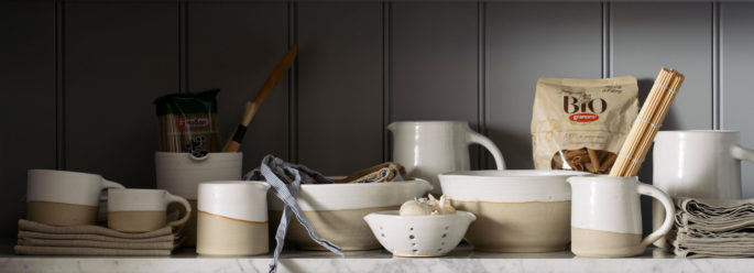
Crockery, Pots & Bowls from deVOL Kitchens, devolkitchens.co.uk
KITCHEN NIGHTMARES:
Pros recall the most egregious design decisions they’ve witnessed in the Wall Street Journal this month:
I have seen a few kitchen island ideas that are striking but come at a price of very little functionality. For example, islands where the entire [structure] is a fish tank and others that look like a sculpture and provide no storage and little or no seating.” —Mary Maydan, architect, Palo Alto, Calif.
A model car collection on top of the wine display.” —Scott Dresner, designer, Chicago
We rented a house when I was growing up that had a faux shingle-roof detail in the space between the top of the cabinets and the ceiling, and the same kitchen was carpeted.” —Amy Sklar, designer, Los Angeles
We came across a kitchen with plate-glass mirror for a backsplash, even behind the range. Can you imagine trying to keep that clean?” —Erin Gates, designer, Newton Centre, Mass.
A collection of empty bottles of fancy booze displayed around the kitchen.” —Jenna Kincaid, art director, Lulu and Georgia

