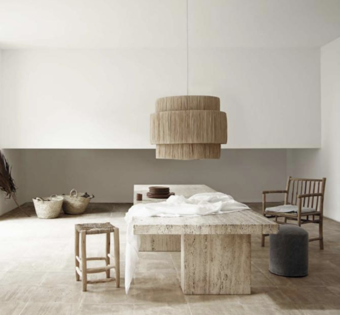
This year, the prevailing design directions are much easier to spot than at other times bringing the concepts of order, calm and tradition back into our homes. Take a look at what’s on our radar as we identify the next big decorating ideas and moods at large from the ones that have bottomed out. The things that are back in the limelight offer an antidote to the chaos in this uncertain period of history, that are cooler, sharper, and more organic than the hectic looks of recent years.
It’s all about soft shine, contemporary timber, big, cheap art, and buffalo checks.
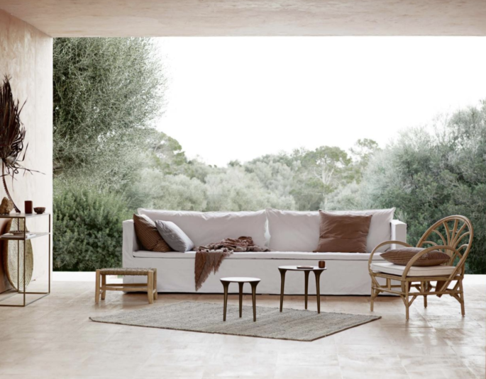
People are looking for more inviting, natural materials such as refreshing rattan in 2019.. Image via Tine K Home 2019 Slow Catalogue, www.tinekhome.com
CHROME IS BACK IN THE LIMELIGHT THIS YEAR
In recent years, many metallic finishes have captured the zeitgeist. Copper has coated everything, from lighting to accessories and furniture, and we’ve moved through golds, both brushed and high-shine. Now it’s the turn of chrome to shine. It has a kind of magic liquidity – offers a pure kind of design language; and is cooler and sharper than the brass and gold of recent seasons. Think of Gubi’s stunning Mulit-Lite by Louis Wesidorf, or Le Corbusier’s iconic LC series for Cassina.
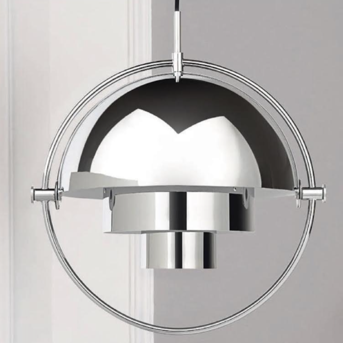
Chrome offers a pure kind of design language; it’s cooler and sharper than the brass and gold of recent seasons. Image of Gubi’s stunning Mulit-Lite by Louis Wesidorf. Image via UK Elle Decoration.
SOFT SHINE
Naked light is out. If you’ve ever felt aged by harsh illumination, you’ll be happy to hear harsh illumination isn’t aging well itself. We’re moving away from the glass-globe fixtures and game-show lighting we’ve been bombarded with over the past few years. That trend has officially peaked.
Subtle, indirect fixtures, like table lamps, sconces and under-cabinet lighting, are the new ultimate luxury for creating ambience without taking over – as we see a shift to softer, diffused light in 2019 interiors.
Look out, too, for installed perforated ceiling panels that create a naturalistic dappled light. Plus, an increased use of uplights to add pockets of light and highlight architectural interest.
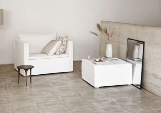
Tine K Home 2019 Slow Catalogue, www.tinekhome.com
VERTICAL TEXTURE
Lacquer lust is looking passé. It seems everyone has done a lacquered study or dressing room. We’re restricting high-gloss paint finish to statement walls and built-ins, juxtaposed unexpectedly with textured walls. Designers are turning to more tactile walls clad in suede, linen and silk for a rich layered look with character. Gallery walls will be vanishing as we crave liveable luxury and layer up with plaster on canvas, or woven glass cloth, for instant depth and dimension.
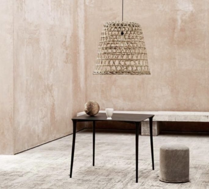
The trend for variegated, muted glaze tiles, refreshing quirky rattan and vertical texture (tactile walls) is on the rise in 2019. Image via Tine K Home 2019 Slow Catalogue, www.tinekhome.com
VARIEGATED GLAZES
Hectic ceramics are officially over as the trend for variegated, muted glaze tiles rises. Patterned tiles tend to dominate a space and date – they simply don’t stand the test of time in a kitchen the way a classic stone or ceramic subway tile does. Plus flooring is one of the most expensive surfaces to replace – so we need to get it right. It’s all about solid-coloured tiles in neutrals, greens, and ochres, with variation in glazes, that are beautiful, natural, and have enduring appeal that will work with successive colour schemes. Inlaid Moroccan versions have fallen from favour. Designers are favouring tiles with a sophisticated antique patina that give a room soul and purity.
BIG CHEAP ART
Fine art might be fetching record prices, but impressively scaled photos, prints and original pieces are more accessible than ever. You can snaffle a Jen Garrido giclée print, from One Kings Lane, for around $400, for a whopping piece. Or seek out sizeable works that resemble a Rothko at Bluethumb, Minted, Society6 and Eventide Collective.
Equally, try West Elm, Saatchi Art, or student art on Etsy which you can team with custom frames to elevate the art.
REFRESHING RATTAN
People are looking for more inviting natural materials now. Wire modernist chairs are on the wane, as they are “very specific to one particular style and feel too trendy—they box themselves in,” says Jessica McCarthy, creative director of Decorist. We’re also saying goodbye to the mass-produced wire-framed chair that surged in popularity because of its modern, clean aesthetic. Past their prime, too, are any vintage classics, like Saarinen and Eames pieces, says the Wall Street Journal, in an article last week, unless you have originals. “Skip the reproductions.” We’re using rattan unexpectedly in our interiors from accents to light fixtures to seating like a Butterfly Rattan Armchair from 1stdibs. “It’s a more organic option, providing the same geometric features that wire-frame chairs do but without the cold stiffness.”
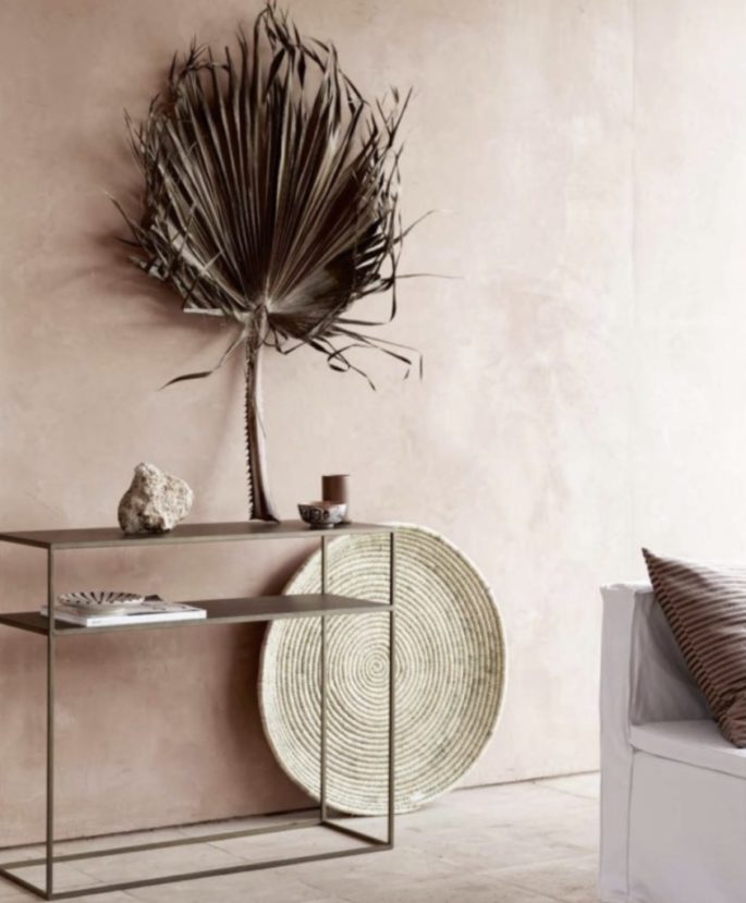
We’re using rattan unexpectedly in our interiors. Tine K Home 2019 Slow Catalogue, www.tinekhome.com
BRITISH KITCHEN MAKERS INVASION
Bespoke British kitchen cupboard makers Plain English and the slightly less pricey company deVol (the company’s Bloomsburg Dark Shaker Cabinets, pictured) are spreading their influential aesthetic for kitchens in dark hues of blue, green and grey.
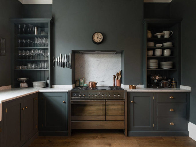
Bespoke British cupboard makers deVol is spreading its influential aesthetic for darker cabinets like Bloomsburg, everywhere. Image via www.remodelista.com
FRINGE-SKIRTED ARMCHAIRS
Spotted everywhere lately: fringe-trimmed armchairs with wool bullion fringe skirting like the ones from LA designers Nickey Kehoe.
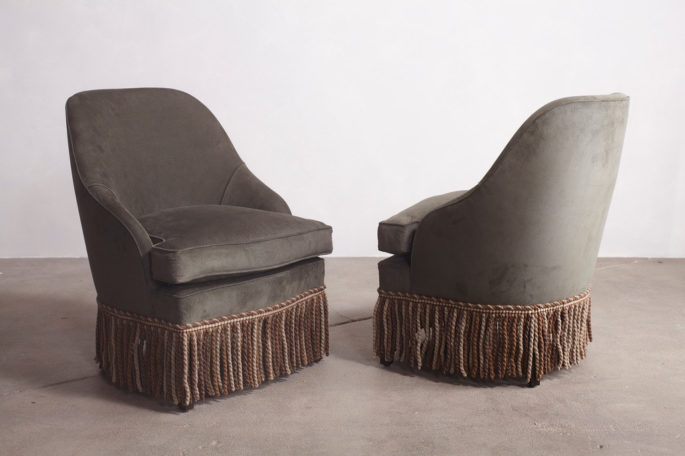
Cover Fireplace Pull-Up Chair with wool bullion fringe skirting from LA designers Nickey Kehoe, $2600 USD, via www.nickeykehoe.com
THE NEW GALLERY WALL: DECORATIVE PLATES AS DÉCOR
We’ve been admiring “plate walls” adorned with matching plates from a series (shown above, a collection of vintage plates from Michoacán are mounted above a collection at Milan’s Bugande cafe where even the ceilings are adorned with plates.)
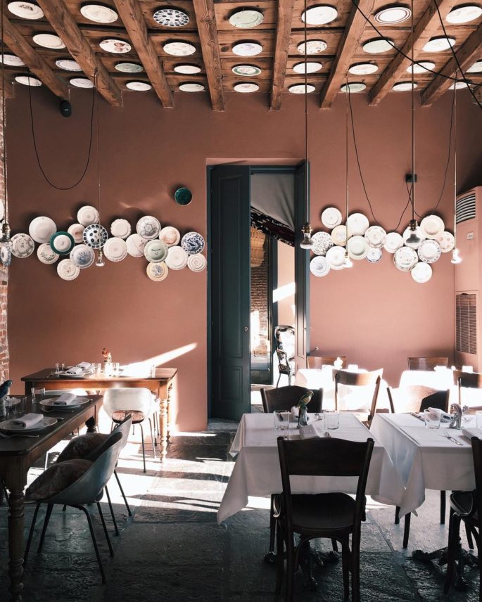
In the main dining room of Bugande cafe, even the ceiling is used as a display canvas for a collection of ceramic plates. Image via www.remodelista.com
IKEA KITCHEN UPGRADES
In the past year or so, US blog Remodelista has brought an array of super-on-trend experimental new companies to our attention, that offer custom cabinet fronts to pair with Ikea’s kitchen systems. Ikea cabinets are like building blocks. Seek out Finnish company A.S. Helsingö as well as names that have sprung up like Superfront, Semihandmade, Koak Design, and Reform among many others.
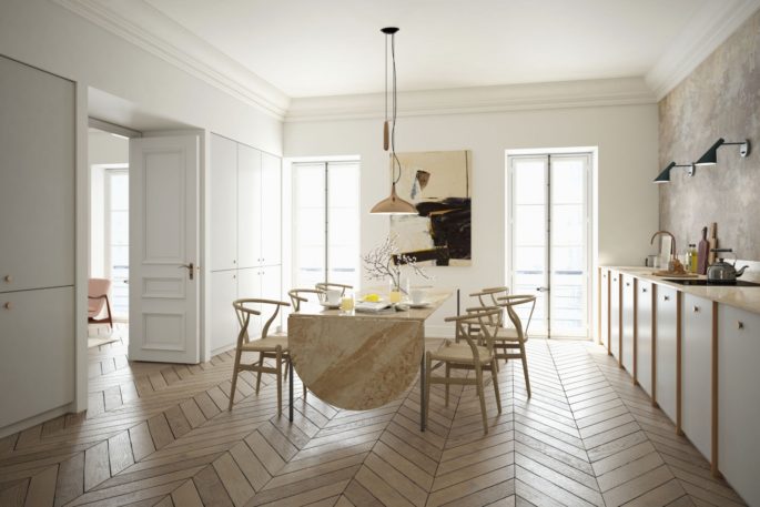
In the past year or so, an array of companies offering custom cabinet fronts to pair with Ikea’s kitchen systems has sprung up, like Finnish company A.S. Helsingö, the company’s kitchen is shown above. Image via www.remodelista.com
SKIRTED SINKS
We’ve long been fans of sink skirts where textiles are used in lieu of cabinet doors; and we’re noticing top designers and architects from from Belgian to New York are picking up on the trend, using everything from Guatamalan textiles to heavy linens to create cabinet curtains and the result is….so fresh.
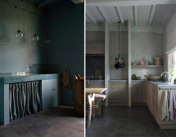
Karin Draaijer in Belgium is one of our favorite under-the-radar interior designers, who favours skirt sinks. Using cabinet curtains in the same palette as the kitchen. Image via www.remodelista.com
QUIRKY RATTAN LAMPS
We recently discovered Atelier Vime in Provence, via Remodelista, a collection of contemporary and vintage designs made of rattan and other natural materials, such as their quirky lamps, pictured. So we took note when we started spotting similar lamps and rattan furniture in stylish interiors, everywhere.
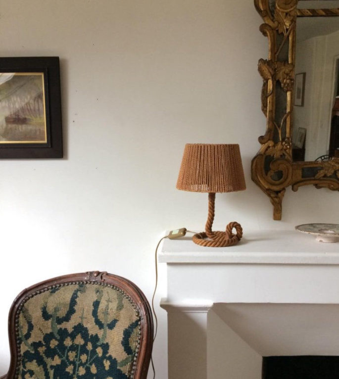
Audoux-Minet Rope Table Lamp from Atelier Vime, their lamp is shown above. So we took note when we started spotting similar lamps in stylish interiors, www.ateliervime.com/en
OVERSIZED PENDANT LAMPS
Spotted lately: statement-making oversized pendant lights as the central point of some of our fave kitchen and dining projects around the globe, including fave Elizabeth Roberts Architecture and Design, pictured. Photograph by Dustin Aksland.
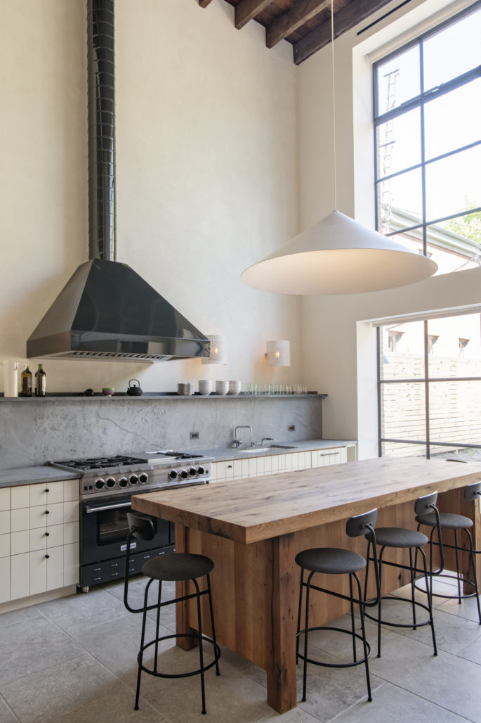
Spotted lately: statement-making oversized pendant lights in some of our favorite kitchen/dining projects; such as this Brooklyn townhouse remodel by Elizabeth Roberts Architecture and Design. Photograph by Dustin Aksland, image via www.remodelista.com
THE RETURN OF THE MONOGRAM
We’ve been admiring antique-style monograms for a while, including custom-embroidered examples such as London-based linen company, Once Milano.
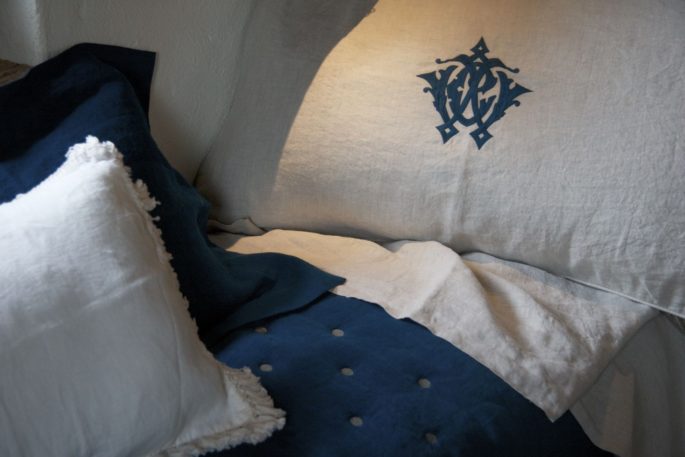
Old World monograms are making a comeback, including custom-embroidered versions like those from London-based linen company Once Milano, via www.oncemilano.com
BUFFALO CHECKS
Suddenly fresh-looking; decorate-y buffalo check, which appears throughout the new and inventively designed Hotel Peter & Paul in New Orleans. Also see Serena & Lily’s Gingham Collection and Crate & Barrel’s Buffalo Check Collection. Of course, Colefax & Fowler’s jumbo Eton Check is a perennial fave.
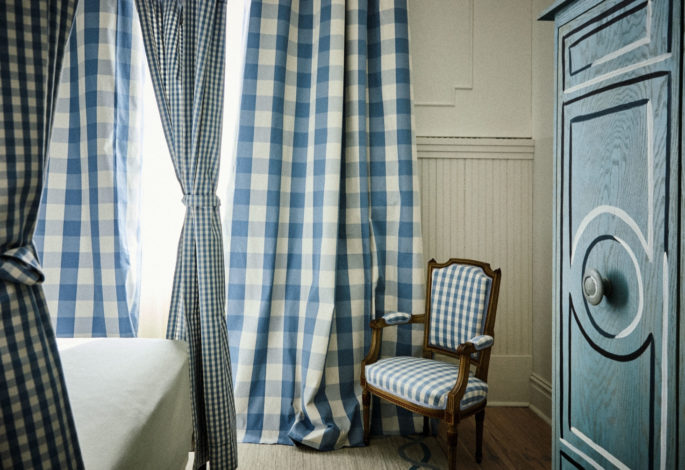
Suddenly fresh-looking; decorate-y buffalo check, which appear throughout the new and inventively designed Hotel Peter & Paul in New Orleans. Image via www.remodelista.com
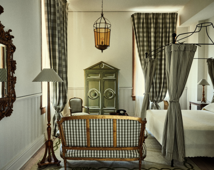
Hotel Peter & Paul: A Former New Orleans school has been restored as a hotel, with cheery checks in all sizes. Image via www.remodelista.com
ZERO-WASTE KITCHEN PANTRY
Bring back the old world pantry: store food in glass or metal containers without using a single shred of plastic. Choose your jars and decant your dried goods; buy in bulk at your grocery store. To minimize cost – wash and reuse old jam jars, etc. Use ones that suit your needs – the biggest sizes for frequently used ingredients like flour, grains, sugar and salt. If you use a lot of spices and herbs, the smallest sizes work best. Mark the contents and date of storage. Commit to an organization strategy with cereals on one shelf, grains and beans on another.
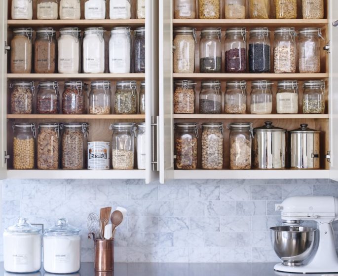
Image via www.remodelista.com
PAINTED SHIPLAP
White shiplap has certainly been having a moment in recent years. And while its popularity isn’t necessarily waning, its look is changing. We’re breaking with tradition, using it as a timeless material that is equally at home in modern architecture and contemporary settings. Painted shiplap, usually in greys or dark blues, is showing up a lot more, too. It’s a great look for bathrooms because it adds texture, dimension, character, and the feeling of craftsmanship in a room that can often feel sterile. Think of it as contemporary timber.
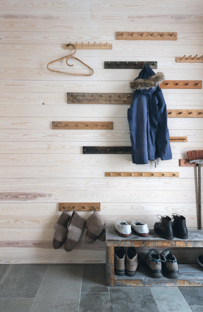
Image via Elle Decoration
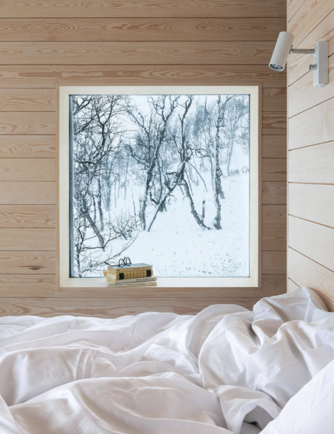
Painted Shiplap’s look is changing for 2019 – think of it as contemporary timber. Image via Elle Decoration
BOUCLE ACCENTS
Led in part by Goop’s collection for CB2, the return of bouclé fabric is officially here says My Domaine in it’s 2019 Home Design Trends report – and we agree. A more sensible follow-up to the recent faux-fur wave, bouclé provides texture and style, without the shedding.
A low-maintainance, but equally chic solution, bouclé can be considered the labradoodle of décor.
CHINOISERIE PANELS
A hand-painted, framed Chinoiserie panel or an antique European hand-woven tapestry will add instant gravitas to any space but ditch those nostalgic, boho macramé walls accents reminiscent of the 60s and 70s – they hit a saturation point in 2018. Contorted rope, and frayed knots, as it turns out, are once again passé. We love celebrating artisans and their work, but having a hand-knotted wall hanging in your home feels very dated in 2019.
TABLETOP AND KITCHENWARE DISRUPTORS
This past year it seems a new tabletop/kitchen tools disrupter pops up constantly, offering direct-to-consumer goods. The No 8 Skillet, was founded by two brothers who aim to re-create the century-old cast iron pans that had been passed down through their family.
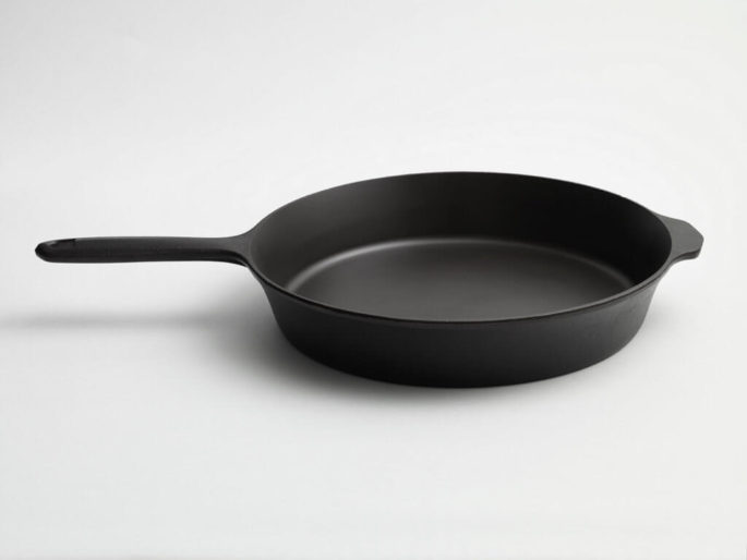
No. 8 Skillet from the Field Company, $100 USD, image via www.remodelista.com

