Unless interior design is your profession, you may not be aware of the most common mistakes made when arranging furniture in a home.
One of the biggest mistakes is placing your sofa directly against a wall. It’s an incredibly common decision people make when arranging furniture in their living room because it’s counterintuitive. You’d think that placing a sofa directly against the wall would make the space appear bigger when, in actuality, pieces of furniture need breathing room, and the visual effect is more pleasing when they are pulled out a bit from being flush with walls.
Often people have good taste, but don’t know how to lay pieces out. Here’s the things professionals notice when entering a home.
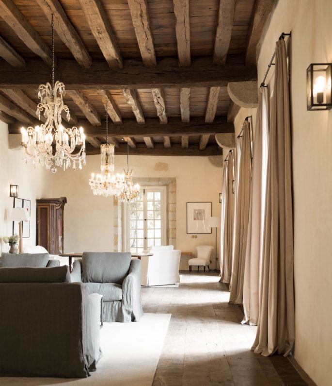
Big is always better with the size of cushions. Las Palacio De Los Trenor by Las Perelli, aaprile.com
THE NUMBER OF CUSHIONS ON THE SOFA
Big is always better: Nothing looks worse than a couple of sad, small, flat cushions on a sofa. Make sure your pillows are well-made, and filled with quality goose down, and measure atleast 60cm x 60cm. Put one in each corner of the sofa and preferably one in the middle.
Add a quality throw for impact.
ALL THE LITTLE ITEMS
The small items in a room are often the first thing people notice. You often walk into beautiful homes to encounter endless tiny memorabilia sitting on the mantel gathering dust. Rooms look better uncluttered and curated. Read more, ‘Clean and Clutter-Free in 15 Minutes a Day.’
HOW SHELVES ARE ARRANGED
How you organise your books says a lot. Books stacked in piles generally show that no one is reading them and they are there as decorative props. Collections of hardbacks look best when they are more accessible. Read more, ‘How To Decorate Your Shelves Like An Interior Designer.’
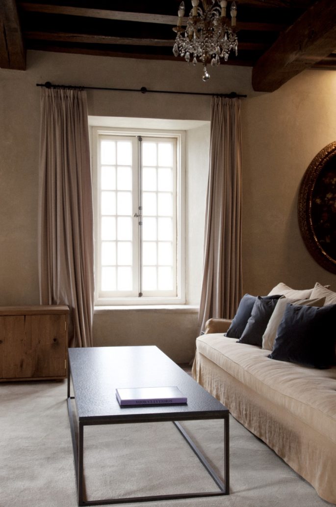
Keep good flow around a living room furniture layout. A space should never feel too cramped. Image via Las Palacio De Los Trenor by Las Perelli, aaprile.com
ALL THE WOODWORK ON THE WALLS
Investing in well-proportioned trims and architraves can establish the look and foundation of a room. A cheap stock trim or casing can’t be hidden.
WHAT IT SMELLS LIKE INSIDE
Candles have their place, but there’s nothing worse than an overwhelming fragrance as soon as you enter a home. Read more, ‘5 Scents for Every Room in the House.’
Whether it’s too many candles, a powerful diffuser or incense, you can’t help but wonder what they are trying to hide.
IF THE CURTAINS TOUCH THE FLOOR
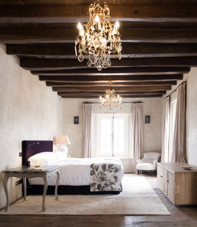
It seems like a minor detail but when a gap exists it can be one of the first things you notice when you enter a room. Because it is out of scale. Read more, ‘No More Dull Curtains: An A-Z Guide to Window Treatments.’
Las Palacio De Los Trenor by Las Perelli, aaprile.com
HOW THE BATHROOM IS STOCKED
Hand soap and clean hand towels are not only subtle, elegant additions to a powder room, but also important ones. Not only does it elevate the hand-washing experience, it shows you care about your home. Read more, ‘The 4 Big Bathroom Trends To Keep on Your Radar in 2019.’
WHERE THEIR FURNITURE WOULD GO
Here’s proof a designer’s mind never stops working: “When I walk into a friend’s home for the first time, I’m rarely (if ever) aware of their belongings,” admits Wood.
“In my mind, I’m always trying to decide how I would arrange my furniture in their house — not their furniture.” Talk about passion for the job.
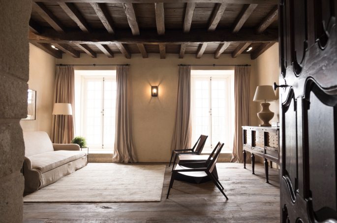
One of the first thing you notice when you enter a room is if the curtains touch the floor. If there is a gap it looks out of scale. Image via Las Palacio De Los Trenor by Las Perelli, aaprile.com
ARTWORK THAT’S TOO SMALL
Don’t hang artwork anything that’s too small, or get two small pieces and spacing them apart to try and give the illusion that it’s taking up more space. Smaller artwork can accentuate an obvious lack of space in a room. If you have open wall space above the sofa, it’s a great place to hang a large piece of artwork. If you can’t find a large enough piece to span the length of two-thirds of your sofa, get as large of a piece as you can, and then add smaller pieces on either side of the large piece, gallery wall-style.
TOO MUCH FURNITURE
One of the main mistakes is too much furniture in a room. Keep good flow around a living room furniture layout. A space should never feel too cramped. To achieve an aesthetic that is pure and simple with plenty of space, maintain a comfortable distance (minimum 50 centimetres if possible) from the edge of a sofa or armchair seat from the edge of the coffee table. Read more, ‘Improve Your Mood With These 50 Top Decorating Tips.’
Less is more. Start with one incredible piece and build around it.
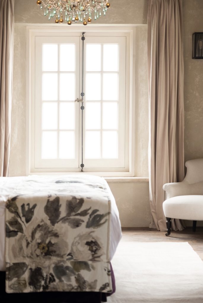
Las Palacio De Los Trenor by Las Perelli, aaprile.com

