Everyone makes mistakes when designing their homes. Between selecting furniture, experimenting with paint swatches and positioning art, there are hundreds of small decisions that go into decorating the perfect space. Read more, ‘The 10 Decorating Mistakes Everyone Makes.’
Even the slightest misjudgment, like hanging artwork too high or choosing paint in a gloss rather than matte finish, can have a surprising effect on a room.
You buy a sofa without measuring your door clearance, you hang a light too low and bump your head on it, or you paint an entire room in the wrong colour without testing it first. Yes, decorating faux pas are many, and most often, it’s easier not to fix them. Whether you have to return a large piece of furniture, call in a plumber or an electrician, it can be tempting to put these decorating fixes at the bottom of the to-do list. The good news is you’re not alone; even top designers purchase items in the wrong scale, forget to consider small but important electrical details. Read more, ’10 Biggest Don’ts in Decorating Small Spaces.’
Here’s how to fix the most common blunders – most of which will take less time than you thought – and your life will improve dramatically.

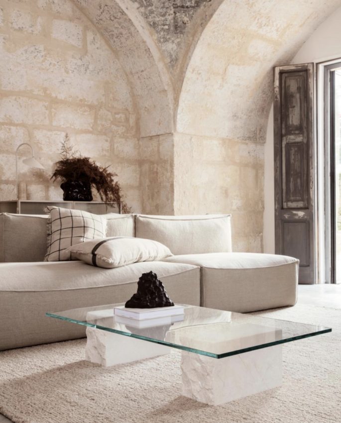
Think of your rooms as a cityscape and fill it with a combination of heights, proportions, and mix of scales such as this room by Ferm Living. Don’t make the common mistake of buying everything in the same size.
Buying Things That Are The Same Height
The Mistake: One simple styling mistake can prevent a room from reaching its full potential. Scale and proportion are the holy grail of design. If everything is the same size or if everything is either too big or too small, your room will look – and feel -wrong.
The Fix: The easiest trick is to think of your space as a city and fill it with a combination of heights and proportions. Look at any cityscape and you’ll find an intriguing mix of scale and a unique blend of fascinating shapes—that’s what you want to recreate. While one piece can certainly transform a space, we often forget how important the sum of multiple parts can be when designing a room. If you have one great piece of furniture without the supporting cast, the space tends to feel lacking. Instead, look at your design as consisting of multiple layers—the foundation base pieces, floor covering, window treatments, art, and accessories. Remember that each individual item will be more than the sum of its parts. A successful room will draw the eye around the space—up, down, side to side.
Not Checking for Outlets
The Mistake: Beware of creating an entire living room layout that revolves around beautiful lamps on a sofa table, only to find out the nearest outlet is across the room.
The Lesson: If you’re not planning on renovating or getting an electrician, plan your electronics and lighting wisely with the placement and number of power outlets in a room.
The last thing you want is a maze of extension cords.
Using Too Much of a Good Thing
The Mistake: Beware of duplication, don’t always buy the same thing so your rooms looks like a shop or hotel suite. Remember the two golden rules of design: Less is more, and contrast is far more interesting. A tone-on-tone room can be stunning and timeless, but one of the common design mistakes is not considering contrast between furnishings.Using varying tones and shades of colour, you can make a tonal room feel multi-dimensional and interesting without using multiple colours. Read more, ’12 Common, Expensive Things That aren’t Worth Your Money.’
The Lesson: There are a couple lessons here. One is to continue to collect objects over time but rotate them in your home. Your story changes over time, so let your home be a reflection of that. Using varying tones and shades of colour, you can make a tonal room feel multi-dimensional and interesting without using multiple colours. And that brings us to the second lesson – the look is all in the edit. As Coco Chanel famously said, “Before you leave the house, look in the mirror and take one thing off.” The same can be said for your home.

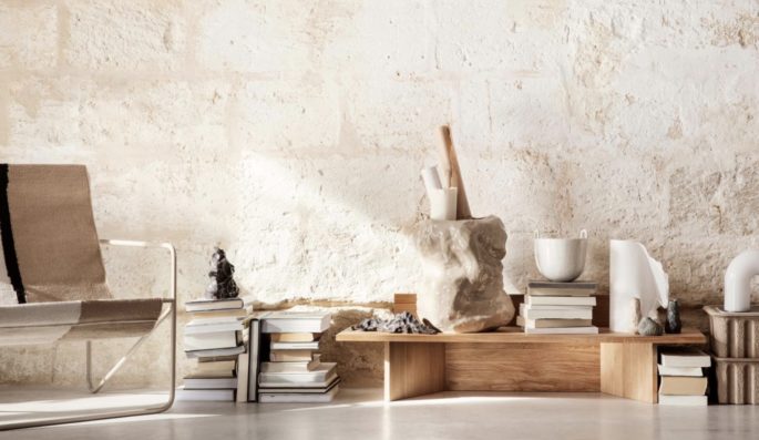
Beware of duplication – don’t always buy the same thing. Break you pattern now. Image via Ferm Living.
Going Too Dark
The Mistake: One key mistake in small rooms is dark furniture. Many people tend to lean toward heavy, bulky, and dark furniture pieces. Dark décor instantly makes a room feel cramped and cumbersome. Read more, ‘Decorating with Colour: A 4 Step Guide.’
The Fix: For small-apartment living, go for lighter fabrics and finishes to lift the space. Opt for sofas or curtains in linen or lightweight fabric, and choose a light-reflecting color palette.
Hanging Art Too High
The Mistake: Finding the perfect piece of art for your home is only half the battle. A key mistake is when art is hung too high or positioned in an obvious way. I think it’s a mistake to be too precious about highlighting the placement of your art. Just because your artwork has value doesn’t mean it won’t still look fantastic above a doorway or sideboard in the hallway with a lamp and a pile of books in front of it. Read more, ‘The Mistake You’re Making When Displaying Art.’
The Fix: Position artwork in an unexpected, subtle location at eye-level is a good starting point, and err on the lower side of that. Use a removable hook to test the placement, and wait a few weeks before affixing it permanently. Read more, ‘How to Start an Art Collection.’
Following Design Trends
The Mistake: Never design your house for the sake of a trend. People are often insecure about interior design, so listen to what everyone else is talking about instead of sitting down and asking, “What do I really love?”
The best interiors are where people let their personal style rise to the surface and ignore the societal norms and trends.
The Fix: Make it personal. The more understated and elegant the interior, the longer it will last. Only buy things you love, that will serve you like a loyal dog. Ask yourself, “What does the space mean to me? What are the colours and textures I love, and what is the feeling that I want to have when I get home?” Push trends aside, and make design choices based on your personal aesthetic to create a space that you’ll love for years to come. Read more, ‘These Will be The Top Home Design Trends for 2020, Part 2.’
Having One Light Source
The Mistake: Lighting decisions are incredibly important to any space but one that people misjudge. When lighting is washed over you from above, it can be unflattering and harsh,” she says. While overhead lighting often seems like the most obvious choice – the best spaces have an array of light sources to create various ambiances.
The Fix: Layer lighting. Be sure to have lighting on dimmers and also coming from multiple sources at different heights, [such as] floor lamps and table lamps. And always choose soft white bulbs,” she says. Harsh fluorescent or white lights can make a space feel stark and uninviting. Read more, ‘The Essential Guide to Lighting.’
“Warm lighting not only sets the mood but also makes a room feel intimate and aglow.”
Buying a Large Dining Table
The Mistake: People make decorating decisions based on an ideal lifestyle rather than reality. While the thought of constantly throwing long-table dinner parties and extravagant events might sound appealing, the reality is often quite different. If you live in a small apartment, avoid buying a large dinner table unless you’re sure you’ll use it. It’s a huge mistake to buy a large dining table with six to eight chairs. Every centimeter counts in a small space, so flexibility is key. Read more, ‘Why We React Badly When the Sofa Arrives.’
The Fix: Opt for a round dinner table, which has the ability to accommodate more guests.

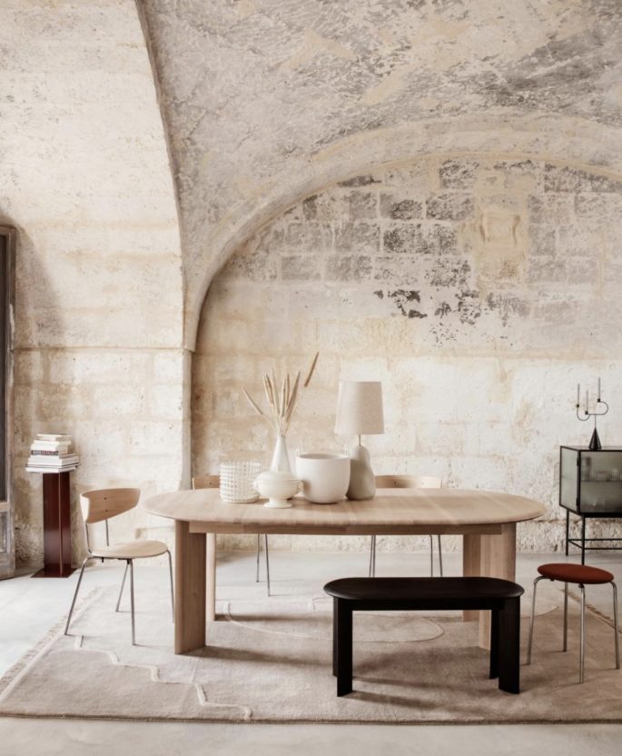
To avoid overcrowding or under-furnishing the space, gather your dimensions. Find a piece you love, save up, take the plunge, and then build the whole room around it. Image via Ferm Living.
Not Measuring a Room
The Mistake: One of the most common interior design mistakes people make is relying on the eye to measure a space. Instead of purchasing furniture pieces because it’s your favourite, consider the overall volume of the space.
Measure every nook and cranny.
The Fix: To avoid overcrowding or under-furnishing the space, gather the dimensions. Mark the height, width, and even the depth of furniture pieces using painter’s tape directly on the wall or floor. This way you can visually see how much space you actually have to work with, instead of making guestimates.
Treating Greenery as an Afterthought
The Mistake: People often run out of ideas and money at the end of a redesign and the finishing touches can get forgotten. They shove a bunch of branches into a tall vase and stick them into a corner to add an element of height and organic texture, but it really doesn’t add much to the room. Read more, ’10 Things Nobody Tells You About Indoor Plants.’
The Fix: Try adding a few low-maintenance indoor plants or trees such as maidenhair ferns to soften, relax and freshen the space.
Shying Away From Investment Pieces
The Mistake: When it comes to getting more bang for your buck, people often make the mistake of buying lots of inexpensive, small accents. It’s more financially savvy to invest in one statement (and, yes, possibly expensive) accent instead. “The most common interior design mistake I see is when people buy lots of small furniture pieces, or piles of accessories, to avoid investing in a big high-impact item like a great sofa, a beautiful bedhead or amazing piece of art. The little things cost just as much and the space feels cluttered rather than cohesive
The Fix: Find a piece you love, save up, take the plunge, and then build the whole room around it. Hunt around on Facebook Marketplace or Craigslist to see if someone local is selling your dream sofa, or commode. Read more, ‘How to Decorate for Happiness and Mental Wellbeing.’


