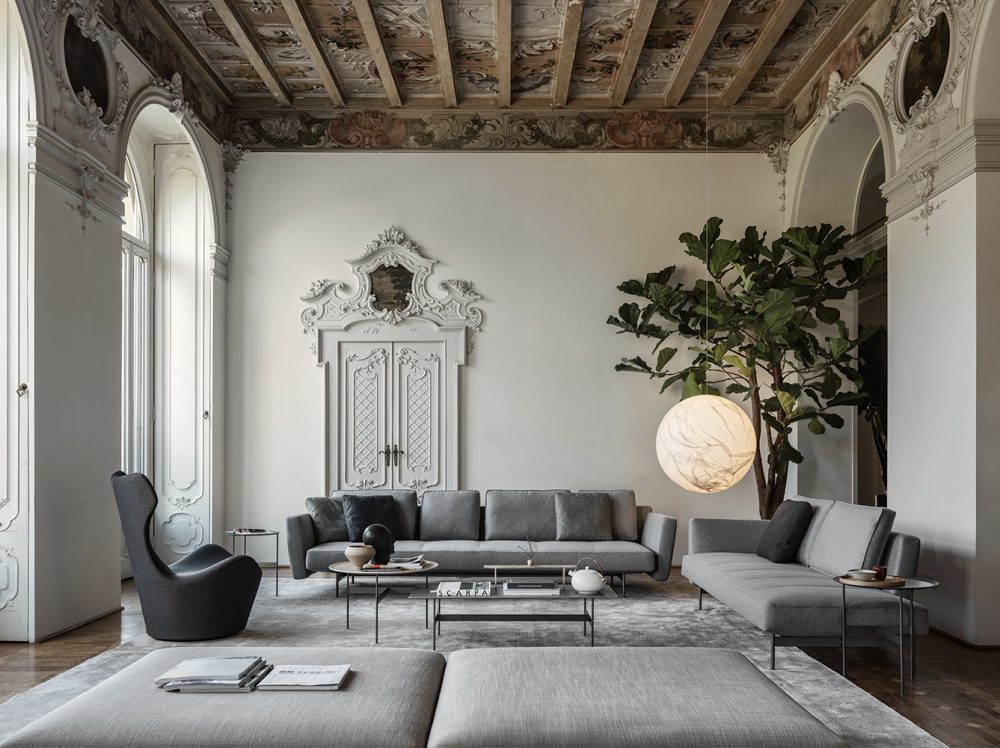
Rules are made to be broken, and none more so than those that dictate what we can and cannot decorate with. Even though there are times and places that do dictate modesty and formality, our interiors are less restricted than ever before. Interior trends are fun to follow and invite us to take part in the creative vision of interior designers who continue to challenge, question and reshape the zeitgeist, but how we decorate is our decision. We can’t let things get in the way of showing off our personal style. Read more, ’15 Style Rules That Will Make You An Interior Guru.’
Here are 17 rules you should immediately erase from your memory, and why.
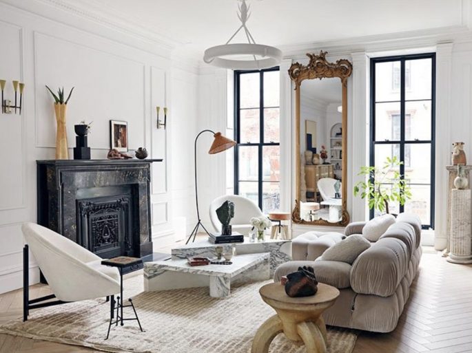
Combinations like oiled bronze with powder-coated metal or black steel is a great way to give your interior game some dimension.Image via @eyeswoon.
1. YOU SHOULD NEVER MIX METALS
Have you been told not to pair a brass light with chrome door handles? It’s just not true. It’s ‘Out with the old’ adage that one must only use a single metal and in with the new of mixing and matching, piling and layering our rooms. You’ll find the combination of metals will only add magpie appeal to your rooms. Combinations like oiled bronze with aged brass, or nickel with copper, is a great way to give your interior game some dimension.
2. BEWARE OF PATTERNS
It’s true we love using loads of textures to build up a room’s character, things such as boucles, weaves, cut-velvets, heavy cotton, rough linens, smooth silks, and sheer muslins, but if you love patterns – mix them.
Stripes with spots? Animal print with floral? Yes and yes.
Mixing prints is the fastest way to achieve that maximalist look we have come to know and love from brands like Gucci or designers such as Richard Quinn and Matty Bovan. The more, the chicer!
3. YOUR CUSHIONS SHOULD MATCH YOUR SOFA AND CURTAINS
Matching your sofa to your cushions or bed to your curtains can offer a delightfully monochromatic look. But it’s an old-school concept and definitely not a rule that needs to be followed. Mixing patterns, textures, and colours is the fastest way to make your room more interesting. Unless you’re someone who lives for a matchy-matchy moment, try thinking about your room holistically and don’t get too tied up in what specific items match or don’t. Read more, ’10 Interior Tips To Happy Up Your Home.’
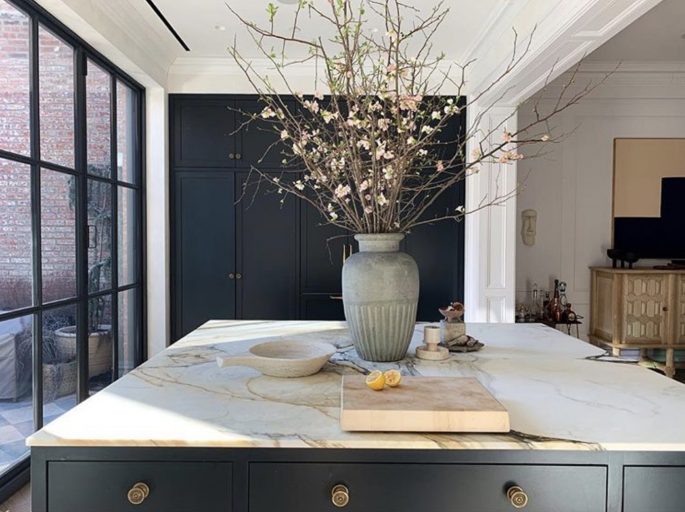
Today, more is more, bolder is better – and frankly, far more inspiring to live with. Image via @eyeswoon.
4. STICK TO WHAT SUITS YOUR SETTING
If there’s one thing we know about what’s flattering, it’s that no singular definition can sum it up. In case you’re not quite sure what it means to you, (showing off your view, a colour that makes you happy), you might as well explore your options, until you find what feels right.
5. YOUR HOME SHOULD DICTATE HOW YOU DECORATE
The world’s most stylish interiors have one thing in common, and that isn’t that they’re all the same. They choose pieces that fit the space as an extension of the owner’s personality. What they do not do is let archaic rules and labels based around the anatomy of rooms dictate the pieces they use. How dull. Follow them, not this rule. Read more, ‘Improve Your Mood With These Top 50 Decorating Tips.’
6. SHOP IN HOME STORES
Simply put, shop anywhere and remember don’t be a brand snob. Read more, ‘Ikea’s 2020 Catalogue Is Here- And It’s Fabulous!’
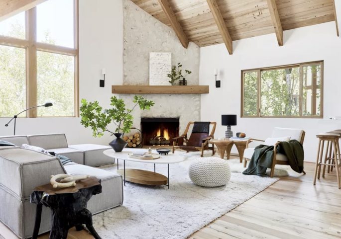
Choose pieces that fit the space as an extension of the owner’s personality.
7. YOU HAVE TO SPEND A TON OF MONEY TO LOOK EXPENSIVE
Personal budgets aside, we happen to pride ourselves on finding pieces that look so much more expensive than they actually cost. Read more, ‘Decorating on a Budget: Insider Secrets.’
8. YOU NEED TO SHOP FOR SOMETHING NEW EVERY SEASON
If you’re looking to cut back on your consumption, look for rare vintage additions to your home. Or don’t shop at all.
9. YOU NEED A LOT TO PULL A ROOM TOGETHER
You don’t need as much as you think. All you need to be chic is furniture with a quiet authority, well-made in muted combinations of colour and fabric.
Beware of duplication – don’t always buy the same thing.
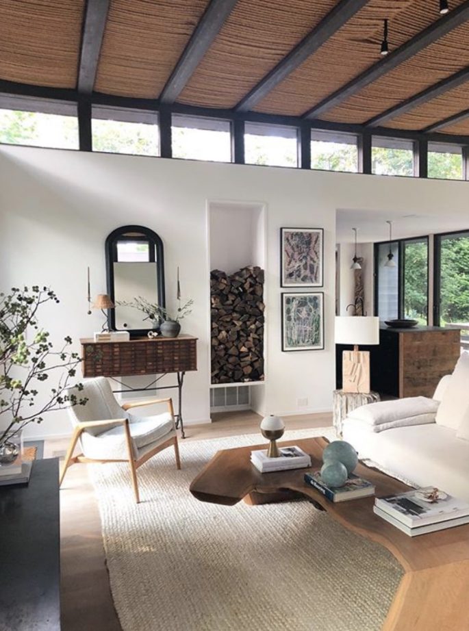
There’s only one real rule when it comes to combining colours: neutrals always look great together – including black and brown. Image via @eyeswoon.
10. BLACK AND BROWN DON’T GO TOGETHER
We always considered this such a silly faux pas. Black and brown are both neutral colours, how could they not complement each other? There’s only one real rule when it comes to combining colours: neutrals always look great together.
Blue and black, brown and black, anything plus black: you’re safe.
11. STOP ASKING, WHERE’S THAT FROM
“Where is that from?” might be the most typical interiors question, but it’s also a valid one that can open a deeper conversation about not only what we buy, but why it matters; including environmental sustainability. And how powerful our interior choices can be.
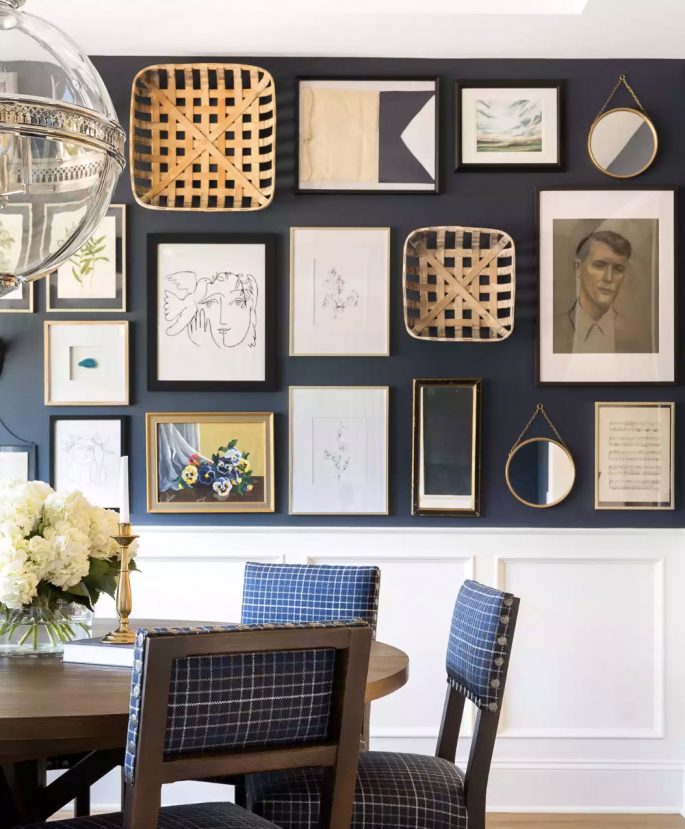
Bria Hammel Interiors, Photo Spacecrafting Photography.
12. ONE DOORWAY IS ENOUGH
Avoid rooms with only one small doorway. Open everything up. With one small doorway, a room becomes a graveyard – and who wants a cemetery in their house? Every room should have big double door openings, as high as possible. Don’t think, ‘We can’t do it.’ Just draw a hole on the wall in Texta, and get a sledgehammer. Then get a plasterer to put up some good architraves, slap on some paint and watch your life improve.
13. DO AS THE DECORATOR SAYS
There’s nothing worse than a house that has been decorated by the best and then photographed so the cleaner puts everything back in the exact same place. You end up with a house that has no soul. The owner has to be involved.
Nothing makes our heart sink faster than a shrine to high design with no personality. You’ve got to live in your house.
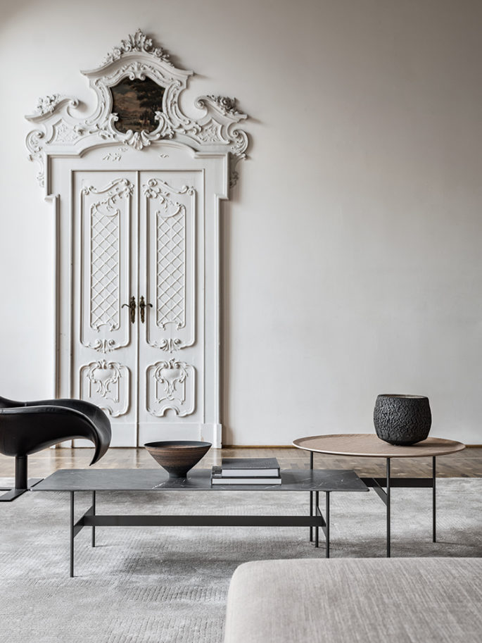
Learn to recognise quality in any price range. Train your eye to recognise good lines, perfect proportions and great finishes. Image via Meridiani.
14. QUALITY IS EXPENSIVE
Learn to recognise quality in any price range. Don’t be a snob. Remember that quality doesn’t always mean big names. Train your eye to recognise good lines, perfect proportions, great finishes. Always check seams, stitching and joins- they’re a good indicator of quality. The key words are elegant, classic, integrity and character.
Don’t buy anything you don’t love just because it has a famous label and don’t miss brilliant no-name buys.
15. AVOID CLASHING
Not every mixed-print look needs to be as bold as clashing animal patterns. Even small pattern clashes (polka dots and dainty florals) or texture mashups (velvet and lace) can yield some of the most memorable and interesting rooms. Today, more is more, bolder is better – and frankly, far more inspiring to live with. Don’t stick to one print. Two bold, eye-catching designs that you wouldn’t necessarily think go together, might somehow work well.
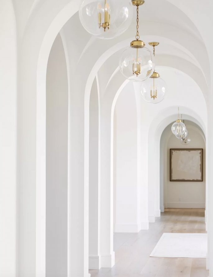
Image via @studiomcgee.
16. DON’T DECORATE WITH LEATHER IN THE SUMMER
You spent so much money on your favourite leather chair and you can’t use it in the warmer months. That’s ridiculous. Treat your leather chair like a cardigan, sitting on it whenever you want.
17. SEE OBSTACLES AS INSPIRATION
Limited light. A tiny kitchen. Zero storage. Every space has its hiccups, but instead of letting those hinder design dreams, let them lead you. You need to build a room as you build anything, where you start with your constraints—whether it’s a spatial constraint, a lighting constraint, a lifestyle constraint—and let those inform the decision-making.
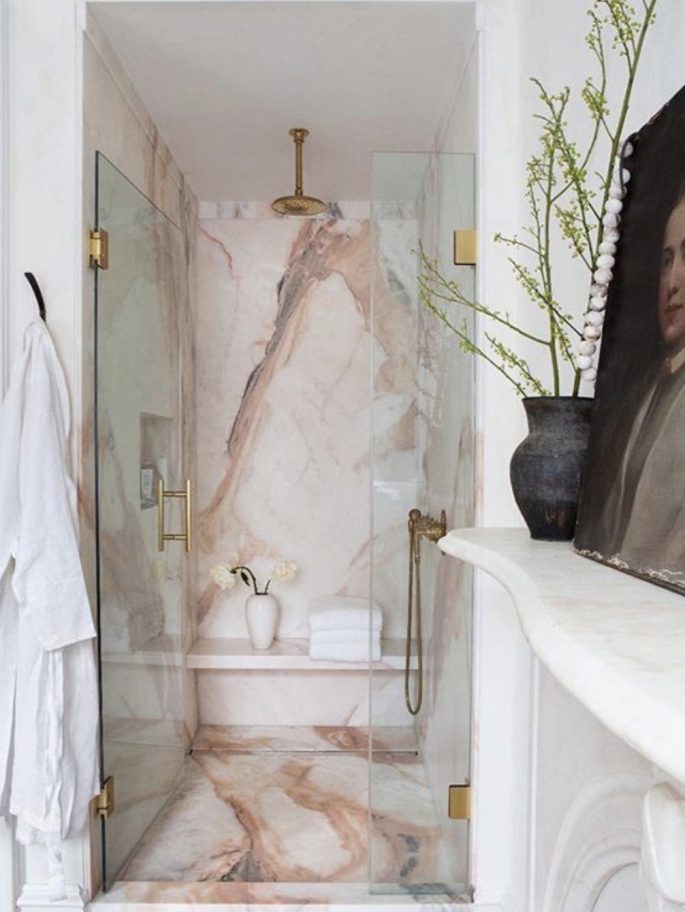
No windows? You need to build a room as you build anything, where you start with your constraints and let those inform the decision-making. Image via @eyeswoon.
AND FINALLY, DON’T KEEP UP WITH THE JONESES
You know that dining room you think you need? According to the pros, you probably don’t. People get bogged down in [the idea that] they have to have certain things, but it’s wiser to design your home according to how you want to live in it. Do you want to have areas for entertaining, space to work, or a room to host out-of-town guests? These are questions to ask—because good design creates experiences in our lives.
It’s about creating different engagement opportunities within the space.
EVERYDAY STAPLES SHOULD BE EXPENSIVE
They say you should “invest in staples,” and often times, we support that decision. But just because you’re using said plate, glass, sheet or quilt, every day does not automatically mean it has to cost you an arm and a leg. Some of our most beloved pieces that have lasted us seasons come from chainstores such as Ikea, and we never object to finding a steal at auction houses or consignment sites.
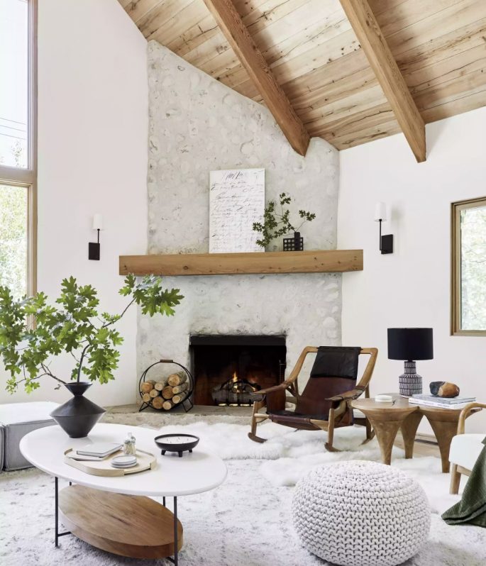
Emily Henderson Design. Photo: Sara Ligorria Tramp for End.

