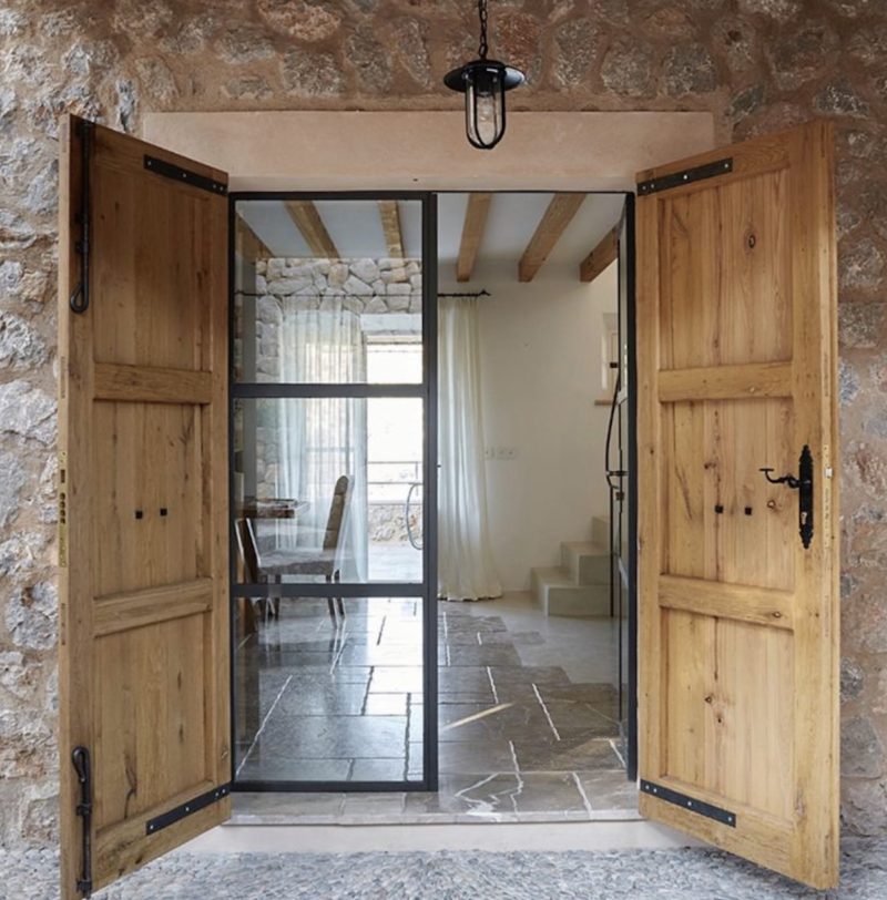
Each room is a canvas on which to create, with the ultimate aim of being able to stand in the middle of any room, no matter how big or small and look at each wall and feel there’s an overall sense of balance, alignment, and consideration in every detail. This is essential to creating a sense of calm, because our brains will always pick up on anything discordant, and the body responds by not being able to fully relax, even if the rational mind cannot instantly identify what’s wrong. The challenge is to achieve a balance between these two seemingly opposing forces – enough to look at but with nothing out of place. Read more, ‘The 50 Best Decorating Tips of All Time.’
Here are the seven key principles to guide you smoothly along that path.
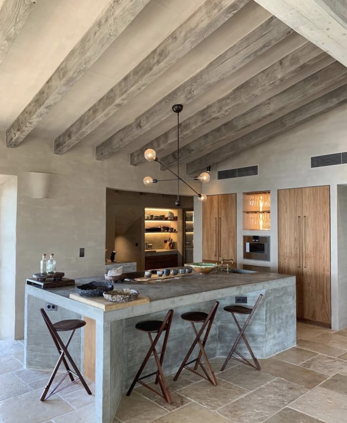
Whether you want your home to be relaxing, calm or invigorating, always start with your floor, then follow with the colours for your walls and know that everything will flow from there. Design by @moredesign.es
1. ALWAYS START WITH YOUR FLOORING
Whether you want your home to be relaxing, calm or invigorating, always start with your floor, says Michelle Ogundehin, former editor of best-selling lifestyle magazine, Elle Decoration UK in her new book, Happy Inside. “Then follow with the colours for your walls and know that everything will flow from there. This is because floors are often overlooked, or left until last, whereas they should be one of the first things you think about as they will be in your eyeline from all viewpoints, underpinning everything in your home both visually and quite literally. Plus, if you own your home, it’ll be one of your biggest investments, so get this sorted before you buy anything else, on the premise that you can sit on a cardboard box on a wonderful floor and it will be magnificent, but anything on a cheap floor will be instantly, and permanently, be compromised.” Read more, ‘Everything You Need To Know About Outdoor Flooring.’
Of course, that’s a dilemma if you can’t afford to install a new floor, or if you rent and have a vile carpet or faux laminate in situ to contend with. The answer is rugs. Try a carpet remnant (always 100 per cent wool), cut to fit and professionally bound around the edges (most good carpet retailers will offer this service at a reasonable cost). Ensure it’s as large as possible, and absolutely toned with your palette, and this will be a very satisfactory stop-gap solution. Having them properly sealed will ensure the edges are dead straight, and you can play around with contrast bindings, or edging techniques such as serging or fringing.
In fact a poor floor could inspire the creation of a wonderfully personalized rug that you’ll keep forever.
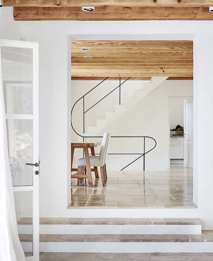
Any white box of a room can be completely transformed with the addition of relief and texture such as this Spanish residence by More Design.
2. ADD RELIEF AND TEXTURE
Applied decorative trims are obviously great for physically adding a line of alignment to work from. They are time-honoured ways to break up blank expanses of wall, and plaster, plus they’re used a lot because they’re tremendously effective in bringing rooms together and give the eye something to rest on. They might include cornicing, picture rails, dados, wooden panelling, and skirtings. And they certainly shouldn’t be regarded as only suitable for older properties or a more traditional look. Any white box of a room can be completely transformed with the addition of a simple, but perhaps taller-than-average, skirting board, a plaster ceiling mould to accent a pendant light or even something as simple as an extra length of decorative casing wrapped around an otherwise plain window to give it more oomph. Read more, ‘This Is How You Keep Your Interior Looking Fresh, Not Dated.’
Textured wallpaper in particular – in any colour to match your scheme – is a subtle way of lifting any surface and giving your eyes something extra to enjoy without the full on distraction of vibrantly patterned wallpaper.
It comes in all manner of patterns and thicknesses, so even remarkably realistic faux dado panelling can be yours on a roll. Combined with trims, layered either above or below them and finished in one colour or more, all surfaces quickly come to life, even before the final touch of any artwork or other decorative accessories.
3. ALIGNMENT IS EVERYTHING
But before you consider adding trims, it’s essential to pick a line from which consistent positioning decisions can be made, as considered alignment inspires an instant feeling of cohesion and harmony. Anything placed on a wall, or around the periphery of a room, becomes a component in the composition of each plane, with a dynamic tension between it and the position of all other elements in the room, from doors and artwork, to the drop of curtains and blocks of applied colour or pattern. We do not want a very regimented sense of alignment, but we need to avoid everything appearing to jiggle up and down with no sense at all of an underlying rationale. Large, high-level items (artworks to TVs) should have coherence, as should anything placed at a lower level, such as dados or wall-hung sideboards. However, it’s not terribly helpful to have fixed rules as to the initial positioning of such a line, because the proportions of every home are different, only that once you’ve settled on one, you stick to it, and ideally use it from room to room too. A good way to start, though, is to stand in the middle of each newly whited out room (preferably emptied of furniture, but if this is not possible, then pile it compactly into the middle so you can see the full perimeter of the floor) and try to see if there’s any inherent order. Read more, ‘15 Ways The Pandemic Will Impact Interior Design As We Know It.’
What details are there in situ that might be taken as a guide – perhaps, original trims, if you’re lucky, or the casings of windows?
Are there any openings, recesses, alcoves, fireplaces, or staircases? Any of these can be a mark from which to begin in an attempt to introduce a regular visual rhythm to a room or space. But remember, we’re trying to work with what we have in order to refine and align, not to obliterate a room’s given bone structure. And if a room completely lacks any existing features of merit, don’t worry. The top line of internal door frames can often be taken as a starting point because they are a standard size based on the average size of the human body, and if there is more than one door in a room, hopefully they will be the same size.
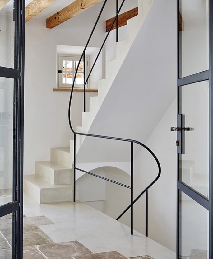
Ask yourself: What details are there in situ that might be taken as a guide – perhaps, original trims, if you’re lucky. Design by @moredesign.es
4. DON’T BE A SLAVE TO CENTREING AND SYMMETRY
There is always a moment when everything has been placed in such a way that it feels balanced. And while a consistent horizontal line around a room will help to pull a look together, perfect centering and symmetry often do not as the brain assumes it has the measure of them in a single glance, and the eye tends to gloss over them. For instance, if we consider even the most beautiful of faces, while the eyes and mouth will invariably be aligned, the face itself is seldom symmetrical around a vertical axis, instead, it will be the small quirks on one side, a slight uplift to the brow, a cross of the front tooth that adds beauty. Applying this to the home, such as a wall with a centrally placed window, clearly, in most cases, it will make sense to give the same treatment to the walls on either side. Read more, ‘The 25 Rooms That Influence The Way We Design.’
But a touch of ‘otherness’ would be to suspend a hanging basket in front of the window or to hang a beautifully framed painting on one side with nothing on the other.
These act as visual nudges – we want our gaze to deliberately linger and be entranced. After all, if you picture a room that has a water stain in one corner, for all the potential beauty of its furnishings and fitting your eye will repeatedly dart to the damp path. We want to install that same sense of being drawn to look more closely, but at something beautiful, not something that needs fixing.
5. MAKE ROOM FOR A VIEW
Regardless of the textural virtuosity of your walls, views outside are incredibly important. They allow the eye to travel beyond the physical borders of a room, implying freedom from constriction which makes any space feel bigger and increases the sense of calm. Consider how the opposite of this works: how cosy a space feels when you deliberately block off such stimuli by drawing curtains or closing shutters. Or if we take this to the extreme: how oppressive a room becomes with no recourse to an external view at all, in the manner of a prison cell. So for some pointers to enhance a feeling of openness you might want to consider the following list. Things to remember – Keep Windows Clear; Go Wide With Curtain Rails; Choose Blinds; Say No To Venetian Blinds; Consider Shutters; and Use White as A Backdrop.
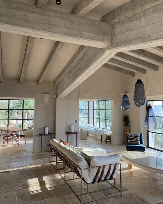
Views outside are incredibly important. They allow the eye to travel beyond the physical borders of a room, implying freedom – so keep windows clear where possible. Design by @moredesign.es
6. LEARN TO LOVE BUILT-IN STORAGE AND SHELVING
,With no legs or brackets to distract the eye and with the full expanse of the floor uninterrupted by furniture, wall-hung shelving and built-in storage units are another way to make any room feel fmore spacious, and therefore clutter-free. Even lifting storage units a few centimeters off the floor will make a huge difference. As for shelving, wherever possible opt for floating shelves, with no visible suppots to allow the focus to be on whatever is being displayed. Read mor, ‘Need More Storage? A Bespoke Approach To Joinery.’
7. VIEWS FROM ROOM TO ROOM
As well as being able to stand in the centre of any room and not having your eye led astray by things that are out of line of by strident colour clashes, it’s important to consider the view from one room to another, as something missed from one angle might be picked up with the benefit of a different vantage point. It’s similar to how an artist might cross-check the composition of a painting by looking at a mirror: the transposed image reflected in the glass created an alternative perspective. Read more, ‘5 Decorating Techniques That Separate The Pros From The Amateurs.’
Looking from room to room also helps understand home decoration as a series of interconnected zones. After all, homes are always experienced in motion, with one ‘stage set’ continually being played out in front of another. This is why a seemingly ideal scheme on paper, doesn’t necessarily translate into something that works in practice. In many ways this is the biggest challenge of designing an interior, unless you are spectacularly gifted, or very experienced, you can never really tell what it’s going to feel like until the end. Regardless, this is another key benefit of the plane-by-plane approach: physically building up a scheme layer by carefully considered layer practically guarantees a better, more satisfying result.
And when you stand in a completed room, gazing happily across at one another, you’ll know it’s been worthwhile being so patient.
The overall concept of decorating in these seven steps in to set your key from the start – your palette and then to play our different versions of it according to the moods you want to create within each of the four defined home zones so that they all work harmoniously together. ‘Think first, decorate later’ must be your mantra. Resist the temptation to leap into action before taking the time to ask yourself – ‘Why am I choosing this?’ thoughout every part of the process. Really immerse yourself in remaking your home to support you from whiting out walls to the application of colour and texture. This is essential to its capacity to have a restorative effect. Let go of any perceived decorative ‘should-dos’. The only limit to what is possible is what you’re prepared to do and what you can afford to do. Read more, ’11 Secrets To Decorating Like The Worlds Chicest Designers.’
Give yourself freedom to allow your palette to evolve.
Aim to keep the core elements consistent, but if and when an ache for change arises, accept that it represents something that needs to be expressed, so embrace it and enjoy finding the solution. Not that this is permission to veer completely off piste; for example, don’t buy a purple lacquer console. By all means experiment, but stay without the prescribed total number of 28 colour notes and be consistent from zone to zone. Otherwise the balance of your home will be thrown, and the overall effect with rapidly become too busy – the antithesis of the happy home.
This is an edited excerpt from Michelle Ogundehin, former editor-in-chief of best-selling lifestyle magazine Elle Decoration UK, new book, Happy Inside.

