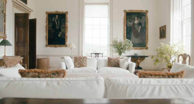
Want a quick lesson in how to decorate like a top designer? Hit the mark everytime with our top tips on which colours look good together, how to work with texture, the way things should be displayed and how to learn the difference between a classic and a fad. This is all practical, no-nonsense basic advice on how to make your interior look like a million dollars.
FUNCTIONAL FURNITURE
Furniture should be useful and work hard. Your interiors should be based on a few timeless pieces that mix and match. The staples are a dining table that is at the heart of the home, a great sofa, some decent chairs, pretty side tables, a good mirror and elegant table lamps. These are the things you will take through life so they have to be good quality, fad-free classics. There is a place for personality pieces and fun updates but they need to be layered lightly on top of the foundation pieces.
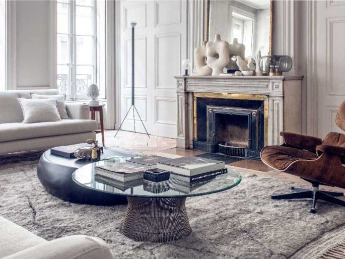
Maison-hand.com
WHEN IN DOUBT, TOSS IT OUT
The biggest single thing you can do to improve the look of your house, and get the designer look, is to take things out of it. Your interior will instantly look better if you simplify what you own and keep only what is useful and beautiful. If you don’t use something, remove it from your life. Bin, bin, bin! That means those witty fridge magnets, (your refrigerator is not a decision-pending tray), and that mouldy old Balinese daybed. Now find a proper place for everything that’s left, and be on constant patrol to keep clutter out of your house.
NO COLOUR LIKE NO COLOUR
People think about colour too much and forget how lovely its absence is. Strong bright colours on walls and ceilings can dramatically shrink a space and tend to date quickly. Instead, try neutral shades for the background areas, then feature one or two strong colours in accessories that can be easily changed.
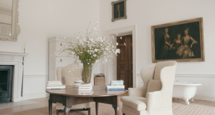
Jasper Conran at home. Image courtesy of Nowness.
GET FLOORING RIGHT
Fabulous flooring sets the tone for everything else. It has a big impact on aesthetics, practicality and budget. Remember, floors outlive paintwork, so it’s best to have something natural and muted that will work with successive colour schemes, which fits in with the way you live. Try a combo of hard floors (the widest timber floors, paver-size tiles and slabs of stone) with faded cotton, woollen or oriental rugs. Rush or sisal matting is another great option loved by designers, that’s cheap but doesn’t look it.
KEEP IT QUIET
Don’t underestimate the power of simplicity. Real style is restrained. Most people overdo things. They overdo patterns. They overdo statement pieces. They own so much, their rooms become obstacle courses. To get the designer look, quieten everything down, particularly colours and clutter. Remember it’s as much about knowing what not to use. You’ll make life easier if you keep the basics neutral and introduce strong statements with rugs, paintings, cushions — things that are potent but portable. Keep ideas like less is more in your mind. You’ll save money and be less likely to repeat mistakes.
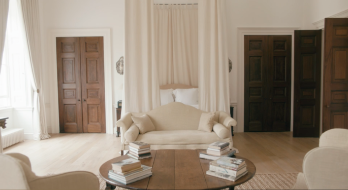
Jasper Conran at home. Image via Nowness.
BEWARE OF PATTERNS
True style is based on texture. Patterns draw your eye. They dominate. They date. And they can ruin everything. When people fall in love with a pattern, they tend to go overboard. Instead, top designers use loads of texture to build up a room’s character: smooth surfaces like mirror, lacquer or satin create a formal environment, while heavier, rougher ones like wood, stone or linen, lend themselves to a more relaxed look.
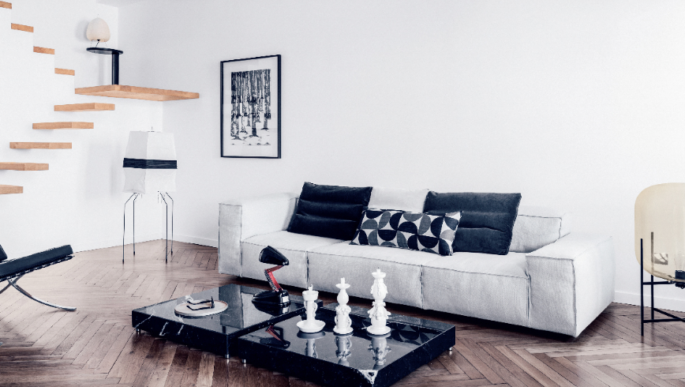
Maison-hand.com; photo by Felix Forest.
DISPLAY YOUR COLLECTIONS WITH STYLE
Stick to one or two hero pieces in a room and allow them space to shine. Even highly decorative items or disparate collections can look simple when displayed in the right way. A French gilt mirror and ornate antique Gustavian bookcase, for example, will feel contemporary when placed in a sparsely decorated room.
IGNORE FADS
Be true to yourself. Unless you want to change your interior as often as your hemline, avoid all the ‘next big things’ and only buy pieces that will serve you like a loyal dog and that you love, and it will work. Quality distinguishes style from fashion.
THE SECRETS OF UPHOLSTERY
Big name designers know soft furnishings, fabrics, curtains, and cushions are the key to comfort: they determine quality, durability, function and make an interior feel right. You can opt for anything, from a cheap cotton to an over-the-top silk, just as long as it feels good and is suitable. Be realistic about the way you live. If you’re on a budget, use special fabrics on small pieces that make a big impact, and cheaper fabrics for curtains. But always use the best quality fabrics you can afford. It’s money well spent.
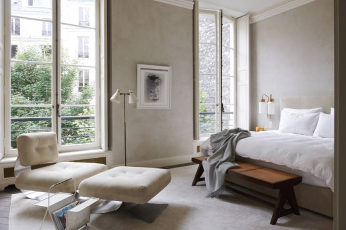
Apartment in Bellechasse, Paris by Joseph Dirand
THROW IN SOMETHING UNEXPECTED
Once you’ve made the big choices, the rest is about how you put it together. It takes a lifetime of collecting to finish a room. Pair the unexpected, mix up your genres, contrast textures: cotton with silk, cashmere with canvas. A lot of style comes from throwing a spanner in the works, mixing incongruous elements such as a chainstore round pedestal table teamed with vintage leather wingback chairs.
IT’S THE LITTLE THINGS
Style is imagination, balance, an ability to judge proportions and knowing how to finish things. That might be buying a second-hand baroque mirror at a junk shop and painting it white or raiding the auction houses for one-offs — commodes, chairs, stools, mirrors — that give your house soul. Nothing has to cost a lot but they need scale and proportion. Buy less, but buy better. And don’t throw out your old coats, boots and hats. They can be better than art, more natural, less try-hard, and make your home look like a Ralph Lauren ad.
THINK COMFORT
Luxury is not about having mod cons, marble bathrooms and a boat at the bottom of the garden. Your home has to be a sanctuary — as soon as you walk through the door, your spirits should lift. If it fees that way to you, everyone that visits will feel the same. Style endures because it works. Surround yourself with the best you can afford. Even if you live in a shoebox, honour your presence in it. Legendary designers know luxury is a comfortable chair with a good reading lamp and a handy table to pop a drink on. You can have that wherever you live.
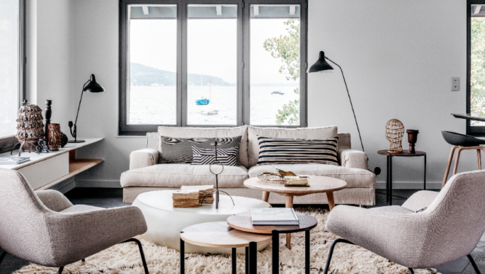
Maison-Hand.com; photo by Felix Forest.
BECOME A CURATOR
What you collect is entirely up to you, but don’t just amass things, be discriminating and follow your heart: the more individual your tastes, the more interesting your collections will be. And remember if it’s worth collecting, it’s worth displaying well. Don’t separate the pieces of a collection — keep them together. Copy the world’s best designers and hang them on the wall, line them along shelves, group on tabletops. Anything en masse looks good.
DEVELOP YOUR EYE
Even if you’re not sure of your taste, start learning. If you can’t afford to buy at the best places in town, window-shop there to see what it’s all about. Develop your sense of what looks great, good proportions, fabrics, finishes. Hit the best hotels, bars and restaurants in town when you go travelling: they’re a lesson in how to pull things together. You may not be able to afford the big name designers that have created the looks, but you’ll pick up the ideas, and then be able to imitate them at home. And it’s free.
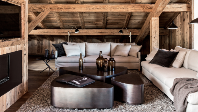
Maison-hand.com
DON’T HAVE ‘GOOD’ AND ‘EVERYDAY’ THINGS
Good glasses and plates should be your everyday stuff. A good glass (or plate) is one that has great proportions and is well balanced and a joy to use: and is just as likely to be made from plain glass as lead crystal (or stoneware as bone china). Get one set of china that is good enough for the smartest dinner party but tough enough for every day. Choose a low maintenance classic that will make food look great.
ASK IS THIS ‘SUITABLE’?
There is nothing worse than an English country look on the 50th floor of a city highrise or a French chateau in half a house on the city’s fringe. Make sure your interior suits your environment and your setting.
COSY THINGS UP
Even if you live in a six-by-four make it beautiful. Put leaves in a vase, a pile of huge books on a table, a pair of big baskets under a console. It is all about comfort, quality and a dash of individuality.
DON’T FORGET THE BEDHEADS
Installing a bedhead is the most cost-effective thing you can do in a bedroom. For the shape, you can go high-square, French, humpback, gothic, or elliptical, and they can be detailed in all sorts of ways, but buttoning and studding are good looks that won’t date.
DON’T LIGHT UP YOUR HOUSE LIKE A FOOTBALL STADIUM
The right lighting can make Godzilla look like a raving Delilah. Do what designers do and opt for a mix of wall lights and table lights which wash the ceiling with a gentle light that relects onto the floor and everything in between. Magic.
MAINTAIN EVERYTHING
Maintenance gives a room form, structure and visual appeal. Keep your chrome polished, your glassware gleaming and your flowers fresh. It takes 10 minutes to whip around each morning and put things straight. And it’s such a great way to live.

