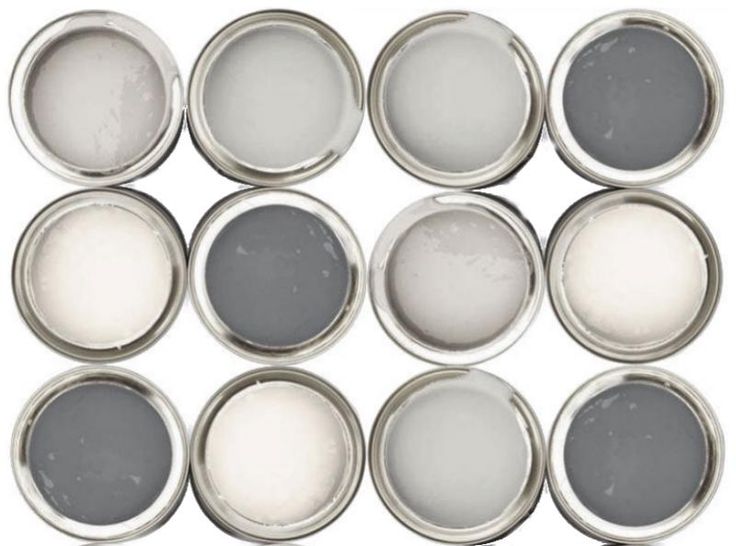
The only difficult bit is deciding which colours to choose. There are no real secrets. Just decide on the colour palette that best suits your home, based on the amount of natural and artificial light reflected in the rooms. Get ideas from interiors magazines, shops, or friends’ homes. The colour is not of paramount importance: it’s the amount of other colours that matters.
Make sure you don’t rely on paint charts and little swatches: remember, the paint will look much stronger once it is applied to four walls. To pull off the perfect interior, stick to the same tones throughout: pale with pale, strong with strong.
Still confused, or even terrified? Then go for a neutral such as ivory, caramel or taupe and vary its strength (half- or quarter-strength) in adjoining rooms. It’s an easy way to achieve both harmony and variation. Then you can just use colourful accessories to give your home a shot of colour and individuality. Here’s where the style set shop, (in no particular order).
Porter’s Paints
If it’s good enough for the Art Gallery of NSW, it’s good enough for us. This boutique paintmaker inspired a generation to splash out on limewash, and over the past 25 years has helped change the colour of Sydney (there are 400 shades in its current fandeck). At the Waterloo headquarters, you can see lots of different hand-coloured shades and finishes displayed in good light on a long curved wall. Hit the colour-fast mineral paints that won’t streak, have a good chemical reaction with the surface render and have a 15-year guarantee: they come in good ochres, aniseeds and greens. Also washable low-sheen eggshell emulsions, stainless steel and rich copper paints and distempers. Highly trained staff give great advice and service. Ask for a super swatch: they’ll paint two coats of eggshell acrylic in your chosen shade on a length of wallpaper so you can test it in your home. It costs a modest price per metre, but beats sample-pot patches on the wall. Great neutral shades include Woodsmoke, Piraeus, Van Helsing, Obsidian, Elegance, Nettle, and Riverstone, all of which come in Porter’s fab acrylics in Eggshell or low sheen. (02) 96985322), www.porterspaints.com.au
Dulux
There are a mind-boggling 6000+ shades. Get to know them all. Vivid White (a bright white) and Stowe White (a cream white) are the best whites around, according to Iain Halliday of Burley Katon Halliday. Other classic whites are Chalk USA and White Opal, two good ochre-based whites (we used Chalk throughout our Sydney home because it has lots of north-east light). Other good colours are Cashmere, Calfskin, Grey Pebble, Timeless Grey, Clear Concrete, Stepney Mole, Charcoal Light, Hog’s Bristle, Water Chestnut, String, Plateau Grey, Obelisk, Deep Onyx, Spanish Eyes and Mansard Stone. Remember: Wash & Wear low sheen on walls for washability (or flat if you have no kids, no dogs), semi-gloss (the old satin) on woodwork, and flat on ceilings. Sells just about everywhere, but the website can help find the outlet nearest you. 132525, www.dulux.com.au
Murobond Coatings
Heavyweight architects love the interesting earthy colours and textures. It’s the brand’s commitment to developing its beautiful palette of technically superior paints that are environmentally sensitive – both off-the-shelf and crafted-to-order – that is Murobond’s success. Look out for its Pentimento limewash emulsions and Chalk paints that give a new wall a bit of a softer, European-looking age and experience, as well as its Bridge Paint, made of micaceous iron oxide (the sort of thing they paint the Harbour Bridge). The latter can be used for everything from metal gates and handrails to shutters, front doors, even and ceilings and walls. (Have a look at landmark buildings like Hydro Majestic, Boomerang, Hyde Park Barracks, and Old Government House to get an idea: deep, warm and earthy colours.) Look out for muddy shades like Rock, Heather, Twill and Basalt. It’s the choice of A-list architects from Peter Stuchbury to Howard Tanner, Nick Tobias, and many more. (02) 99067299 or 1800 199299, www.murobond.com.au
Resene
If colour is your thing, come to this New Zealand company selling its own line of premium paints. Fab unusual colours (including a range designed by NZ fashion guru Karen Walker),with 300 whites and neutrals alone. It has a reputation among decorators for sophisticated tinting and colours that stay true long after they have been applied. (02) 94609988, www.resene.com.au
Annie Sloan
You can instantly update any piece of furniture (or room) with a lick of British Annie Sloan chalk paint. It’s the quickest way of adding warmth and character to world-weary tables, chairs, cupboards, stools, mirrors, floors, walls ,or an entire space. And it’s foolproof: don’t bother sanding or priming first, just slap it on, then apply a simple wax rub. The result? A matte velvety finish that looks instantly old.
And what colours. There are 30 decorative and historical colours in perfect hues of French Linen, Paris Grey, duck egg blue, Coco, Greek blue, Chateau Grey, Old Ochre, and Aubusson Blue and lots more. (02) 9698 4449 www.cotemaison.com.au www.anniesloan.com
