The combining of common rooms was already losing its lustre. But as the pandemic has triggered the demand for private spaces like home offices and studies, designers are looking for a new solution.
The open-plan interior has demonstrated remarkable staying power. The plan that typically combines entryway, kitchen, living and dining room into one “great room” has dominated home design for decades. Why? For families, it facilitates a benign surveillance state with the kitchen island as parental command centre. For young couples, the loft-like atmosphere conveys a whiff of midcentury Bohemianism. For competitive cooks, it offers a stage. Real estate agents love how it photographs. (How “airy!”) Developers embraced it because it’s cheaper. TV execs boost it because market research showed young folk tune in for demolition. Plus, it’s a surefire way to foster a “sense of togetherness.” Read more, ‘An Evolution: Trend Report Exploring What’s Next For Design.’
Of course, there’s the rub. With Covid-19 driving work and school (and almost every other activity) into the domestic sphere, families rub shoulders 24/7. As a result, the demand for private ancillary spaces—sculleries, libraries, sitting rooms—that percolated pre-pandemic seems to have kicked into high speed. Now fusty old things like doors seem a luxury. Read more, ‘We Can’t Go Back To Normal- How Coronavirus Will Change Home Design.’
Suddenly, the study is a hot commodity. The open plan isn’t dead, but we’re going to be paying more attention to creating purposeful private spaces with a more thoughtful balance between the two. Read more, ‘Top 10 Design Trends For 2021: Meet Your New Home.’

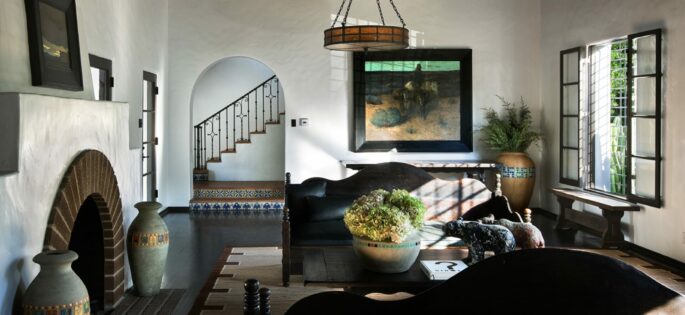
Sometimes simpler strategies suffice such as separate rooms for living, dining and cooking. Diane Keaton’s former residence in Beverly Hills. Photo by Scott Frances
Shelf Service
Double-sided bookcases provide discretion and separation while leaving the sense that the room is open.
Deeply Felt
Textiles that block sound and light are becoming popular. Try curtains using hospital ceiling tracks—believe it or not, it can be really chic. In the past homeowners most common request was a desire to open up the entire living floor. These days, people prefer to keep the rooms on their primary living floor well-defined, adding a master suite and roof deck upstairs as an airy escape.
Sometimes simpler strategies suffice. When renovating an open-plan interior, you can include sliding metal screens, partial perpendicular walls and shifts in material—to create a sense of separation.
A movable bookshelf can form distinct spaces for two children to rest and work. These pieces block noise and provide privacy, without destroying the aesthetic of their house.
Custom curtains lined with sound-deadening flannel can be used to partition off an open hallway in the eaves above her kitchen, in which you can put a desk. Then when you need take a work call or when a child – who might have been using the dining room table —is in a class, you can pull the curtains and the sound is totally mitigated. An unassuming corner of a family’s kitchen might come in handy – you can try extending the benchtop that faces a serene wall to create a desk, by adding a bar stool.
The kitchen might seem an odd place for a desk but it might turn out to be the perfect breakout space, tucked away from distractions.

More textiles, and subtle ways of creating rooms within rooms are tricks we will see more of. A Charlotte Barnes Design, via 1stDibs.com
Clever design interventions and flourishes like this were integral to early iterations of the open-plan concept pioneered by master architects such as Frank Lloyd Wright and Richard Neutra, but they faded away as the masses co-opted the style. When you look at the famous modernist homes architects designed from the 1920s through the 1960s, there were nuances—pass-throughs, more screens and textiles, more subtle ways of creating a sense of rooms within rooms—that you rarely see anymore. In context, today’s revival of such tricks reads as a correction of the open plan gone astray.
There’s no mystery in the open concept. No hallways, no sense of a home unfolding. And mentally, it creates a sense of vulnerability.
You’re literally exposed every time you open the front door. Creating refuge spaces that make you feel protected—with niches and nooks or booths or even canopies—can lower stress and help you focus. People are willing to give up a little square metreage for highly functional spaces—like discrete mudrooms or dens. The trick is finding that perfect balance between openness and hiding.

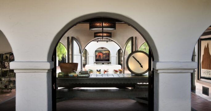
Now fusty old things like doors and hallways seem a luxury. Loggias with repeating arches surround the courtyard of Diane Keaton’s former residence in Beverly Hills. Photo by Scott Frances
CRUMBLING WALLS / A Timeline
1800s: The Urban Rowhouse
Many limestone, brick, and masonry row houses in eastern U.S. cities are built with living spaces on the parlour floor separated by large or sliding pocket doors. Without an open plan, the middle of the narrow home, with windows only at the front and rear, would receive no light and airflow.
1901: The Prairie School
Frank Lloyd Wright publishes a plan for “A Home in a Prairie Town” in Ladies’ Home Journal, which features a fluid, open living space and lays the groundwork for an influential new All-American style. In Chicago’s Frederick C. Robie House (1910), shown here, a central fireplace suggests separation.
1929: The International Style
Richard Neutra finishes work on his groundbreaking Lovell “Health” House, a streamlined three-story open-plan home perched on a cliff overlooking Los Angeles. Considered the first steel-framed house in the country, it marks a seminal moment for the International Style in America.
1945-65: Mass Modernism
Post-WWII, with millions of young families seeking homeownership, developers like Cliff May and Joseph Eichler (who built more than 11,000 homes in California alone) absorb influences from architects like Wright and Le Corbusier and sow suburban communities of open-plan A-frames, split-level and ranch houses.
1965-1985: The Artists’ Loft
In the 1960s artists begin taking over empty buildings in urban neighborhoods, like New York’s Soho, that have been abandoned as manufacturing zones. Residents box in bathrooms and sleeping nooks and hang sheets in the windows for insulation and privacy—the birth of the urban “loft.”
1990s: The HGTV Era
Booming development and house flippers keep the open plan alive as a status symbol among the masses. But some critics start to question whether the appeal is more about cost cutting (fewer walls = less materials) and TV ratings (there’s nothing more exciting than a sledgehammer) than good design.
This is an edited excerpt from an article that appeared in the Wall Street Journal.


