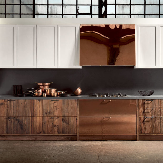
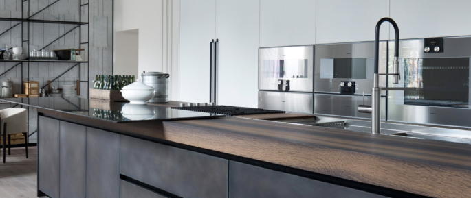
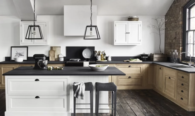
After decades of all-white palettes and high gloss finishes, the rise of charismatic, hue-infused, texture-rich kitchen design is helping homeowners stand out from the rest of the pack. As folk increasingly art-direct their homes and jockey for “likes” on social media, they have become more adventurous with materials. They want earthy, tactile surfaces that visibly wear and tear, have character, integrity, and individuality. It’s a status symbol to create kitchens that feel personality-driven, not store-bought, and colour and texture are a big part of that. You need to read our primer on the latest looks in kitchens – and how to really organise your layout.
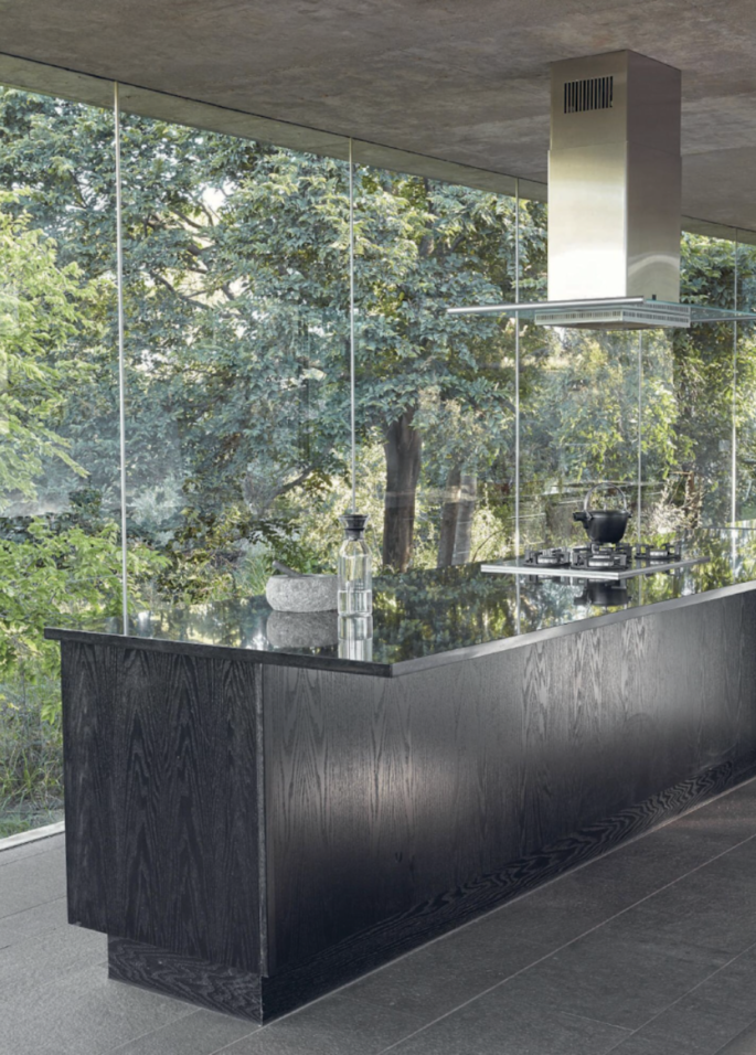
Image via Elle Decor
The 2018 kitchen is more commonly seen as a continuation of the rest of the home, not a sterile, isolated nook—which, given the enduring popularity of open-plan living spaces, few actually are.
Fixtures and faucets are veering away from cold white porcelain and silver metals. Fireclay and granite sinks are a key trend with ‘living’ metals such as antique and unfinished brass or copper tapware transforming kitchens everywhere.
Texture, texture, texture
One of the biggest shifts is that designers are moving away from high-gloss finishes to more earthy, tactile ones. Advances in technology are largely responsible for this; manufacturers are now able to create rich, textured surfaces with all the high-performance qualities of their high-gloss equivalents – something that was simply not possible a few years ago.
These tactile finishes create a warm, natural aesthetic in the kitchen – and are a departure from the cool, minimalist Scandi feel that has dominated over the past few years.
Seek out cabinet doors with interesting textures, kitchen islands with eye-catching, roughened facades, and raised hobs crafted from tactile, heavily grained timbers.
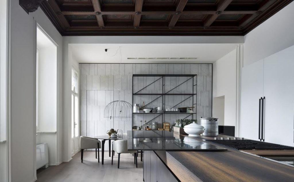
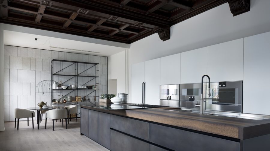
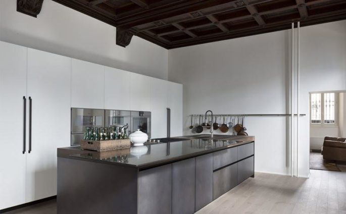
Rich, earthy materials are a key trend such as Salvatori and Boffi’s new 2018 kitchen designs.
The all-white kitchen has had its moment in the spotlight, and being replaced by kitchens in rich, warm colours and sumptuous, natural materials. Timber is central to this new look, with colours that range from honey tones to deep browns, often featuring lively, textured grains. When paired with stainless steel or marble, this creates a sophisticated yet welcoming feel.
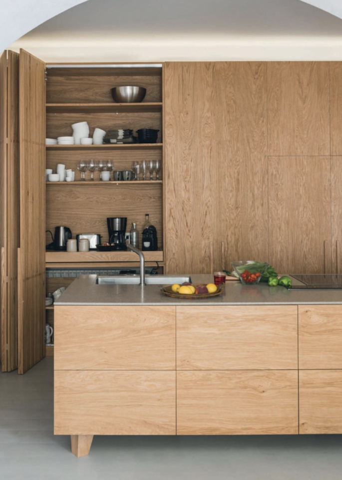
Image via Elle Decor
Marble was another dominant finish. But not the whites and pale greys of the past few years, more rich brown (emperador) and black (marquina) marbles with prominent white veining.
All-in-one cooking islands
Say hello to stovetops integrated seamlessly into kitchen islands. The island is becoming something of the Swiss army knife of the kitchen – a hub that incorporates everything from cooking zone and dining area to storage and display.
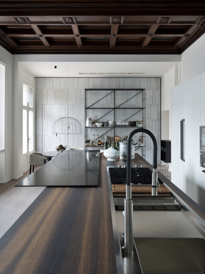
The all-in-one island is transforming kitchens everywhere, such as this Boffi and Salvatori 2018 design.
There are several benefits to having the stovetop situated in this spot – it keeps the cook facing towards guests rather than away from them, frees up bench space around the perimeter of the kitchen, and provides space to accommodate an appliance niche to house items such as a coffee machine or blender.
Suspended shelves
After years of hiding things away in an effort to keep surfaces clear and clutter-free, designers are now fully embracing the concept of open displays in the kitchen. Suspended shelving in timber or steel similar to the kind you see in a commercial bar, which hangs from the ceiling, is becoming de rigeur in kitchens, for displaying pots, pans, and adding a sense of depth and luxury.

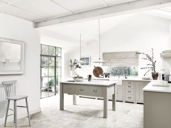
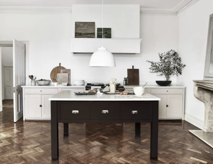
The all-white kitchen is being replaced by rich, earthy colours as we seek individuality and personality. Image via Elle Decoration.
Stainless-steel benchtops
Stainless steel, once seen mainly in commercial kitchens is making a regular appearance in the best European kitchens. It’s easy to see the appeal; stainless steel makes for a perfect neutral that sits beautifully alongside all the rich timbers and brown marbles coming through.
As a material, stainless steel is also tough enough to cope with just about anything a busy cook can throw at it – although be warned, it does tend to scratch.
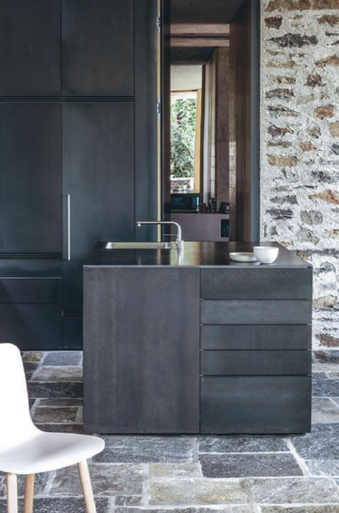
Image via Elle Decor
Slim stainless-steel benchtops dominated, in both brushed and patterned finishes. These were often paired with more textured, earthy materials. This hardy metal also appeared on door facings, creating a visual connection between benchtops and cabinetry.
HOW TO ORGANISE YOUR KITCHEN
Utilize vertical and negative space. Chris Ono keeps cutting boards in a vertical rack, so they take up less counter space than they would stored flat. He can’t install low shelves on one wall because they’d hit someone in the head, but he may add high ones for items he doesn’t use often.
Don’t overbuy. If your schedule allows you to shop more than once a week, you should do so, said Mr. Ono. Everything’s that much fresher; you reduce waste and conserve storage space.
Manage flow. Galen Zamarra emphasizes this point. Prep protein near the stove where you’ll cook it, and make space near the sink to assemble salads.
Pivot. An efficient kitchen is one where nobody’s walking much. Mr. Zamarra’s line cook can pivot from burners to refrigerated drawers to grab ingredients.

