Designing a room is like putting a puzzle together. From optimal rug sizing to how high to hang lights, here are formulas for living rooms None of these pointers are etched in parquet, but even experienced designers largely stick to them. And they’ll help you map out a great living room.
When laying out seating in a living space, Ellen S. Fisher, vice president for academic affairs and dean of the New York School of Interior Design, often conjures an image of three sides of a square for inspiration. Why this shape? Because everyone likes a corner seat and to sit at right angles to others when conversing. Passageways between pieces that will see traffic should be at least 60 to 90 centimetres wide.

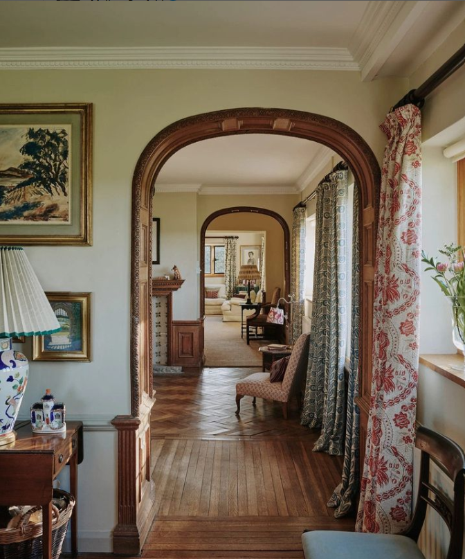
Your curtains look best, and most luxurious, hung floor to ceiling. Image via @horwoodphoto for House & Garden UK, @houseandgardenuk
1. Serve Up Comfort
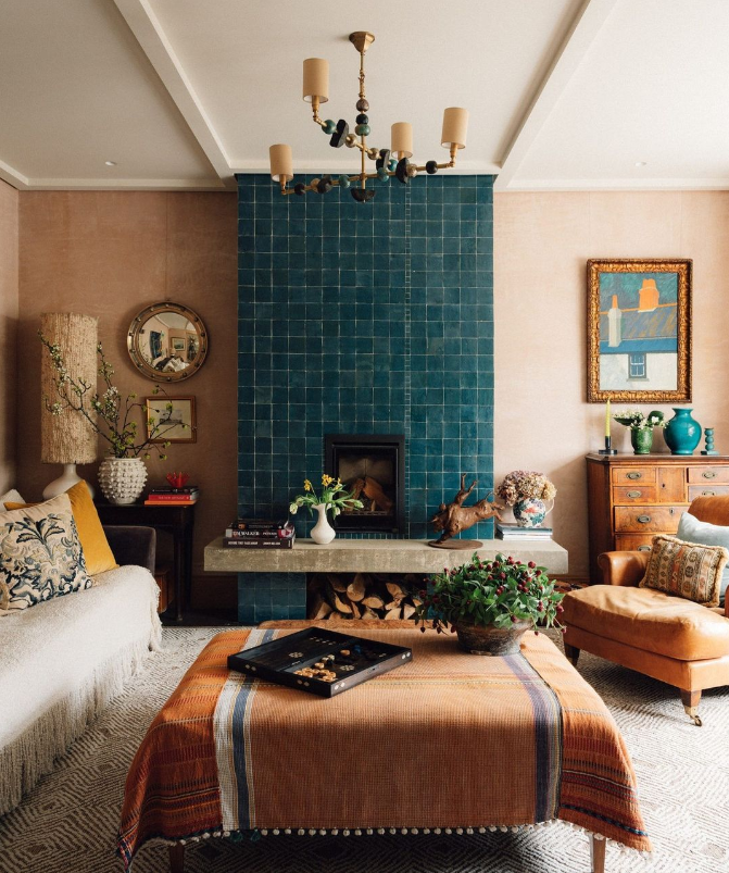
Ideally, a coffee table surface and seat should be the same height (as should a side table and sofa arm). If it’s too small, tall people will have to stoop like drooping tulips just to pick up their evening drink. And place the coffee table no further than 38 centimetres from the sofa. Or even 30 centimetres. That might seem too close, but if the table is too far away, a person on the sofa can’t pick up an hors d’oeuvre, book or drink.
And the table should be one half to two-thirds the length of your sofa, small enough that you can negotiate around it but large enough that people sitting on the ends can still easily access the table.
Optimally, a coffee table is ½ to ⅔ the length of your sofa. Place a coffee table 30cm to 38cm from the sofa. The ideal depth of a coffee table is 45cm to 60cm. The coffee table should be about the same height as the sofa seat.Side tables should be about the same height as the arms of the sofa.
2. Lower the Lights
You probably know to layer your lighting. An optimal scheme includes recessed, atmospheric and task lighting. But are you aware of ideal placements? Table and floor lamps, for example, should be low enough so when you’re sitting, the shade doesn’t go above eye-level. Chandeliers need a minimum of 90cm from the floor to the lowest point of the light but a maximum of 210cm. You see a lot of houses that have double stories—those homes in suburbia trying to be mansions—where the poor fixture is hugging the ceiling and doesn’t feel like part of the room.
The aim is to have walking space while lending ambience, atmosphere and scale to the space. Got sconces? Place them on either side of whatever they’re bracketing – a painting or mirror, aligned with the centreline.
Lower edge of lamp shades should stay below eye-level when you’re seated.Hang ceiling fixtures between 90cm and 210cm from bottom of light to floor. Place sconces at the center line of the object they’re bracketing.

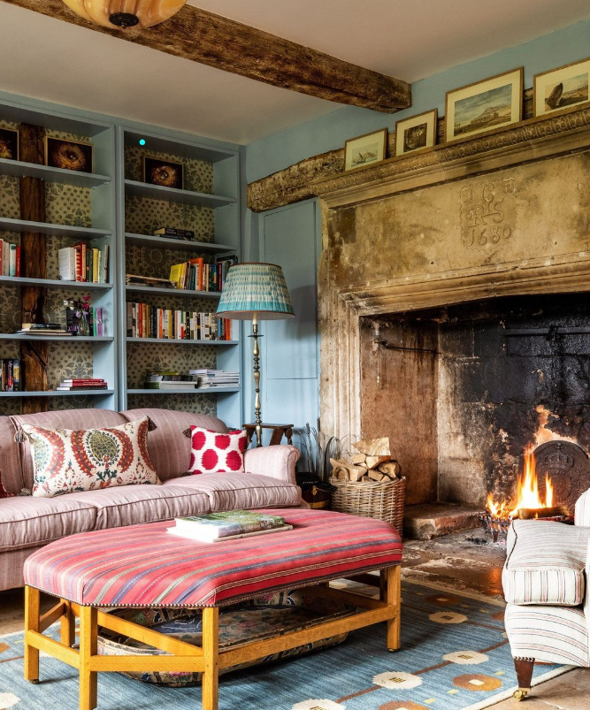
@lucycunninghaminteriors and photography by Harry Crowder for House & Garden UK, @houseandgardenuk
3. Roll Out a Big Rug
You might loathe the bland, taupe wall-to-wall carpet you inherited from your home’s previous owners, but have to admit, it creates a boundless horizon and feels good underfoot. Conversely, a too-small rug is bound to shrink the room. At minimum, the front feet of the furniture should sit on the rug. Better: all four feet.
Take it a step further, and custom-order expansive rugs so they extend to within 30cms – 45cms of the “limiting factor” (such as a wall or fireplace).
4. Slowly With the Sofa
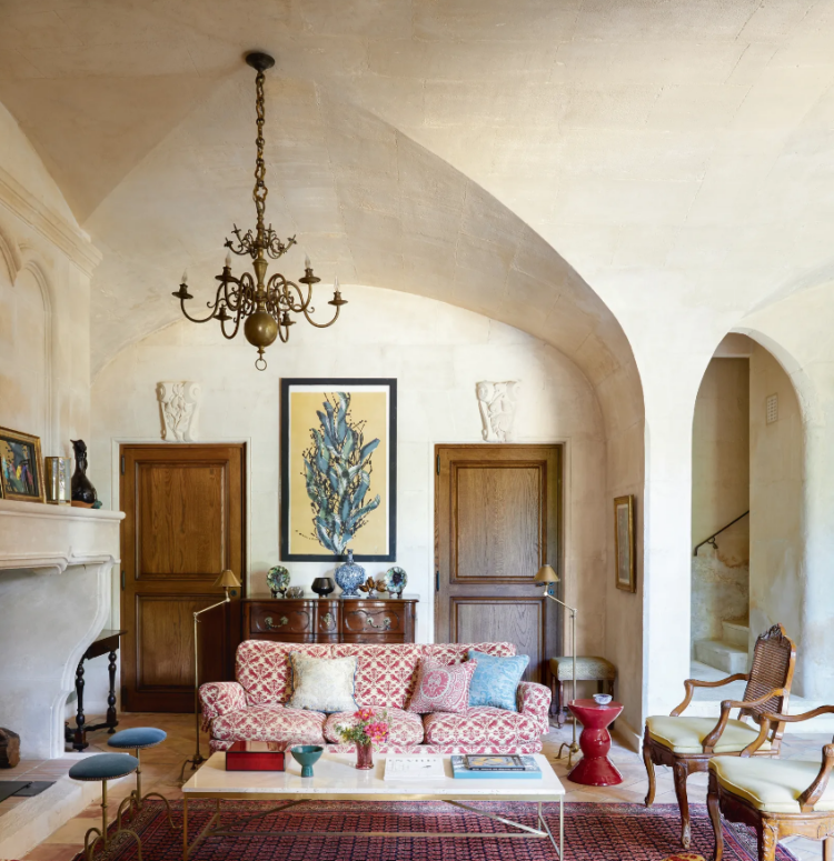
A 1.8m- to 2.4m-long sofa is going to give you the most flexibility in designing a room. As to the depth of the seat, a person can sit back about 20cms before they start to recline, and feel like they might need to be forklifted out. Anything deeper calls for throw pillows. As for the overall depth of a sofa, less than 85cms starts to feel like a bench seat, and more than 96cms creates a footprint that will impact everything else.
A 1.8m to 2.4m long sofa will give you the most design flexibility. A total sofa depth less than 84cms starts to feel like a bench.A sofa deeper than 96cms impacts the rest of the design. A sofa seat deeper than 60cm calls for throw pillows.

Wimbledon house, photograph by Mark Anthony Fox, House & Garden UK, @houseandgardenuk
5. Aim High
If you dream of flinging open silk velvet curtains each morning, like a “Downton Abbey” maid, go high. If you make the splurge, how high should they be hung? It doesn’t matter if you have thousand-foot-tall ceilings, take your curtains as high as you can go, and don’t stop short of the floor. If you have crown moulding, roost your curtain rods just below it. Yes, this costs, but it also makes rooms feel voluminous.
Your curtains look best (and most modern) hung floor to ceiling, and the void of a fireplace is best balanced with art or a vignette similar in scale. Max Out the Viewing
Whether placing a TV, mirror or painting, consider where the observing peepers will be. Hang art so that its center is 150cm from the floor—“the average human eye level. Televisions, since they’re watched while sitting, can be hung as low as 120cm floor-to-centre. Ideal viewing distance? “Roughly 1½ to 2½ times the diagonal measurement of the screen. For example, a 150cm screen is best placed 2.3m to 3.8m from your seats. Any closer and you’ll notice a breakdown in picture quality. Any farther and you won’t feel engaged. Distance from TV to viewer should be 1 ½ to 2 ½ times the diagonal measurement of screen. Place TV 120cm to 150cm from the floor to centre of the screen.


