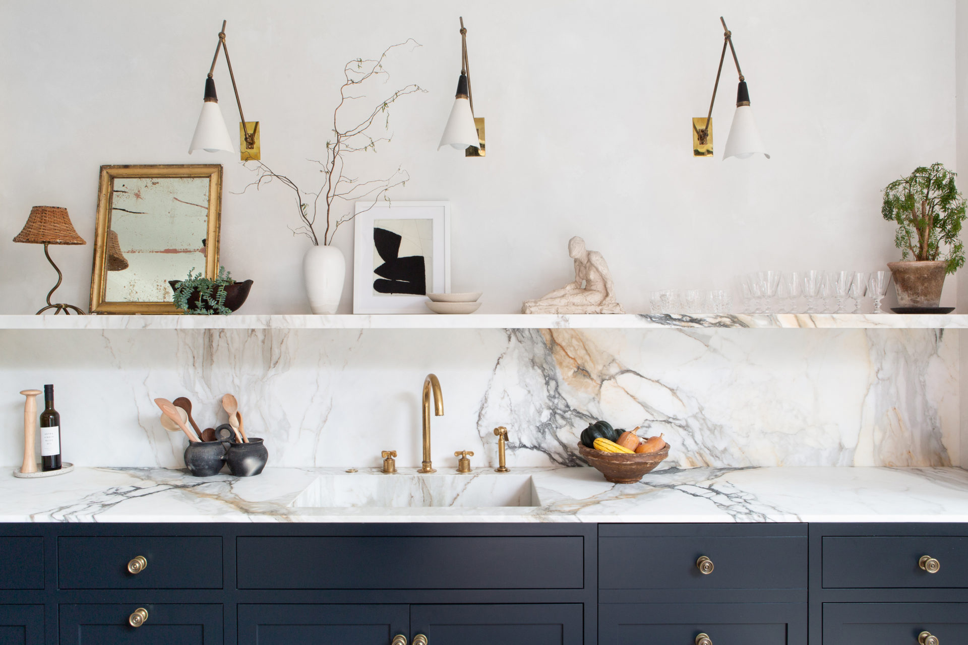
Open kitchen shelving. Sheepskin rugs. Vessel sinks. Design pros smack their foreheads as they recall the most foolish, yet still popular, decorating ideas of the last 10 years, according to the Wall Street Journal.
A thought-provoking look at the least-livable design choices of the past decade, from the impossible-to-clean to the just plain uncomfortable.
Last month designer Jonathan Adler christened white bouclé the season’s “It” fabric. In an Instagram video launching the New York flagship store of his eponymous home-furnishing brand, he commanded, “You must get everything in white bouclé.” The playful authoritarianism worked: His bouclé Beaumont Lounge Chairs are wait-listed. Seemingly in step with his dictate, furniture retailers CB2, West Elm and Wayfair are also hawking seating clad in the pallid, loopy wool. And, at the most recent iteration of the Paris design fair Maison & Objet, countless vendors showed pieces thus upholstered. But the bouclé boom befuddles New York designer Kati Curtis. As she observed, the napped fabric stains and traps crumbs: “If you touch it, it gets dirty.” Read more, ‘What’s Hot, What’s Not- It’s Time To Say Goodbye To These Trends.’
Design history is littered with wildly popular, then regrettable, interior trends.
The squeaky blowup furniture of the early aughts, fueled by Disney star Hilary Duff’s inflatable neon chairs; the fuzzy flocked wallpaper of the 1970s that left areas around light switches irreversibly soiled; the vertiginous swoosh of water beds. Here, designers weigh in on the least-livable design choices of the past 10 years, from the impossible-to-clean to the just plain uncomfortable.
OPEN KITCHEN SHELVING
Unless you like your gazpacho with a hint of dust, or perhaps a dead fly or two with your morning cereal, you’ll need to wash dishes left on trendy unprotected shelves before every meal. Editing your possessions, too, becomes a part-time job. “In order for the kitchen to remain looking clean and organized, all the dinnerware, glassware and serving items have to be coordinated and curated,” said Boston designer Erin Gates. No mugs from your university days. Read more, ‘Kitchen Design Ideas: Inspiration For The Heart of The House.’
Instead: Use open shelving as an accent instead of main storage, perhaps to straddle a corner between sets of cabinets. If you want that light and airy feeling, Gates recommends facing top cabinets with metal wire grills that partially obscure a sadly eclectic cookware collection. Mirrored-glass door fronts will also create an illusion of openness without exposing your styling shortcomings.
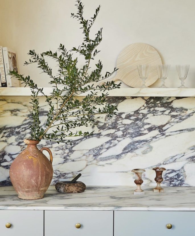
Unless you like your wine or cereal with a hint of dust, or perhaps a dead fly or two, you’ll need to wash glasses and dishes left on trendy unprotected shelves before every meal. Kitchen open shelving via @Eyeswoon Instagram
VESSEL SINKS
These first appeared in upscale homes as a contemporary take on the way ye olde washbasins perched charmingly atop dedicated washstands, but they quickly veered into tacky territory. The oversize bowls showed up in every would-be-posh restaurant bathroom, and trickled into tract developer homes. Mounting the sinks requires an uncomfortably low benchtop height: you don’t want to bend over if you don’t have to. Read more, ‘The 4 Big Bathroom Trends To Keep On Your Radar.’ And it’s hard to vanquish the toothpaste and soap scum that accumulates in the crevice where basin meets benchtop. Read more, ’10 Bathroom Looks for 2020 Picking Up Steam.’
Instead: Opt for classic pedestal sinks, or a hammered metal sink that is undermounted, with no dirt-catching lip.
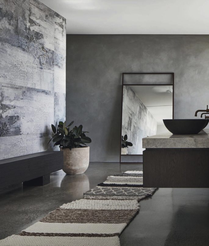
It’s hard to vanquish the toothpaste and soap scum that accumulates in the crevice where basin meets benchtop. Vessel Sinks via Elle Decoration UK.
DINING BENCHES
A side effect of America’s susceptibility to farmhouse-chic décor, the idea of replacing chairs with a bench has its pros. Miami designer Kobi Karp noted the benches’ “ability to disappear underneath dining tables.” But anyone who’s tried to look appealingly alert on a bar stool knows that a backless perch makes slouching inevitable. Adding to the monk-like dearth of comfort: Rusticated benches frequently lack cushions. They are famously heavy and hard to move, and determining the optimal distance between table and bench leaves guests at the mercy of table-mates. Read more, ‘The Most Drop Dead Dining Chairs.’
And heaven help any middle-seat person hoping to leave the table gracefully.
Instead: Rely on the humble dining chair. “They might not seem all that innovative or en vogue…but dining chairs actually offer endless possibilities,” said Mr. Karp.
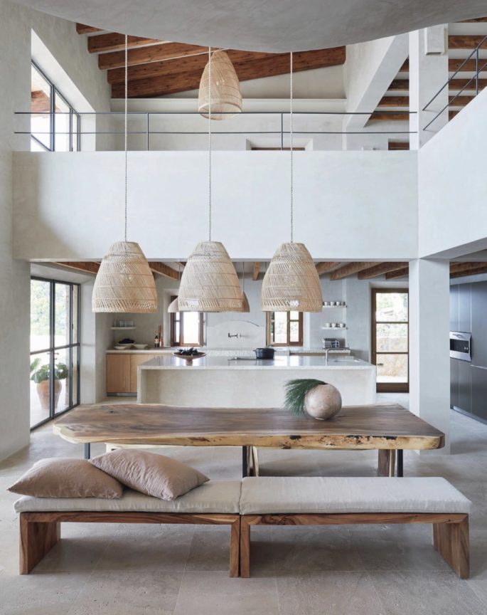
Anyone who’s tried to look appealingly alert on a bar stool knows that a backless perch makes slouching inevitable. Dining Bench via Elle Decoration UK.
UNLACQUERED BRASS
Left unpolished, brass will develop a pleasant patina. But as the deterioration develops over time, your fixtures can soon look like a greasy mess—which design brands deviously spin as “living metal.” Said Parisian design dealer Guillaume Excoffier, “Yes, brass has a warm colour, goes with anything and gives your home an air of 1970s glam, but no one told you that you actually can’t touch brass because any fingerprint will look like a butter stain.” Plus, patina tends to erupt haphazardly and unequally on various pieces, resulting in a room that’s “a hodgepodge of patination,” said Los Angeles designer Madeline Stuart.
Instead: Ms. Stuart recommends polished or satin nickel. Unlike brass, nickel develops a far more reliable patina over time “and never looks tired or out of date,” she said.
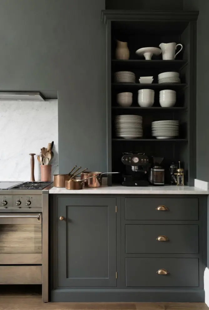
Left unpolished, brass will develop a pleasant patina. But as the deterioration develops over time, your fixtures can soon look like a greasy mess. Image via Devol Kitchens.
SHEEPSKIN RUGS AND THROWS
As featured in magazines and Instagram posts of celebrity homes, sheepskin rugs and throws look pristine yet seductively soft.
In real life, they’re more than likely hiding errant Lego and a strand of
linguine from last month.
The material’s 2-inch long fibres have a tendency to “felt” together over time, creating a permanent matted mess that resembles a feral dog’s coat. “Life is too busy for that—I’m sorry,” said Ms. Hillery, who was tempted to use a sheepskin rug in her own child’s nursery before realizing that a nursery is the last place you should put anything you can never get entirely clean.
Instead: If you love the warmth and earthiness that animal pelts bring, consider a more practical cowhide. “Cleaning a cow is so much easier” than cleaning a sheep, noted Ms. Hillery. A little soap and water can freshen up a hair-on hide.
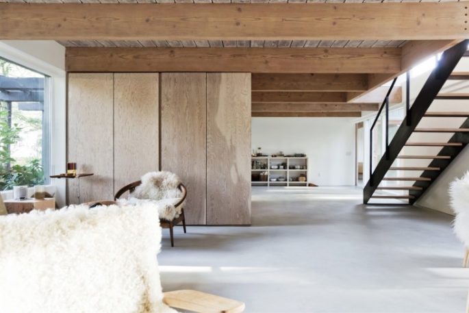
In magazines and Instagram posts of celebrity homes, sheepskin rugs and throws look pristine yet seductively soft. In real life, they’re more than likely hiding errant Lego and a strand of linguine from last month. Image via Remodelista.com
BLACK FLOORS
Yes, ebony boards contrast arrestingly with white walls and are a shortcut to urban sophistication, though it’s questionable why you’d want urbanity in a country house, where this trend also popped up. And, as Ms. Stuart pointed out, “If you’ve ever owned a black car, you know how quickly a dark surface can attract and magnify even a single speck of dust or dirt.”
Also, any chair pulled or pushed too aggressively can leave a scratch as glaring and regrettable as a permanent neck tattoo.
Instead: A rich, deep stain on oak or walnut floors can add depth to a room and be much more forgiving of everyday detritus and your impulses to move furniture.
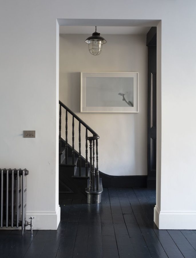
Black floors look arresting next to white walls but if you’ve ever owned a black car, you know how quickly a dark surface can attract and magnify even a single speck of dust or dirt. Image via Remodelista.com

