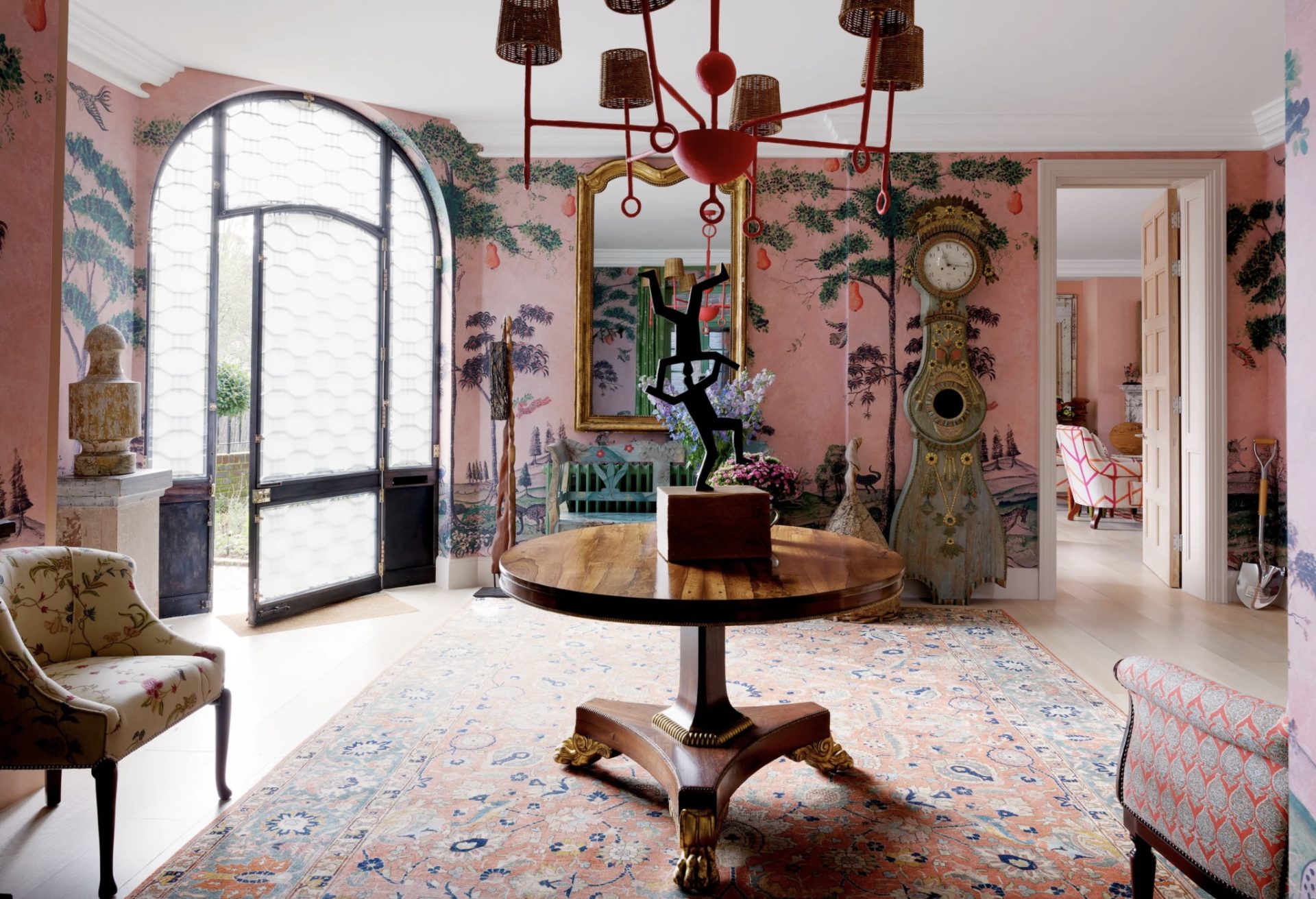
Given the choice, most decorators with a personal design itch would scratch it by moving from one house to another, exchanging one expertly completed realm for a new challenge, ad infinitum. That would not be Kit Kemp, the effervescent British interior designer who is also the creative director and cofounder, with her husband, Tim, of the eccentrically chic Firmdale Hotels, an international hospitality empire composed of 10 smart hostelries and eight fizzy bars and restaurants, stretching from London to New York City. “I’ve lived in other places before, but I’m going to stick with this one,” she explains. “I’m no quitter.” Read more, ‘Can You Design A Happy Home? It’s Easier Than It Looks.’
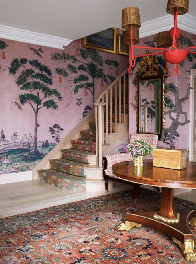
In the entry, flat-weave rugs were fashioned into a stair runner, antique mirror.
The address to which Kemp has pledged her devotion for 20 years and raised three daughters is a three-story, grey brick, vaguely medieval house on a cul-de-sac near Hyde Park, around the corner from Royal Albert Hall and a couple of blocks off heavily trafficked Kensington Road. Still, she says, “it’s almost quieter here than in the countryside.” Since the couple bought the 1930s property, the L-shaped residence has undergone a series of transformative adjustments, all the better to express, at any particular moment, what the designer describes as “the way we live now.” Dormers have been added, and windows have been enlarged. Early on, the garage at the rear of the property was remodeled into an apartment for a nanny; today it serves as a gym. Read more, ‘This Is The First Thing An Interior Designer Notices When Entering A Home.’
“I’m always having a little experiment with this or that,” says Kemp, who has called her style colourful and carefree. “My poor husband has to put up with it.”
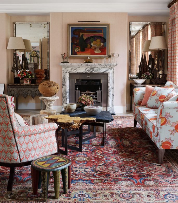
A Mark Gertler painting hangs over the drawing room’s neoclassical mantel. Cocktail tables by Tom Stogdon for Kit Kemp; African side table; antique rug.
A decade ago, the empty nesters’ kitchen, located at the front of the house, was relocated to the rear of the building, taking over what had been an elegant oblong drawing room. “[AD100 decorator] Robert Kime told me that he always advises clients to put the kitchen in the best room of the house,” Kemp notes of the space, where custom-made cabinets follow the curved walls. “Everybody ends up in the kitchen anyway.” Off the kitchen, she and Tim built a conservatory–cum–dining space, a glass-walled volume that connects to a welcoming stone terrace. Elsewhere, the dramatically beamed attic became a yoga studio—it’s since become the master bedroom— as well as home to the couple’s gleaming grand piano, a beloved fixture, even though Kemp admits, “We both play extremely badly.” For another house tour read more, ‘Elle Macpherson’s Fashion Art-Filled Miami Home.’
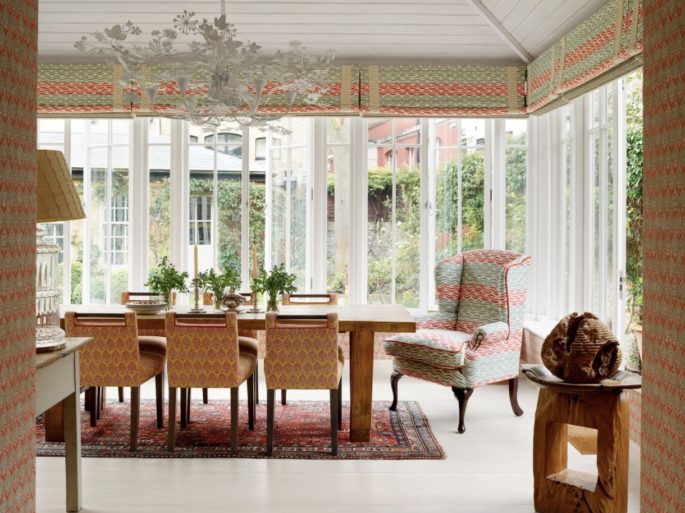
In the dining room, an armchair and the pelmets are made of the same Raoul Textiles linen. A Tord Boontje chandelier hangs about the oak dining table with chairs by Kit Kemp; antique Turkish rug.
The Kemps’ most recent domestic metamorphosis was completed last summer and resulted in the reconfiguration of the ground floor, as well as a comprehensive redecoration. “It’s taken us years to be brave enough to knock down all those walls,” the designer says. The glamorous bronze-and-glass front door was moved to another location, where it opens into a new entrance hall big enough to handle the full repeat of a Kemp-design landscape wallpaper for Andrew Martin that resembles the naive murals of itinerant 19th-century American artist Rufus Porter. (Kemp also used it in private dining rooms at Firmdale’s Whitby Hotel in New York City.)
As for the original entrance hall, Kemp combined it with two sitting rooms to create a sunny 30-by-22-foot drawing room that stretches from the front of the house to the back and features two replaces with marble mantles on one long wall. The space bleeds into the kitchen, erasing a traditional boundary in favour of something more laid-back.
“The whole floor is a walk-through now,” Kemp observes.
“It’s not an original idea, but it’s just terrific.”
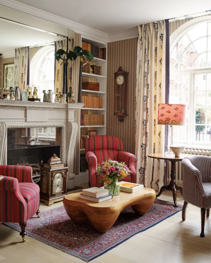
Though the house feels different than it was in its previous incarnation, what hasn’t changed is the high-octane spirit.
Bright colours and bold patterns come together in welcoming abandon, as they do at Charleston, the country home of Bloomsbury artists Vanessa Bell and Duncan Grant, one of Kemp’s inspirations. “They made it into a hub for intellectual and artistic people who never wanted to leave,” the designer says, noting that the still life above one of her drawing-room mantles was painted by Mark Gertler, a member of the provocative and highly creative Charleston circle. “What more can you say about an interior that makes you feel that way?” For another hour tour read more, ‘Inside Nate Berkus and Jermiah Brent’s NYC Family Townhouse.’
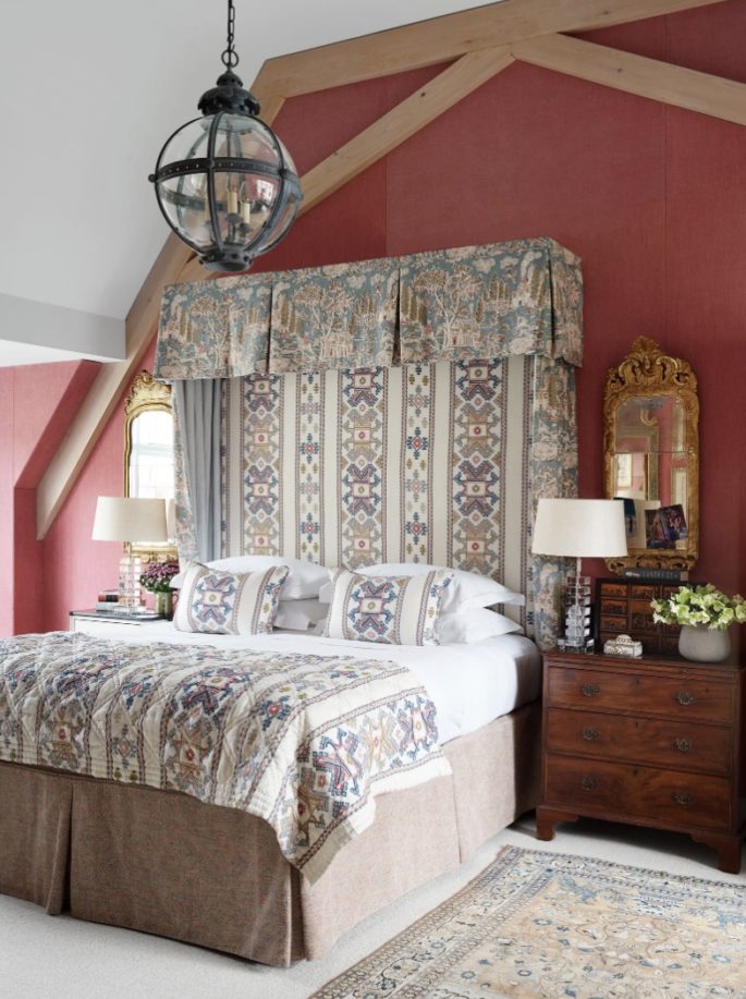
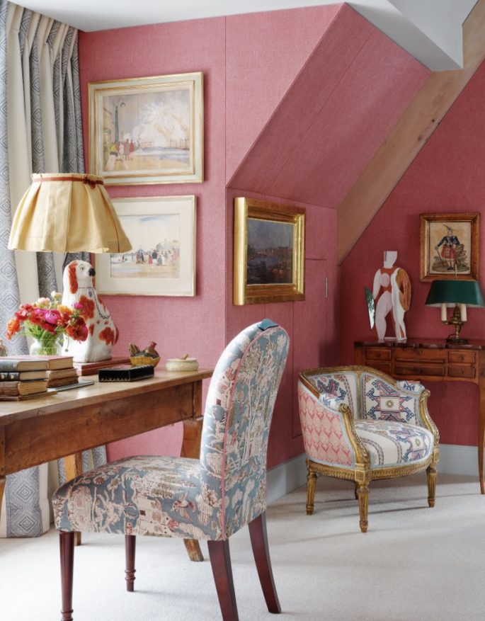
An outsize herringbone motif in hot pink and orange climbs some of the drawing room walls and curtains its arched windows, joined by Oriental carpets, a painted African stool, a sofa dressed in a cartoonish pomegranate print, and an 18th-century Spanish chest on stand. “An old piece of wood is grounding for a room,” Kemp advises. The kitchen’s cabinets, formerly limed oak, have been painted robin’s-egg blue, while French doors to the garden, various window frames, and bookshelves on a library-like upper landing—the latest perch for the grand piano—are now jade green. The entrance hall’s woodwork, on the other hand, is a marzipan shade of pink. Up under the roof, the master bedroom is wrapped in a madder-red fabric with the radiator rouged to match. Read more, ‘How To Decorate Your Shelves Like An Interior Designer.’
“Colour makes you happy,” Kemp says. “If you put your key in the lock and open the door to a bit of joy, then so much the better.”
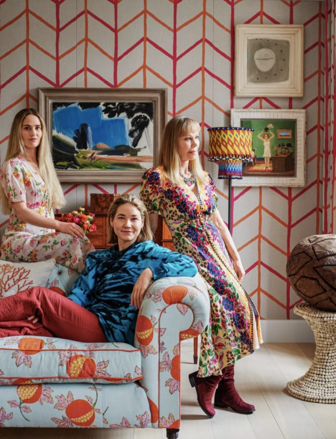
Kemp (right) and her daughters Minnie (center) and Willow lounge on the drawing room sofa, which wears a linen by Raoul Textiles.

