Curtains, rollers, romans, swags, valances—where do you start? We share all the advice you need to achieve smart window decorating, including tips on new technologies.
People don’t think they’re important,” says Ellen Fisher, dean of the New York School of Interior Design and author of “Home: The Foundations of Enduring Spaces” (Clarkson Potter). Unlike a fireplace mantel, which most people see as a decorating opportunity, windows aren’t perceived as a place where a room comes alive,” Fisher says, But they can be. Window treatments to rooms what the perfect handbag is to an outfit. Read more, ‘Curtains 101: Four of The Best.’
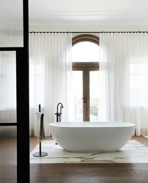
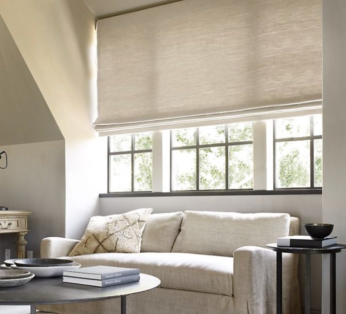
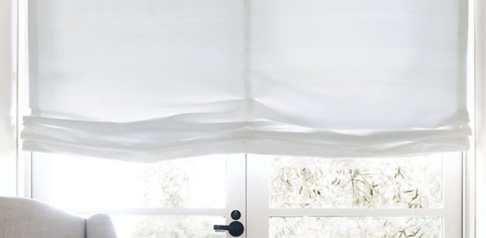
Design pros, fall into two camps on the subject of window treatments. The first champions simplicity. The key to a great blind for them is a sheer Roman that will soften light and obscure subpar views. The idea is to treat the window and wall as one seamless surface. They might even leave windows bare, especially those that look out on balming nature. “Often light is the magic ingredient in an interior,” says Ray Booth, a principal at Nashville-based architecture and design firm McAlpine. “We strive to keep drapery gauzy and fresh.
Heavy window treatments are like a person in need of a eyelid lift.
Some designers even discreetly hide curtain hardware in the ceiling or behind woodwork. Worth noting: Simplicity needn’t look meagre. Some in this cohort approve of elegantly pleated panels that cascade from ceiling to floor, as polished as Jackie Kennedy in a shift dress. You can even correct poor dimensions (small window, low ceiling, and so on) with simple window treatments allowing your blind to be as wide and as high as the window should be, and not as it is. Read more, ‘How to Create a Serene Home.’
The opposing, maximalist camp embraces pattern, layers and ornament. Like couture. “We used to only do single-fabric, French-pleated curtains or simple Roman shades,” said New York designer Kati Curtis, who recently finished off an interior by installing teal cashmere sheers bedecked in embroidered trim and pompom fringe. “We haven’t done things like this since the 1980s and ’90s.” Designer Kirill Istomin, who splits his time between New York and Moscow, extols the over-the-top and considers window treatments “an opportunity to frame a room with something unique and fun.” One of his tricks: topping a window with a squared-off, mirrored “pelmet” (a valance variant) to conceal curtain hardware, an idea he stole from a 1920s room created by Rose Cumming, Marlene Dietrich’s decorator.
Both sides of the curtain divide, however, value innovation. Blackout roller shades, once grimly plain and dense, can now be printed with patterns so charming you’d never guess the material was brawny enough to block light. Curtain panels that absorb sound now come in implausibly gossamer sheers. And motorised shades and curtains bring wizardry to décor.
Here’s an alphabetical compendium of methods and products that designers press into the service of dressing windows.
A is for Acoustic
Once curtains heavy enough to muffle sound were dense as a coffin lining. Carnegie fabrics says its diaphanous sheers reduce incoming and outgoing racket by up to 65%. Alphacoustic Sheers, carnegiefabrics.com
B is for Bare
Go nude where you like the view and don’t need privacy. “Curtains would have hampered the connection to outside, which is what this space is about,” says Bunny Williams of the rooms, featured in her new book “Love Affairs with Houses” (Abrams).
C is for Contrast Tape
Trim, designed to edge a curtain is like a statement necklace with a little black dress – Acanthus Tape by Celerie Kemble for Schumacher, orienthouse.net.au
D is for Drama
Drama can be anywhere—wherever you live. The trick: balance. You can lighten the effect of grand velvet curtains with clean-lined wicker furniture.
E is for En Suite
Using the same pattern on both walls and window treatments to envelop you, even in the bathroom. Consistent pattern helps to keep the eye calm and focused.
F is for French Return Rods
Seek out curtain hardware that curves and hugs the wall, blocking light and adding polish. Avoid ornate finials and let your lush fabrics take centre stage. French Return Hardware Set, from $45, ballarddesigns.com
G is for Green
Thanks to chemical-free vegetable dyes, you can find organic-cotton panels in different earthy hues. Direct-to-consumer company Barn & Willow delivers custom orders within 10 days, barnandwillow.com
H is for Hand-Painted
Artisanal textiles bring a human touch to a room – especially when used for window treatments with high-contrast designs for drama and softly variegated ones for subtlety. Seek out designs like Black Silk Taffeta with Hand Painted Flowers, bandjfabrics.com
I is for Integrated
For a fuss-free look, create the illusion that curtains come from the ceiling. Or go one step further, dyeing curtains to match walls, which allows the material to recede into the background and gives architectural details permission to speak.
J is for Jabots
Linen swags and jabots, the fabric that falls vertically, can give the large space above windows an architectural quality. They provide swagger, lightness and wit.
K is for Kinship
Knoll Textiles looked to fashion, decorating’s sibling, for their Contour Collection, which includes a range of polyester sheer fabrics for curtains, inspired by a Christian Dior couture coat in the Spring 2018 collection. Bounce, knoll.com
L is for Linen
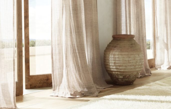
We love linen for curtains because it naturally creases and infuses texture to a space with a lived-in, effortless feel. Seek out Annie Selke’s new line of ready-made linen panels that come in happy prints and pastels. Pine Cone Hill Lush Linen Curtain Panel, annieselke.com
M is for Motorisation
Window treatments can obey voice and app commands. One of the design industry’s go-tos for shade gizmos: Hunter Douglas’s PowerView Motorization, which is now compatible with Apple Home Kit. From USD $850, hunterdouglas.com
N is for Netting
There are all kinds of lovely translucent linen, wool and polyester curtain options that are a fresh twist on the traditional sheer, providing another layer of textural warmth.
O is for Ornamentation
We like the idea of layering cashmere sheers trimmed in patterned tape under a set of embroidered linen curtains edged in pompom fringe: People can’t seem to layer in enough details these days. Gypsy Fringe, lingerlongertextiles.com
P is for Pleats
Pleated fabric in an elegant, tailored option – to attach curtains to rods, like grommets.
Q is for Quaint
A combination of shutters and Roman blinds are great for privacy, letting light in and you can still be creative with fabric and trim.
R is for Roman
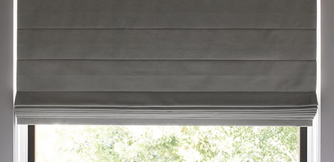
When there’s no room for fabric below a window, go for Roman shades – great if you have to work around a heater, as it still softens the space.
S is for Sheers
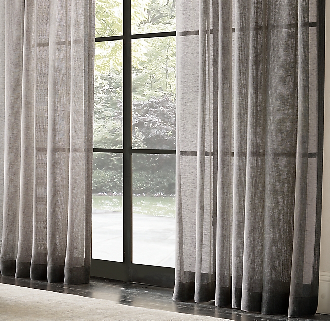
Good for obscuring ugly views while still letting in light, sheers now come in all kinds of printed and patterned versions with great affordable options at most chainstores.
T is for Tiebacks
They can be a little design surprise.
U is for Unexpected
Go graphic and bold when you want to add life and lightness to a more subdued space. The effect can be bright and sophisticated without feeling whimsical or feminine.
V is for Valance
Valances, usually made of fabric, box off the messy tops of curtains. Cornices or pelmets, can be upholstered wood or more structured in mirror. They are clever way to create the perception of interior architecture in a room.
W is for Woven Wood
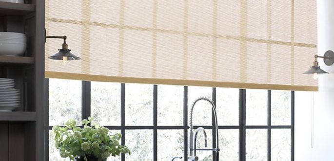
We love how matchstick shades stipple light. They add instant texture, dimension and can be mounted inside or outside the window recess. Plus, they’re affordable.
X is for X-tra Large Prints
Try using large-scale motifs or fabric repeats for rooms with otherwise simple forms and patterns.
Y is for Yours Alone
Danish company Kvadrat’s customisable Ready Made Curtain systems are newly available at Design within Reach. An online Configurator helps you choose colours for the hanging mechanism, pegs, cords, and 16 hues of fabric.
Z is for ZZZZZZ
Alexa Hampton’s new collection of blackout shades for the Shade Store—in perky colours and lively motifs—defy the notion that only heavy, murky materials can guarantee total dark.
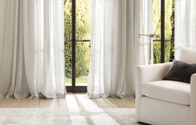
One relatively achievable formula: ample folds of sheer curtains that break on the floor.
The 3 Curtain Mistakes to Avoid and How To Avoid Them:
1. Hanging Curtains Too Low
People often install panels flush with the top of windows. Curtains hung well above them can make a low ceiling look higher. That area tends to be dead space anyway.
2. Skimping on Length
Be sure curtains graze the floor. Otherwise, said San Francisco designer Heather Hilliard, “it’s like seeing a man whose pants are too short and don’t break at the shoes.
3. Skimping on Width
People hang panels that clearly would never be able to close. Get enough fabric and use a wider bar to create the illusion that a narrow window isn’t so small.

