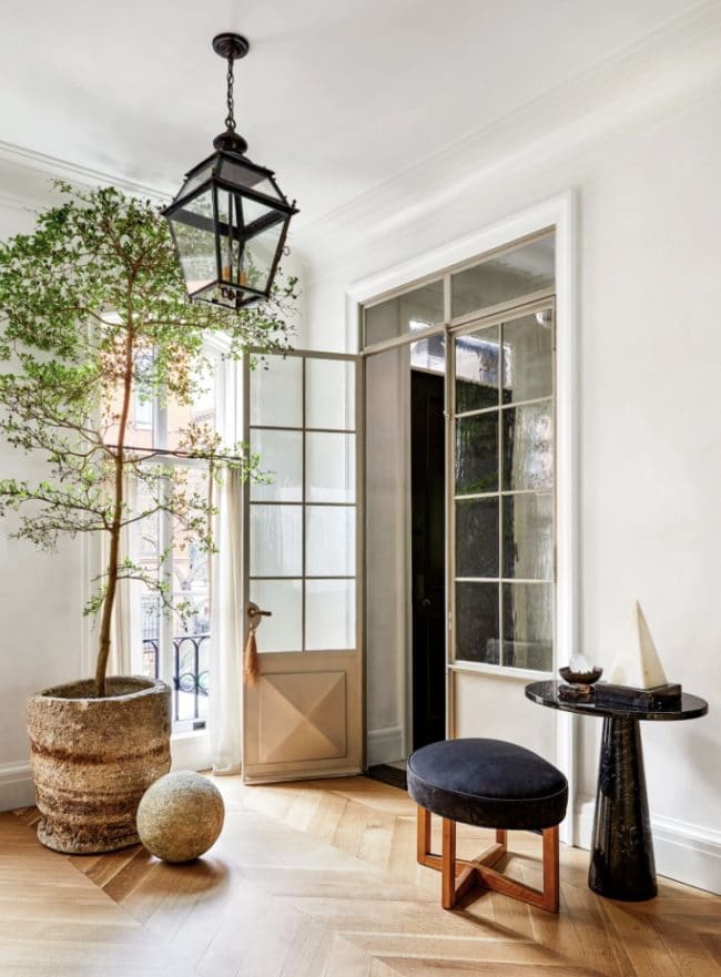
There’s no point in beating around the bush. Nate Berkus and Jeremiah Brent want you to know they’re embarrassed. Chastened. “Humiliated!” says Berkus.
Seated in a pair of armchairs in front of a blazing fire in their new West Village town house, the married designers look content and perfectly at home—if a little sheepish. After all, it seems like just yesterday when they moved into what was supposed to be their dream home, a nearly 9,000-square-foot Spanish colonial in Los Angeles. Fans of their TLC show, Nate & Jeremiah by Design (and readers of AD’s January 2018 story), witnessed the couple gushing over the house’s sun-drenched rooms, wrought-iron balustrade, and 200-year-old oak tree in the backyard. The house, they proclaimed, was where they and their then-two-year-old daughter, Poppy, would “put down roots.”
Ruh-roh. Now, just two years later, they’ve sold the house, edited down their belongings, and booked it back to New York, the city where the couple started dating and first made a home together. “One thing I can promise you,” says Berkus, leaning forward in his chair, his blue eyes twinkling, “is that I will never again tell a publication that a house is my ‘forever home.’ ” “We learned our lesson,” chimes in Brent. “We shan’t be saying that again!”
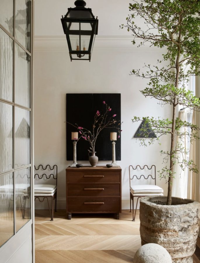
A pair of Jean Royère-style side chairs flank a 1930s dresser by Axel Einar Hjorth. 18th-century stone table lamps; triangle artwork by Ricky Swallow.
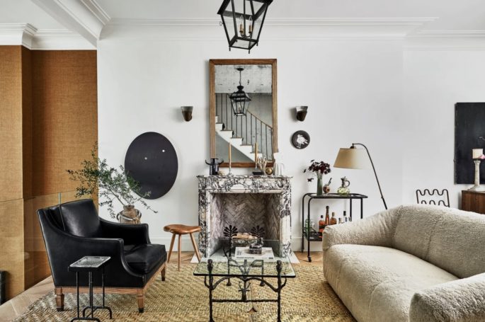
In a sitting area, a 1940’s armchair and shearling-covered sofa surround the 1960’s cocktail table by Diego Giacometti. Painting by James HD Brown.
The photogenic first couple of TV home makeovers had originally moved West following the death of Berkus’s father in 2015. Berkus, who was born in Orange County but mostly raised in suburban Minneapolis, wanted to be closer to his siblings out in Southern California. “And we were ready for a new adventure,” he explains. During their time there, they filmed three seasons of their show, welcomed the birth of baby Oskar (now two), and continued to grow their separate design businesses. (Berkus’s headquarters have always been based in Chicago; Brent kept his New York practice going, and also opened a Los Angeles office.)
But almost immediately, Brent missed the energy and street life back East. “I felt untethered in Los Angeles,” he says. “It didn’t feel like us.”
He also became convinced that Poppy, now five, and Oskar would have a richer experience growing up in the urban density of New York. “I realized that Poppy talked to the same 11 people every day,” he says. Berkus (eventually) came around, too. “I realized that New York would never get out of Jeremiah’s system,” he says. And he knew that he personally would be just as happy either way. “Jeremiah always says, ‘It’s either the place or the space that holds you.’ For him it’s the place,” he says, gesturing toward the windows and the city beyond. “For me it’s the space.”
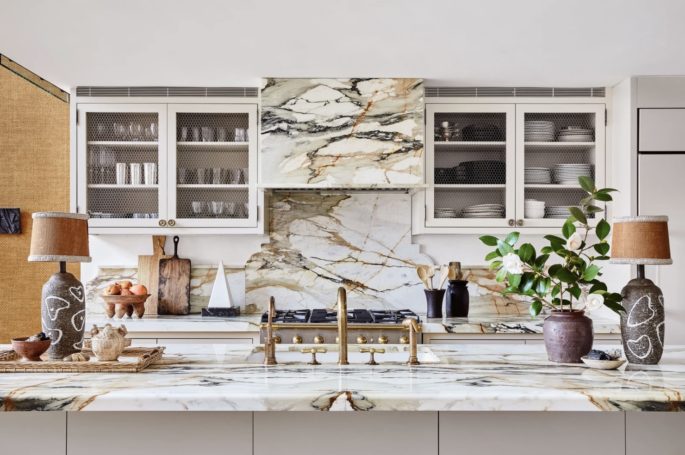
In the kitchen, the custom hood, backsplash, and countertops are made of Calacatta.
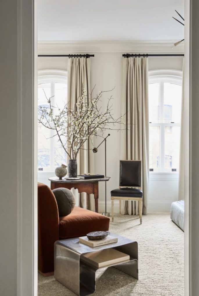
In the master bedroom, a steel table by Maria Pergay sidles up to a chair by Nate + Jeremiah for Living Spaces, upholstered in a mohair velvet by Cowtan & Taut. Jansen side chair; 1960s floor lamp.
Fortunately, transforming four walls into a home is something Nate and Jeremiah know a thing or two about. When the couple saw this 3,400-square-foot 1899 townhouse, they immediately agreed it felt like them—or, at least, that it had the potential to. It had just undergone a complete gut renovation, so everything from the wiring and plumbing to the newly tiled bathrooms was in pristine condition. But the house had been so stripped down that it also felt somewhat “sterile,” as Brent puts it. “Our job was going to be to give it some soul again.” They started by designing a showstopping double-height bookcase in white oak that would not only warm up the living room but also provide a much-needed place for their books, framed family photos, and pottery. “I didn’t want to live without those picture frames—they’ve been in every home I’ve lived in for the past 15 years,” says Berkus.
The white oak bookcase is a small feat of engineering; it is so heavy, the upper portion had to be bolted to the exterior wall. “It’s my favorite of everything we did here,” says Berkus. “It set the tone.”
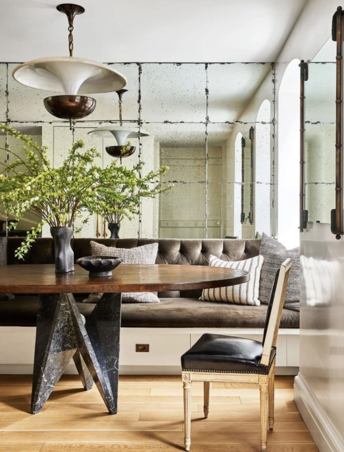
Custom mirrors by TG Glass works line a wall in the dining area, where the table has a 1980’s Italian base and a custom walnut top by Dos Gallos. 1950’s Jansen side chair; C. 1950 pendant.
In fact, one could say the bookshelf is a distillation of the designers’ twofold approach to the whole house: adding texture, detail, and architectural touches (through eye-catching mantels, wallpaper, and vintage light fixtures), while also taking on the dilemma of space management. Because, when compared with a palatial Southern California estate, an 18-foot-wide townhouse is relatively… cramped.
“Painful” is how Berkus, the family’s alpha layerer and collector-in-chief, describes the editing-down process.
They moved some furniture to their offices, other pieces to storage, and sold still more on Berkus’s 1stdibs shop. They winnowed down their cookware. They off-loaded racks of clothing to The RealReal. “Our old living room had 30 pieces of furniture,” says Berkus. “This one has six! But what you see is the best that we’ve got.” And with the designers’ addition of basket-weave grass-cloth wall covering, an 18th-century Italian mantel, and a plush mohair rug, the result is as handsome as rooms get.
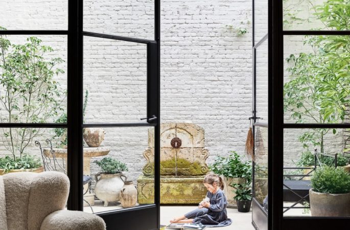
Poppy plays in the courtyard, which features a 17th-century French fountain and an 18th-century stone table.
Upstairs, the master suite didn’t offer quite enough closet space. “Bill Blass said that dressing rooms should be large and bathrooms should be small,” says Berkus. In lieu of ripping up the bathroom, they stole footage from the bedroom area to accommodate more storage. And while the resulting sleeping chamber may seem small, it embodies tranquility at its coziest, with chalky plaster walls, looped ivory carpeting, and a sculptural fluted plaster cabinet they designed to hide the TV.
“We don’t need a huge bedroom with, like, 20 seating areas,” says Berkus.
“Yeah, like, who’s coming over?” adds Brent. Nobody—except, of course, Poppy and Oskar, who much prefer wreaking havoc in their basement playroom or marching around the kitchen island as Brent makes their favorite pancakes. And when everybody starts going stir-crazy, well, that’s fine too. “The best part,” says Berkus, “is we just turn the doorknob and the whole city is right outside.”
*This is an article from Architectural Digest. Text: Catherine Hong. Photography: Nicole Franzen. Styling: Colin King.
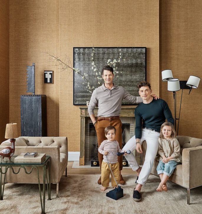
The family gathers in the living room. Oskar (left) and Poppy wear clothing by Caramel; artworks by (from left) James HD Brown, Lyman Kipp, and Simon Mathers.

