There’s no better time to breathe new life into your home than Spring, a season that makes you want to banish the hoarding of winter and embrace a future full of interior design possibilities. Once you’ve got all of the cleaning and organizing under your belt, redecorating is the logical next step, whether that means a coffee table refresh, a complete bedroom makeover or rearranging your furniture. Here’s some of our favourite decorating fixes to transform your rooms into chic expressions that speak to and of you – plus everything you need to get your interior design projects off the ground in style.
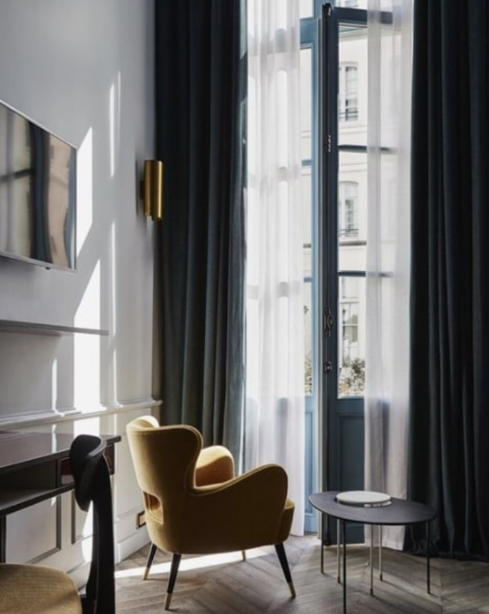
Curtains and blinds are another layer of architecture that can make a room taller, wider, bigger and extend the space. Image via www.gubi.com
DON’T BUY ANYTHING…YET
Wait until you do a big chuck-out. The best way to improve your interior is to get things out. If you haven’t used something in several months, get it out, (the only exception is seasonal things).
BECOME COLOUR CONSCIOUS
Step back and look at your rooms, in particular how the colours co-ordinate. Don’t focus on the walls, look at the small things such as lamp bases and shades, side tables, painting, cushions and even magazines. It’s in the accessories that most problems lie. Every object in a room adds its colour ‘noise’. Most lived-in houses, with their random accumulation of colours are a cacophony. Look and listen to yours. Decide on an accent colour for each area. It might be suggested by a rug or painting. Try to echo that tone in flashes everywhere: a vase, a pile of books, a cushion, a tablecloth. Keep other colours to a minimum, so that your accent colour strikes its note. What could be more chic than a room with white plaster walls, white timber shelves piled with white china, white muslin curtains, a white linen slip-covered sofa, and a basket of red apples. Colour is the easiest way to update a room. By changing key components, you can give the illusion of redecoration.
A QUICK BRUSH UP
Don’t be scared of settling on a colour scheme. The rules are simple. Establish your base (main background colour) to use in full-strength throughout a room, then another colour that tones with it, and an accent colour to add drama in small touches. As a rule, use the strongest colour in the smallest amount. Matt trims are more chic than gloss, satin enamel is best. Shiny shows the dust and chips easily.
GO WITH THE FLOW
Work with the character of rooms rather than force a colour scheme on them. If a space is naturally dark, white walls could strike a false note or look dinghy. Decisive opulent notes like chocolate or dark blue will probably work better.
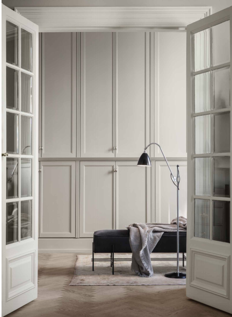
Work with the character of rooms rather than force a colour scheme on them. Image via Gubi.
REARRANGE YOUR FURNITURE
Use your furniture in different settings. Move an ottoman into an upstairs bedroom or take two chairs out of the dining room and allow them to flank a fireplace – and then get going with the paintings. Display your collections in a different way or group similar objects together – all your glass on a sideboard, all your hats on a wall. When massed together even mundane things achieve drama.
MAKE AN ENTRANCE
Fix your front door, you never get a second chance to make a first impression. Splash out on a grand new doormat, clear out the wilting plants and other detritus, and put something dramatic by the door – a huge empty urn or two big lollipops of topiary. If flooring inside the door is worn, tear up the first metre or two. Buy some sisal matting, or carpet and get it fitted, fast.
DEFINE YOUR PALETTE
Pick your palette, (materials and colours) for your entire interior, and stick to it. You can always extend it, but do so consistently. In other words, if you decide that you’re going to use both brass and chrome in your home, don’t then suddenly throw in copper, unless you do it in more than one room.
WHEN USING COLOUR
When using colour, use it in planes (i.e. paint entire walls from architrave to skirtings). Don’t pick out the detailing in contrasting colours. It looks (and feels) old-fashioned.
WINDOWS ON THE WORLD
If you can’t raise your ceiling, literally, consider raising your window treatments to create an illusion of height and give it a grander feel. Window treatments are often underrated and people overlook the impact they have on a space. Curtains and blinds are another layer of architecture that can help correct a potentially not-perfect window shape, to make a room taller, wider, bigger and extend the space. Just hang them wider or longer than the actual windows’ dimensions, to the size the window should be.
FLOORING
Spend as much as you can afford on your floor. You can sit on a box on a beautiful floor and be happy, but nothing will ever improve a cheap floor. Flooring underpins everything, and outlives paintwork, so it’s best to stick to something natural and muted that will work with successive colour schemes as it’s not easy to change. Remember, it has the biggest impact on aesthetics, practicality and budget. What does your house need?
THE DETAILS THAT MATTER
Invest on door hardware, light fixtures, tapware, even light switches. Details that get used daily need to be not only good-looking, but durable. And you should never skimp on things you notice or touch every day.
ACCESSORISE
Decorating a space is like getting dressed. Accessories are the element that separate your room from everyone else’s and give it individuality. Don’t jam-pack surfaces. Mix styles but keep things organized. If you have lots of small objects, then a tray is a good way to organize them. It’s about making your collections feel edited and well displayed.
EASY UPDATES
Replace one group of old, mismatched accessories with a new lot in your accent colour. New cushions, or a pair of great vases, a beautiful table lamp, artfully placed, will make your house look as if you have spent a lot more than you have.
BE STRICT WITH YOURSELF
Small spaces are all about editing. The more pieces, possessions, and patterns you have in a room, the more cluttered it will feel. Avoid too many knickknacks or at least group them so they read as an installation. Ditto with art; concentrate your framed pieces on one or two walls. Avoid busy patterns and overwhelming colours. The bottom line is you need to be strict with yourself, (actually, this concept applies to all spaces), and intentional about everything that goes into the room. If you go for the wallpaper accent wall, then keep the rest of the room simple. If you need that huge oil painting in your living room, try having it be the only art in the room.
GIVE CHAIRS THE SLIP
Do what the British aristocracy does when things get hot, slide slip covers in linen, cotton or canvas over your existing chairs and sofas. They dramatically alter a room bring harmony to discordant pieces of furniture and make everything relaxed elegant all for a fraction of the cost of upholstery. Call an upholsterer for a quote and have covers made up in fabrics you can pop in the washing machine. Plain colours, neturals and stripes or checks all work best.
SURPRISE YOURSELF
Use banal things in original settings. A bunch of pencils in a squat vase, a basket of shiny apples, a cauliflower or cabbage in the middle of the table are more chic than flowers.
DON’T DIY
Forget all those television home make-over shows. A tradesperson will do it better, faster, and cheaper. They’re not emotionallly attached and they’ve got a financial incentive to finish the job. Nothing is worse than ‘a quick paint job’ that takes six months. A professional will be in and out in a couple of days.
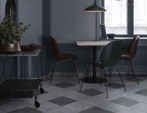
Define your palette, materials and colours and stick to it. Image via www.gubi.com
THE RULE OF THREE
Always work with uneven numbers on tabletops (consoles, desks, bedsides, coffee tables) – think one, three or five. Start with a ‘horizontal’ object – such as a book or tray – then add something tall and vertical – like a vase or candlestick, followed by something low and bulky – such as a paperweight or bowl. It’s foolproof.
CHANGE YOUR COFFEE TABLE REGULARLY
Start with something large in the middle, like a low basket filled with a plant, or hurricane shade. Then, build out from that with stacks of books, candles, or a bronze sculpture. Pile up the the glossy hardcovers with deep stacks, to the edges of your coffee table. Not only will they finish your table and room, they will also reflect your style. Plus piles of beautiful magazines, with interesting covers, on your table means no-one need be bored.
CHOP! CHOP!
It’s always easier not to do things than to do them. Find time to finish all the things you promised to do when you moved in, but never got around to. Rip down those curtains. Bash down that arch. Paint the raw timber curtain rods. It will take time less time and money than you thought, and your life will improve dramatically.
GET WIRED
Manage all your sockets and cables and cords. They are too ugly to be on display, so get an electician in to get drilling and create unobtrusive connections. Keep sockets as close to your desk, table, bed or sofas as possible.
MAKE THE MOST OF THE SPACE YOU HAVE
Carve space out of every niche, and optimise every alcove. Install shelving in hallways to stow books and files. Sliding doors can save space, hide clutter and give texture to a bland wall. Be imaginative and make space work double time: a desk can be a wide ledge at the bottom of a staircase, or even a section of the kitchen benchtop. Use bits of blank wall space for decorative but practical shelving. Make every square inch work for you.
LUXURY COMES IN MANY FORMS AND ONE OF THEM IS SOUND
If you want your space to feel more luxurious, think of layering it with sound absorbing materials. Fabrics, curtains, throws, rugs and cushions can soften the hard lines of architecture. Each of these layers and textures absorbs sound, makes a room feel rich and promotes comfort.
HOW TO LAYER YOUR BED
You don’t have to spend a fortune to do a quick bedroom makeover. Get the bed right. Beds with just a stack of pillows and a duvet make a room look like student digs. For an extra layer of warmth and comfort, add two Euro pillows, a fresh duvet, and a lightweight quilt or throw folded at the end of your bed – in the same colours, tones and textures. Forget a mountain cushions on the bed – they scare men.
MIRROR, MIRROR ON THE WALL
Mirrors are magic, an old trick that still works. A mirrored wall doubles the light, and the impression of space in any room.
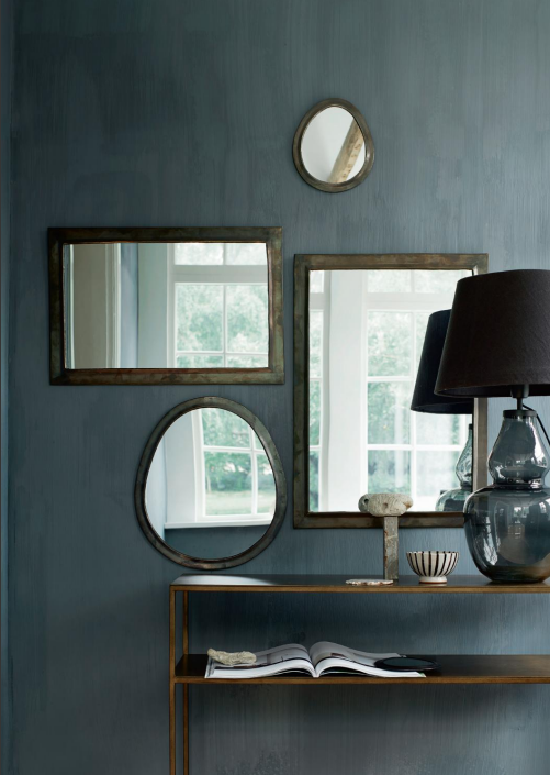
Mirrors are an old trick, instantly doubling your space, and what you own. Image via www.tinekhome.com
EVERY ROOM FEELS BETTER WITH SOFT LIGHT
Don’t light up your house like a football stadium. The right lighting can make Godzilla look like a raving Delilah – Balanced and diffused light is the most flattering. And for a romantic vibe, instead of overhead lighting, think of “pools of light” at eye level.
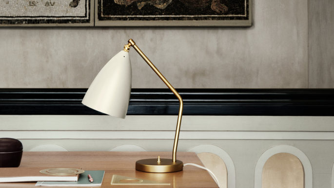
Instead of overhead lighting, think of “pools of light” at eye level. Image via www.gubi.com
THE POWER OF A SINGLE IDEA
With so many products available, the tendency is to buy visually arresting pieces without thinking about how they all hang together – and then lacking the discipline of an overarching design concept, the room becomes a humble jumble of stuff. If the goal is a calm setting, then it demands that everything be simple and work together in a harmonious way. If we’ve learned anything it’s this: A single idea or colour story is enough, and simplicity is always best. You can’t have everything say, “Look at me!”
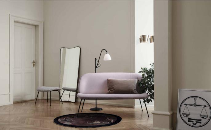
Clearing out, and keeping your home clutter-free and fresh is a form of visual health. Image via gubi.com
AVOID TOO MUCH CLUTTER
We tend to be blind to all that we’ve brought into our homes, but space is precious. Clearing out and keeping your home fresh is a form of visual health as well as mental health. People think about things, too much – remember, the presence of absence.
BLACK
No matter what style your interior—modern, traditional, or eclectic—introducing a black element such as a piece of furniture, painting, lampshade, or accessory will add instant edge to your interior. Black is a classic that adds instant rigour to any room and can have a big impact. Try a pair of small black antique chairs. Or a black console. A cabinet in black. Even black tableware will look very definite. You don’t need to whizz off to the shops. Rearrange what you’ve got. Move paintings or tables from room to room, until every room has atleast one splash of black.

