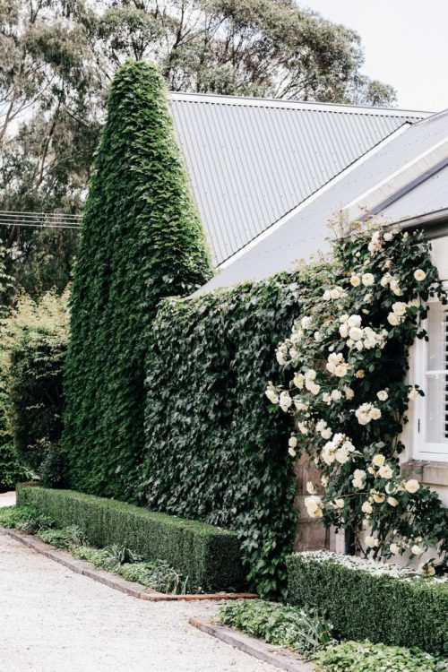
The subtleties of interior design can have huge impacts on our mental health, in ways we often don’t fully understand. Here we explore the elements of design, from colour to the presence of nature, that make us feel at home, according to a recent article published in UK House & Garden.
What is it about a space that makes us feel at home?
On the most fundamental level, human beings have a need for shelter, but beyond that we also want comfort, beauty, and connection with those around us and with the world outside. Our responses to the design of houses and other spaces are sometimes conscious, sometimes unconscious; most of us have clear opinions about our taste that we can define, but many of our reactions to interiors go on beneath the surface, hard-wired in and bound up with our instincts for security and stimulation. Read more, ‘Improve Your Mood With These 50 Top Decorating Tips.’
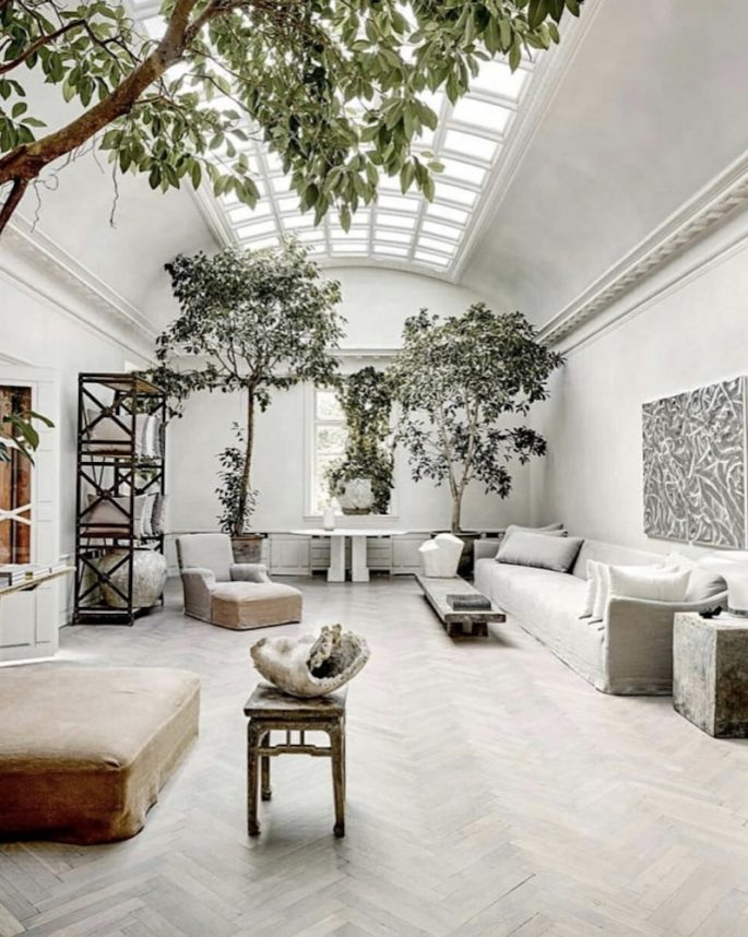
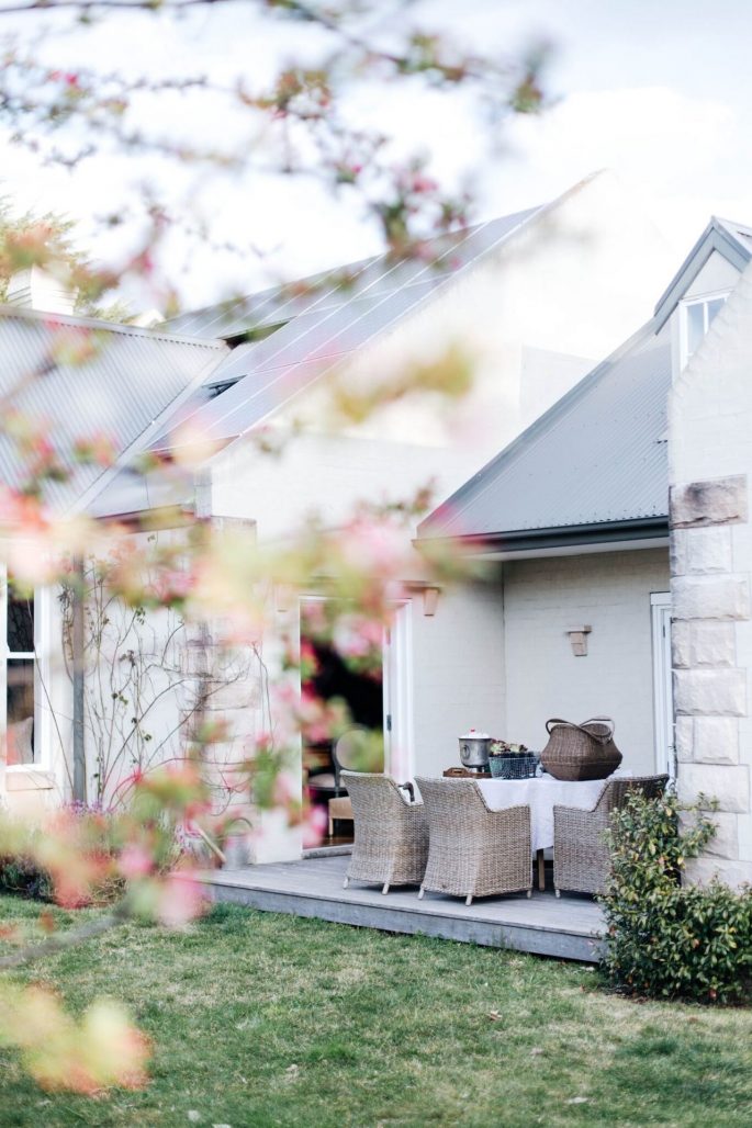
Each individual’s home needs to feel like a place of refuge from the rest of the world. This psychology should always inform good design. Image via @est_living.
When children are asked to draw a home, they commonly draw houses with steeply pitched roofs, even when they themselves live in flats, according to Lily Bernheimer, a researcher in environmental psychology who runs a design consultancy and has written a book called The Shaping of Us: How Everyday Spaces Structure Our Lives, Behaviour, and Well-Being. The pitched roof symbolises shelter and enclosure, which we need to make ourselves feel secure. Each individual’s home needs to feel like a place of refuge from the rest of the world. This psychology should always inform good design.
As Alain de Botton discusses in his book, The Architecture of Happiness, we may seek beauty from design, but there all sorts of other aspects that we may not even be conscious of that lead us to find buildings and objects attractive or unattractive: “Our designs go wrong because our feelings of contentment are woven from fine and unexpected filaments. It isn’t sufficient that our chairs comfortably support us; they should in addition afford us a sense that our backs are covered, as though we were at some level still warding off ancestral fears of attacks by a predator. When we approach front doors, we appreciate those that have a small threshold in front of them, a piece of railing, a canopy or a simple line of flowers or stones – features that help us mark the transition between public and private space and appease the anxiety of entering or leaving a house.’ Read more, ’10 Interior Tips To Happy Up Your Home.’
Trends in current research support de Botton’s assertion that when it comes to design, we are subject to a host of neurological responses we have no control over, and which we may not even recognise. At this year’s Salone del Mobile in Milan, Google partnered with the Arts & Mind Lab at Johns Hopkins university to conduct an interesting experiment, exploring the impact of sensory input – what we see, hear, smell and touch – on our minds and bodies. This field is called neuroaesthetics. Three different rooms were designed in collaboration with Finnish furniture company Muuto, and visitors wore bands to track their physiological responses as they moved through the rooms. They were encouraged to stay quiet, stay off their phones and engage fully with their surroundings–touching objects, noticing smells, sounds and movement. Ivy Ross, VP of Product Design at Google, who led the project, said that around half of the participants were surprised by the room they felt calmest in, and that it was not necessarily the one that they were most attracted to visually. “We’ve been optimising our environments too much for our cognitive mind in recent years, and we need to ignite our senses and bring more awareness to what feels good rather than what we think.”
Perhaps what we think we want isn’t actually what makes us feel at home.
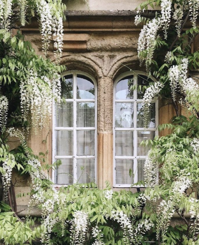
We may seek beauty from design, but there all sorts of other aspects that we may not even be conscious of that lead us to find buildings and things attractive or unattractive.
Nonetheless, the sense of control over one’s environment, and the ability to make an impact on it, is surely one of the most important things in dictating how we feel, especially in our homes.
John Berger, talking about choosing art in the 1954 issue of House & Garden, emphasises the role of pictures in creating a space that is just for you: “Dogs before they lie down turn round several times – a habit that goes back to the day when they were wild and had to smooth down the grass or bracken. As I look round this room, the pictures, reflecting my own taste and personality more intimately than anything else, confirm that this is the space which – like a dog, but in a more complicated way – I have cleared for myself.” The Chinese-American geographer Yi-Fu Tuan, whose book Space and Place: The Perspective of Experience is one of the seminal texts of humanistic geography, also talks about how memories of home are usually associated with the things in it, which you can touch and smell (“the attic and the cellar, the fireplace and the bay window, the hidden corners, a stool, a gilded mirror, a chipped shell”) rather than the building in its entirety, which you can only see.
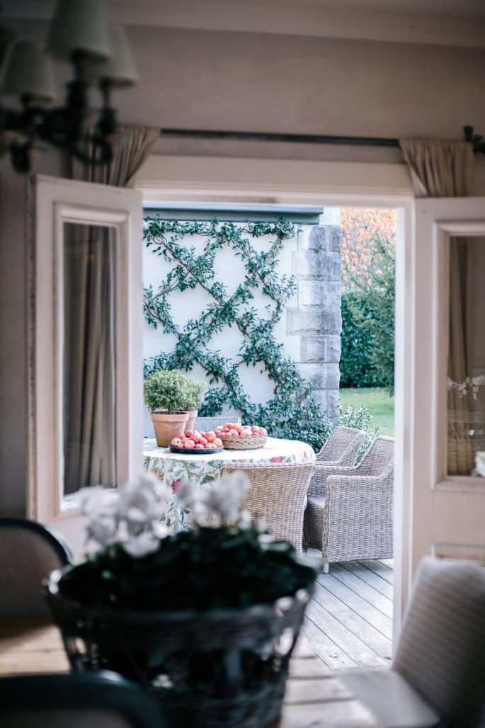
Melissa’s Country House where happiness and wellbeing are at the core of the design.
The importance of being able to feel like yourself in a space has been a major concern of Maggie’s, the cancer organisation founded by landscape designers Maggie Keswick-Jencks and Charles Jencks. Maggie’s has built centres in the grounds of hospitals around Britain and the world, and unlike normal hospitals and doctors’ offices, they have made a vast investment in creating spaces that don’t feel institutional, hiring some of the most prestigious architects in the world to carry their vision out. Laura Lee, the Chief Executive of Maggie’s, says they started off “thinking about what is it that leaves people feeling tired and dejected in hospital environments, what makes people feel that they have lost themselves.” Their aim has been to design environments that make visitors feel more in control and hopeful, and the principles can be carried through into domestic contexts.
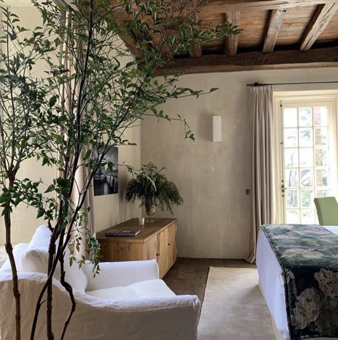
We need a combination of intimate, small spaces and wide-open spaces to feel happy. Image via @lasperelli
At Maggie’s, the drive towards a non-institutional, homely environment focuses on how people respond to different types of interior space. “We need a combination of intimate, small spaces and wide-open spaces,” says Laura Lee. Small rooms can be comforting and provide a sense of shelter and intimacy, but wide-open spaces connect us back to the rest of the world. What emerges from the philosophy of Maggie’s is that design shouldn’t aim to make you feel one particular way, but rather to allow you to connect properly with yourself and the people around you. Lily Bernheimer emphasises this idea in the context of your home: “The space you create needs to support the people and the purpose, the culture, even the climate of that space.” Each individual needs to have zones where they can do the things that are important to them, whether it’s an open space where children can play or a cosseting place to read a book.
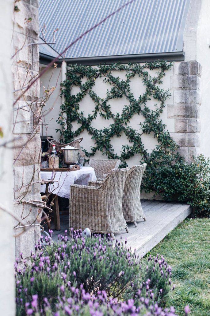
Melissa’s Country House where each individual has zones where they can do the things that are important to them.
It’s not only connection with ourselves and other people that makes for a happy space, however. In the 1980s, the biologist E. O. Wilson coined the term biophilia to refer to the ways that humans need and seek out connections with nature, and studies have found that elements of the natural world or even reminders of them have a positive effect on mental and physical health. The concept is gaining ground among architects and interior designers, and the principles of biophilic design centre on the incorporation of daylight, free-flowing air, organic materials, plants, even wildlife–into houses and workspaces. This is quite a different approach to the more technological approaches to ‘green’ design that have held sway in the last couple of decades. As Prince Charles lamented in his introduction to House & Garden’s Green by Design supplement in 2008, “Why, I must ask, does being “green” mean building with glass and steel and concrete and then adding wind turbines, solar panels and waterheaters, sedum rooves, glass atria – all the paraphernalia of a new “green building industry” – to offset buildings that are inefficient in the first place?” Sometimes the most simple approach is the best. Every Maggie’s Centre, for example, has a garden which is visible from as much of the interior as possible, helping people to feel connected to the outside world. Says Lee, “Gardens are always changing, with different light quality and plants coming out at different times. It doesn’t have to be much to create a sense of possibility beyond the space you’re actually in.”
Most people are well aware of the benefits of houseplants and plenty of daylight, but there are less obvious aspects of biophilia that can help us to feel more connected to nature. Using organic materials like wooden flooring and furniture, rather than plastic or laminate, helps to create a feeling of being grounded in your environment.
The idea that nature is constantly changing and shifting is also something that can be recreated in a house.
If the aim is to allow our bodies to harmonise with our environment, then interior lighting should mimic the patterns of daylight, which shifts as the sun moves through the sky over the course of the day and has a phenomenal impact on our circadian rhythms and the way we feel. Clever combinations of lighting which include ceiling lights, table and task lamps, and more decorative candles and sconces mean that you can change the lighting for any given mood and time of day. Dimmable switches and lights in various parts of the room give almost endless options for change and customisation. We also need darkness and cosiness as well as bright light, so there should be areas of your house which are more snug and dimly lit.
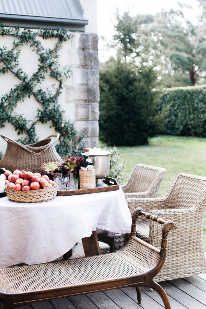
It’s not only connection with ourselves and other people that makes for a happy space, however, it’s also the human need for a connection with nature. Melissa’s Country House where all rooms open onto the garden.
Light also interacts strongly with the colours in an interior, which have a comparable effect on how we respond to it. While everyone has their own preferences when it comes to colour, and research on how people react to different colours struggles with the problem of subjectivity, we seem to have a need to connect certain colours with certain ideas. The field of colour psychology is now mostly concerned with the squashy world of identifying individuals’ ‘colour personalities’ for corporate profiling purposes, or finding out what colours audiences respond well to when designing a logo or a shop.
McDonald’s has been one of the most successful in this respect–its headache-inducingly bright and shiny interiors are designed to stimulate, making customers eat more and eat faster.
What limited research there is shows only the vaguest of tendencies: that long wavelength colours, like reds, oranges and yellows, are stimulating, and short wavelength colours, greens, blues and purples, are soothing. The colour red tends to increase aggression and to help performance in physical situations. The colour blue on the other hand, helps performance on cognitive tasks. Such ideas, however slippery, have a long and distinguished pedigree. The German thinker Johann Wolfgang von Goethe, who wrote an influential treatise entitled Theory of Colours in 1810, created a colour wheel that assigned various concepts to the colours of the spectrum: red was connected with the “beautiful”, orange with the “noble”, yellow with the “good”, green with the “useful”, blue with the “common”, and violet with the “unnecessary”. He even decorated his own house according to his ideas of how colour impacted mood, with the ‘Juno’ Room where he received guests painted an unwelcoming blue, and the more intimate dining room to which favoured guests were admitted painted a cheery yellow.
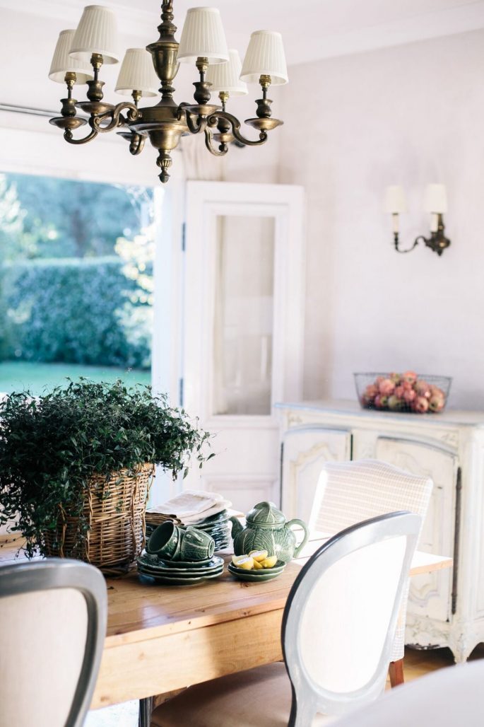
If the aim is to allow our bodies to harmonise with our environment, then interior lighting should mimic the patterns of daylight. Melissa’s Country House which is flooded with natural light.
While the impact of your interiors on your wellbeing may ultimately be a deeply personal thing, with no cut-and-dried answers, it is absolutely worth considering how these fundamental principles of interior design have the capacity to affect how you feel. From the balance and proportion of a room–a bedroom with soaring ceilings may feel airy to one person, but overwhelming to another–to the texture of the fabrics and the ornaments on the shelves, every aspect of a room is capable of producing wildly different reactions in each individual.
As Google’s Ivy Ross concluded, perhaps we need to be paying a little less attention to what we think we like, and a little more to how we actually feel.
Melissa’s Country House

