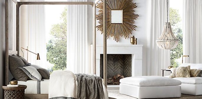
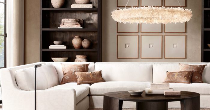
Neutrals have been the most popular tones for the home during the first decades of the 21st century – and for good reason. There’s no colour like no colour. Many people feel comfortable when surrounded by carefully balanced colours that create an understated environment and make few demands on the eye.
Neutrals offer infinite possibilities for makes spaces airy and relaxing, refined and timeless, or elegantly sophisticated. However, it’s easy to fall into the trap of using bland, depressing colours that are nothing like the subtle, complex palettes shown in our gallery.
Light plays a huge part in how neutrals appear, which is why leading Brit paint house has created distinct Neutral Groups – Traditional, Yellow-Based, Contemporary and Architectural – for every light condition. Selecting a group is easy – simply consider the light in the room and decide which group you are most drawn to. You can then build a decorating scheme, possibly with the addition of bolder colours and patterns. Older buildings tend to demand softer effect from colours and are most suited to the Traditional and Yellow-Based Neutrals. Modern settings benefit from the harmonious greys of the Contemporary and Architectural Neutrals.

Restoration Homeware
TRADITIONAL NEUTRALS
Their underlying green-tones have a softness that feels very old world. If used in spaces starved of light or that face south, the underlying green may be more prominent. One of the most effective ways to use these shades is to layer them: the mid ‘Off-White’ on the walls, the darker ‘Lime White’ on moulding and ‘Slipper Satin’ on the ceiling and doors. This feels relaxed and refined. #1 Lime White #2 Off-White #3 Slipper-Satin #4 Old White
ARCHITECTURAL NEUTRALS
This is the ideal white for those wanting a strong industrial feel. Cool with a blue undertone, the Architectural Neutrals are a great alternative to pure white, which can be almost blindingly stark. With the addition of almost imperceptible other pigments, these greys take on a new personality, creating a sense of spaciousness while avoiding a clinical look. These shades are most often used with the lightest tone, ‘Blackened’, on walls and ceilings throughout the house to create a seamless space, with ‘Dimpse’ and ‘Pavilion Grey’ used in small rooms as accents or on furniture. #1 Manor House Grey #2 Pavilion Grey #3 Dimpse #4 Blackened
CONTEMPORARY NETURALS
Their magic lies in the fact they have an underlying lilac tone, which lends an urban, clean edge while bringing warmth. So they are perfect in a family home, because they will never have the gritty industrial feel of colder, bluer greys. This colour group is often used throughout an entire house. The strongest tone, ‘Elephant’s Breath’ could feature in a hall for drama, while ‘Skimming Stone’ will make living areas feel light. ‘Strong White’ is a favourite for kitchens where it feels natural. #1 Strong White #2 Elephant’s Breath #3 Skimming Stone #4 All White
YELLOW-BASED NEUTRALS
Don’t think of these as yellow – they are more complex and have an unmatchable delicacy. The trad feel comes from a dash of black. It is the prettiest and simplest of the neutrals that works perfectly in any rustic situation, and is very easy to live with. Great for sunny garden rooms, where they will enhance the connection between indoors and out. #1 New White #2 White Tie #3 String #4 Matchstick
From ‘Farrow & Ball: How to Decorate’ by Joa Studholem and Charlotte Cosby (Mitchell Beazley).


