Given second-class status, behind-the-scenes, back-of-house spaces such as mud and dry rooms are ready for their close-ups, and architect Gil P Schafer is leading the way.
“Everything is more informal these days,” says American architect Gil P. Schafer, who uses classicist traditions to create blue-chip spaces steeped in elegance and charm. “Until recently, the family never really went into workhorse zones such as laundry rooms. Now Mum and Dad are folding laundry, so those areas better work well and look good. Details such as mouldings should be simpler so that things don’t feel precious.”
Here, Schafer shares his insights on high-performing spaces that are a joy to use.

Mud Room by architect Gil P. Schafer
MUD ROOMS
For a family in Tenessee, above, Schafer created a station that conceals purpose-built storage in a sun-drenched hallway with cream-coloured millwork and broad timer plank floors. “You want to make it simple for kids to throw their stuff somewhere, so the space stays neat,” Schafer says. “This room has lockers with charging docks for devices and a place to hang coats. We added a skylight so that you can check the weather before you head out.”

L-R: Images via Paul Cosetllo; Eric Piasecki.
LAUNDRY ROOMS
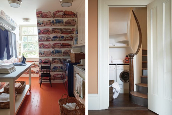
For a decorating-driven collaboration with designer Libby Cameron, above left, Schafer kitted out a utility area with orange floors and a navy washing machine, but practical details still abound from a table with a padded, upholstered top for ironing: a hanging rack that lets delicates drip-dry, a laundering nook tucked under a spiral staircase, above right– situated to service the guest rooms on the floor above- “adds quirkiness,” Schafer says.

L-R: Images via Eric Piasecki; Paul Costello.
LINEN STORAGE
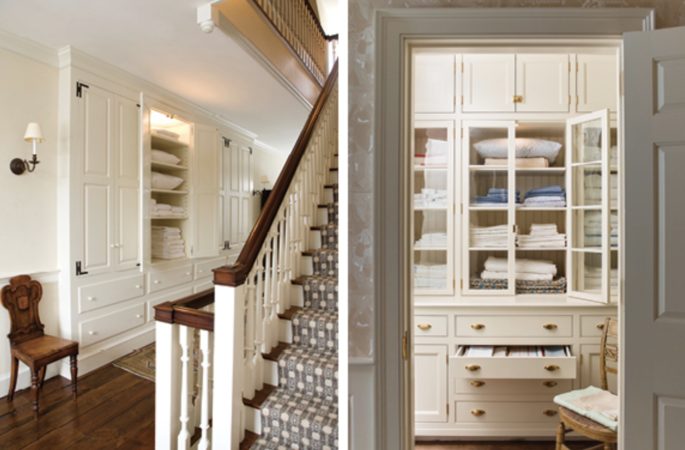
In a Hudson Valley house with storage on a well-traveled landing, above left, Schafer used wrought-iron hinges and overlay drawer fronts that vibe with the original 18th-century aesthetic; one of the cabinets conceals a laundry chute. For a walk-in closet in a different project, above right, drawers plus solid-door and glass-paned cabinets provide a range of storage options. The brass drawer pulls and wallpaper backing the shelves provide just the right finishing touches.

L-R: Images via Eric Roth, Paul Costello.
BACK STAIRS
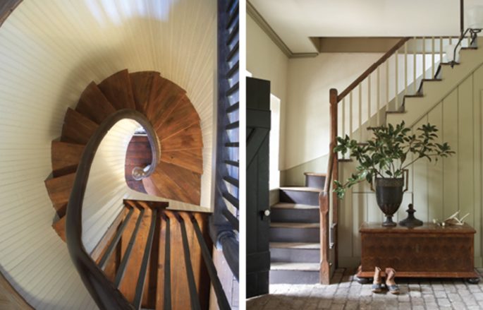
Schafer lined a heavily trafficked spiral staircase in a Charleston house, above left, with hardy beadboard to stand up to bangs and scrapes. In the same house, above right, Schafer turned the back-stair landing into a rustically refined entry foyer. The plainspoken stair rail and reclaimed brick pavers give the space a rough-hewn nobility. “Many architects would’ve reconfigured the space to set the landing against something less awkward than the window,” he says, “but it adds character- you don’t always have to fix everything.” Original story taken from Schumacher blog.
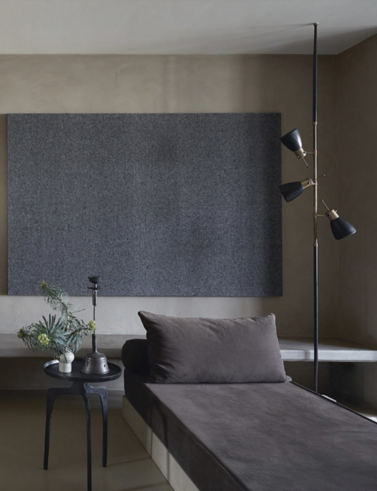
And our lead image of a bedroom in an apartment in Holland designed by Piet Asserti – is a reminder to carve space out of every niche at the back of your pad, optimise every alcove, even turning that tiny useless space beside the laundry into a little guest room. Mx


