When fashion designer Camilla Freeman-Topper, of Camilla & Marc, favoured by Nicole Kidman, Bella Hadid, Katy Perry, and Cindy Crawford isn’t working, she might be visiting Milan Fair to hone her understanding of interior colour, fabric and texture for her knockout new Sydney house. With its curves and straight lines, the 1930s residence created with interior designer Romaine Alwill following an extensive yet sensitive two-year renovation by Sydney architect Luigi Rosselli – is a masterclass in elegant minimalism reminiscent of a Joseph Dirand interior. It feels connected to the past, but in a contemporary way that surprises us.
Grand architectural elements mix with subdued Northern European furnishings – with the simplest and grandest of gestures.
Here is the story that features in Architectural Digest this week – where Freeman-Topper opens up about the remodel and getting it right.
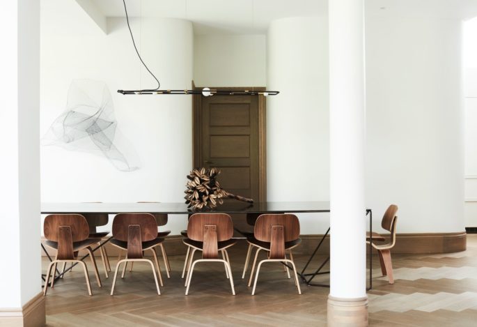
For months fashion designer and interior designer obsessed over the informal dining table, which Freeman-Topper wanted to have designed to feel super industrial and architectural. Engineering- and design-wise it was a nightmare, she says, but produced a quite substantial steel and glass result she loves. Extra ends can take it from seating 12 to 20 people, though each requires several men to move, clocking in at 220-plus pounds each. Photo: Prue Ruscoe.
As the creative director—and co-founder, with brother Marc Freeman—of Camilla and Marc, Australia’s renowned womenswear label, Camilla Freeman-Topper knows how to build an ensemble. She imagines a collection and brings life to a vision.
She knows these things take time—rushing is not the way to stoke the fires of creativity. But she also knows about striking while the iron’s hot—as in, say, snapping up the in-need-of-work house around the corner sitting on the market after stopping by on a whim.
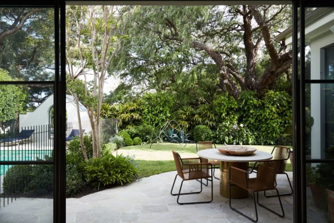
Paola Lenti furniture in navy, tobacco and timber tones in the backyard flow with an outdoor dining table they designed with a brass base and travertine top. A Camie Lyons sculpture sits in the grass. Photo: Prue Ruscoe.
Which is why when Freeman-Topper saw her family’s home in Sydney’s eastern suburb of Bellevue Hill a few years ago and fell in love with it, she called her husband, Dave Topper, to come home from business in Hong Kong. “There was something about it—the late morning light that was sort of seeping through the arches. It was reminiscent of Chateau Marmont, and had moments that felt really special,” she recalls of the way the 1930s six-bedroom house romanced them.
“I think people had put it into the too-hard basket, but a project like that for me is extraordinarily exciting.”
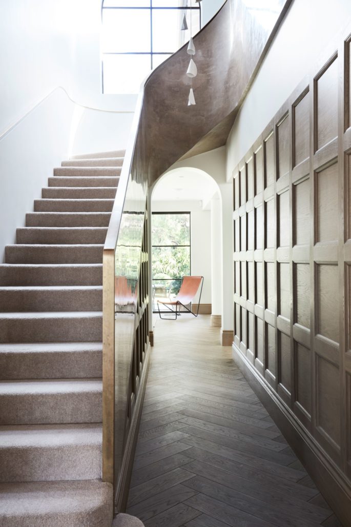
During the renovations the staircase was completely rebuilt with walls of putty-coloured Italian stucco lustre. “It was really important that there was a central spine to the home that it would create a sculptural architectural centrepiece,” says Freeman-Topper of the three-floor focal point that now features alabaster Bocci ceramic pendant lights dripping through it and natural alpaca carpet. Photo: Prue Ruscoe.
That doesn’t mean the designer jumped immediately into ripping out the dated green carpet or timber paneling that had gone orange over time.
Freeman-Topper understood she would only fully comprehend the house’s needs—and her family’s—from the inside.
So the couple and their three children moved in for one year, along with the richly textured, vibrant furniture of their previous home, to “wild” effect. “The ideas and concepts we had when we bought it before we moved in, changed completely once we lived in it for a while,” she says. “The rhythm of the house and its energy were really important to understand.”
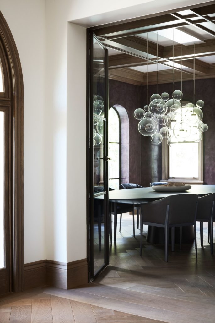
What was a TV room in its former life became the quite seductive deep grape stucco lustre–wrapped formal dining room, built around Cassina leather dining chairs Freeman-Topper fell in love with in Milan, available locally at Space Furniture. “The moment I sat in them I said, ‘I have to have these, how can I get them?’ Because they’re just the most comfortable chairs I’ve ever sat on.” They surround an oval Emmemobili table under a bubbly Giopato & Coombes Bolle pendant, creating the perfect mood for formal dinner parties. Photo: Prue Ruscoe.
After their year in quasi-quarantine, the family of five moved out, making room for an extensive yet sensitive two-year renovation conceived by leading Sydney architect Luigi Rosselli of LRA that included tearing out the sculptural “central spine,” aka the three-floor staircase, and reimagining it with a brass handrail meticulously crafted on site, natural alpaca carpet, and alabaster ceramic pendants.
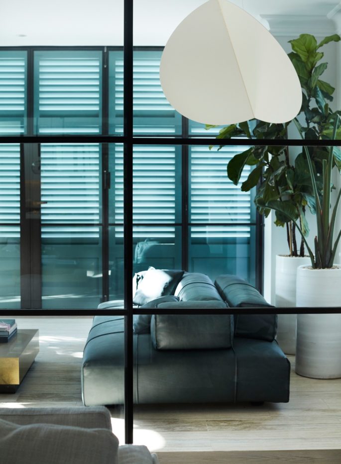
Low-lying convertible Baxter leather pieces in deep green—seen first in Milan—and an avant-garde Roll & Hill lighting installation give a modern edge to the conservatory-like loggia. Gatherings with friends either start or end in the indoor-outdoor space with timber inlay travertine flooring, steel doors, and fine shutters framing the view over Sydney Harbour. “It’s a great place to lounge around and have a cup of tea or glass of wine,” says Freeman-Topper. “I often spend my Sundays in there as well—it has a beautiful light and beautiful energy.” Photo: Prue Ruscoe.
Meanwhile, Freeman-Topper honed her understanding of colour, fabric, and texture and how they work in interiors as opposed to fashion, in part through a research trip to Milan during Salon de Mobile with her interior designer, Romaine Alwill of Alwill Interiors. “That’s where it all came together,” she says. The pair’s mood boards—highlighting the work of Joseph Dirand and Vincent van Duysen, along with 1930s and ’40s Scandinavian homes—evolved significantly as they poured over hundreds of photos they’d taken to carefully curate each room.
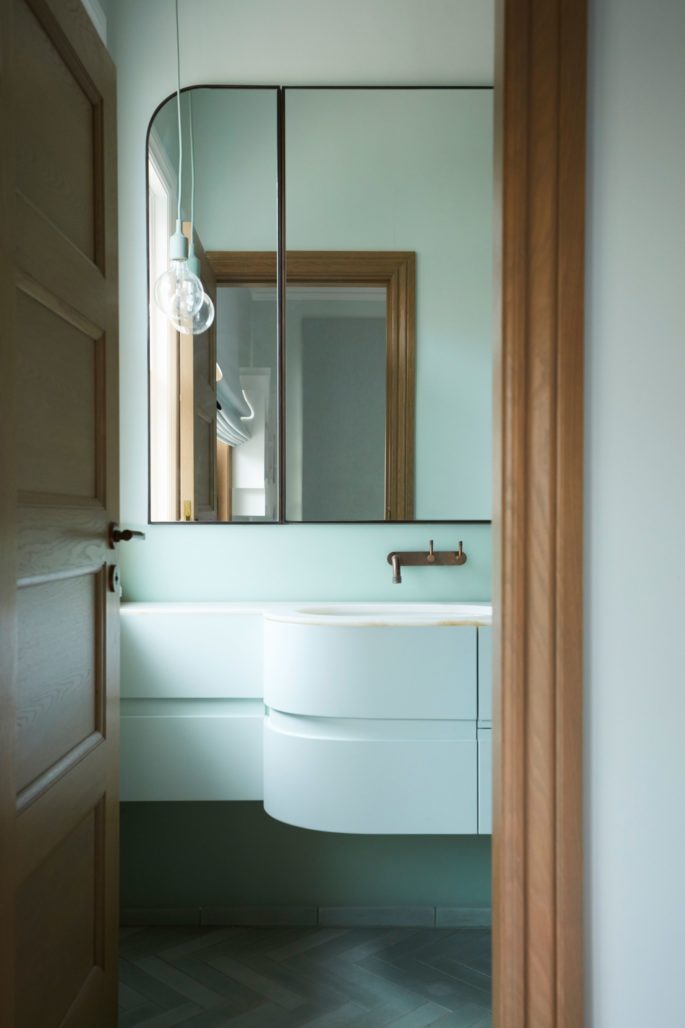
The concept for Freeman-Topper’s three kids’ en suite bedrooms was for each to be like its own box of macarons. Mint was the chosen colourway for her younger daughter, rendered partly in resin wrapping around the wall, with onyx or marble to match. Photo: Prue Ruscoe.
“I have very clear ideas of what it is I like and don’t like,” says Freeman-Topper, who designs her label’s knockout, stand-alone boutiques in Australia. “It can sometimes be a bit fraught when there are two creatives working together, but the experience was so beautiful and symbiotic.”
Together Alwill and Freeman-Topper zeroed in on minimal Northern European styling and textured, tonal touches that would unexpectedly play with the home’s grand traditional features, namely its arches and decorative ceiling detailing.
To match the smoky oak flooring, they laid in a painstakingly planned herringbone pattern for beautiful flow; a perfectionist painter took to the original orangey timber with his brush, creating natural-looking veins so it would match the new wood (see the formal dining room’s coffered ceiling).
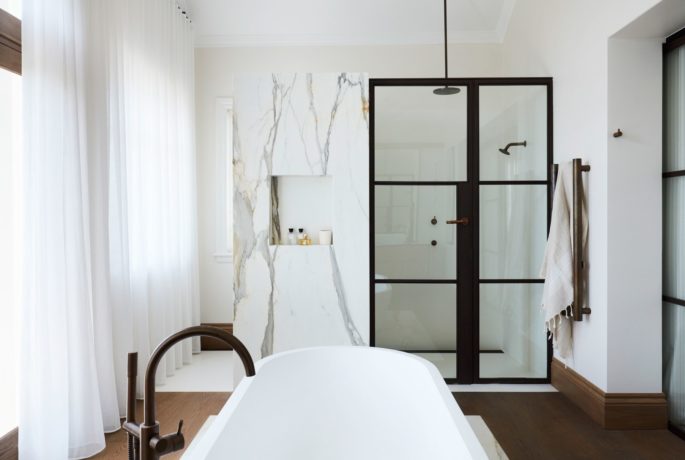
The master bathroom is all about timber and marble, designed as a generous yet understated place to enjoy impeccable views of the Sydney Harbour Bridge. It was originally a sunroom, which the designer made her office. “But I would find my husband standing in there staring out, and I thought, It has to be used in a better way.” He had the lightbulb idea: “He’s like, ‘I want to stand and have a shower and be able to look straight out and see the harbor.’ It’s very untraditional and loads of people might be put off, but there’s more than enough privacy and I thoroughly enjoy waking up and getting ready and seeing what’s going on on the water—it’s a really calm, sensory experience.”
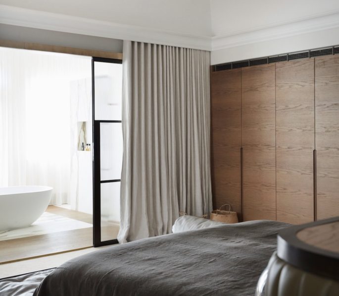
Though points of interest include intricate ceiling detailing and archways, the focal point of the master bedroom is Sydney Harbor, seen from the bed. After sleeping oriented in another direction, Freeman-Topper decided post-renovation she wanted it to be smack-bang in the middle so she could look out at the view, among smoky oak joinery, linen drapes, layers of marble, timber, leather, and weathered brass. Photo: Prue Ruscoe.
Ultimately they brought in entirely new furnishings and decor, including some seen in Milan, the one heirloom exception being an “extraordinary” Art Deco bar trolley Freeman-Topper’s late grandfather left her that she recalls from childhood and that she uses every time she entertains – which is frequently. Other furniture was designed by the threesome and made to fit exacting standards, including the master bed in olive leather with leather fluting and brass detailing, and the glass and steel informal dining table that transitions from seating 12 to 20—“an exercise in both design and engineering.”
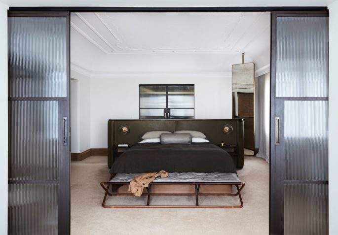
“The joinery is extraordinary,” Freeman-Topper says of the workmanship that matches the detail in her walk-in wardrobe. The olive colour of the custom leather bed she designed alongside their architect and interior designer was inspired by a specific shade of lamb leather featured in a Camilla and Marc collection three years ago. Nightstands and Giopato & Coombes bedside lights are built in, while a brass Baxter ottoman and a soaring Baxter mirror add further interest. Photo: Prue Ruscoe.
There was plenty of conversation around curves—in every room, there are curved and straight elements—and Freeman-Topper admittedly became fixated during the years-long project.
“Because we came from such a bright, richly coloured home, I really wanted this home to feel super calm and super tonal.”
“It was a non-negotiation for me. But sometimes that can be a little bit sterile, so it was really important we built those tones up in different layers to have that overarching sense of calm and warmth.”

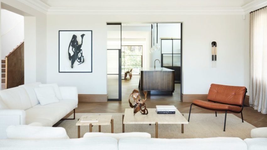
With access from the entry and kitchen, the living room maintains a raw, tonal palette comprising hemp, linen, leather, and stone. A horsehair sconce by Apparatus adds further texture to the space encompassing B&B Italia and Living Divani sofas and armchairs both available at Space Furniture, Ten10 travertine and brass coffee tables, and a custom-made hemp rug by Cadrys in Melbourne. Freeman-Topper had seen the sofas in Milan, and said, “‘OK, that’s exactly what we need there, but we need to have the perfect rug with the right texture and right tone,’ and I got fixated.” The ink and charcoal drawing, Animal Brain, is by Sydney artist Camie Lyons, who also created the bronze sculpture, Enviable Attributes. Photo: Prue Ruscoe.
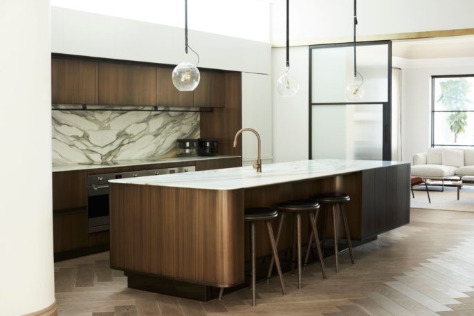
The heartbeat of fashion designer Camilla Freeman-Topper’s Sydney home is the kitchen, with its elegant sense of order, cordoned off from other living spaces by custom glass steel doors. It was designed with enormous care to ensure she has a clear triangle when preparing and cooking meals. Burnished brass-finished cupboards, Viabizzuno lighting, and a dramatic Italian marble backsplash give the space polished edge. “It took us a long time to find it,” she says of the stone, “and when we found it we knew it was the one immediately.” Photo: Prue Ruscoe.
Contrary to the atmosphere of many contemporary-leaning homes, this one manages to be supremely homey, relaxed and welcoming. “It’s like a boomerang,” describes Freeman-Topper of their ever-revolving door that opens for poolside barbecues, pre-dinner cocktails in the Sydney Harbor–view loggia, and lustrous dinners in the grape-clad formal dining room. “Our friends just want to keep coming over.”
This story appeared in www.architecturaldigest.com ; www.camillaandmarc.com.au
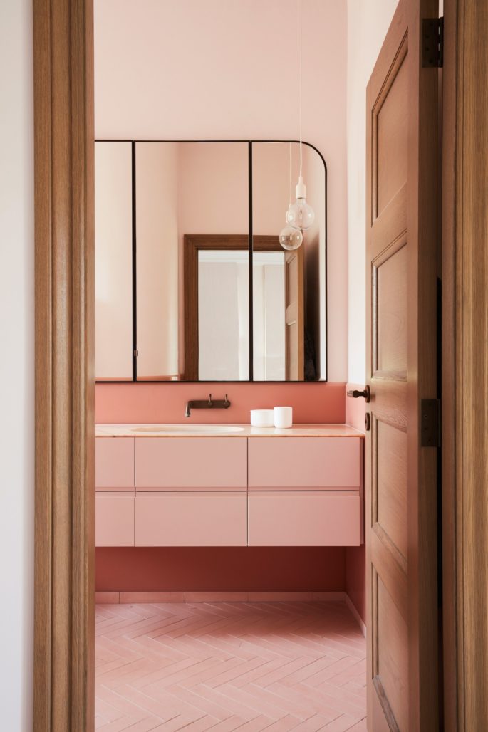
Freeman-Topper’s 10-year-old daughter’s bathroom references sweet macarons in coral pink. (Her son’s is dove grey.) Photo: Prue Ruscoe.

