
In August 2017, the American designer Summer Thornton posted a seemingly innocuous image of a tomato-red firehouse door on Instagram, citing it as inspiration for an upcoming kitchen project. But the picture set off alarm bells for at least one viewer. “I thought, ‘Oh boy, I hope that’s not for us,’” says Neil Heller, a friend, and admittedly colour-averse client who worked with Thornton on several projects (including his main residence two hours outside Chicago) before enlisting her to gut-renovate his three-bedroom pied-à-terre in a historic building on that city’s Gold Coast. Spoiler alert: It was.
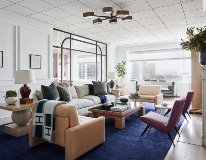
Tiving room features masculine patterns such as herringbone, tweed and sumptuous textures like velvet. Image via ArchitecturalDigest.com
“Summer is colour and pattern to the max, which is completely opposite from me,” Heller says, recalling the trepidation that he quickly quashed.
“We joked that I wasn’t her ideal client, but I went into this process with a really open mind. I knew that if I put my trust in her and let her do her thing, we would end up with something spectacular.” Adds Thornton, “We always like to try something we’ve never done before, but I also know [Neil] really well. I wasn’t going to push something that he wasn’t going to go for.”
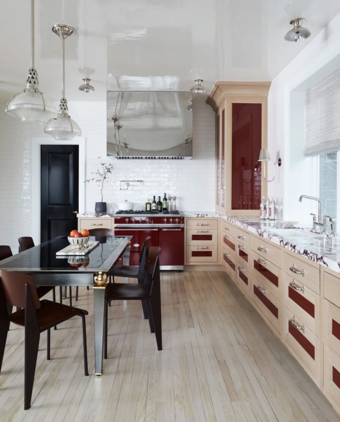
A chrome hood above the burgundy Lacanche range picks up on the metallic details in a 1980s Borgo chrome dining table. Prouvé chairs, polished-nickel Urban Archaeology pendants, and Waterworks flush-mounted lighting finish the look. Image via ArchitecturalDigest.com
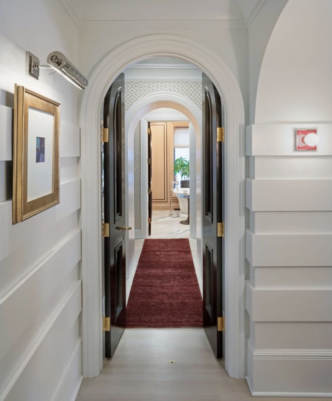
Thornton created rounded doorways near the entry to hide steel-beam supports beneath the ceiling. Image via ArchitecturalDigest.com
So the usually very involved Heller and wife Jen Burge Heller took a hands-off approach, allowing Thornton to structurally recast the space to better suit the needs of a growing family. After combining two units that hadn’t been touched since the 1960s, she expanded and moved the galley kitchen to the front of the apartment, replacing a small bedroom to maximize views and installing a glass divider to provide a sense of separation while maintaining a connection with the adjacent living room. The entry was reworked, original molding and existing hardware was restored, and clever solutions like arched doorways and disappearing storage added to hide unsightly steel beams and plumbing.
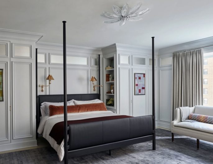
A bed by Baker Furniture dominates in the master bedroom, Image via ArchitecturalDigest.com
But the homeowners also allowed Thornton to flex her now well-known aesthetic muscles, giving her free rein to embrace rather than restrain her wild side. In the lobby, she gave the building’s 1930s architecture a modern edge with horizontal fluting on the walls and a fresh take on the lobby’s black-and-white marble flooring. Yet the most impactful style choice appears in the kitchen, where she offset traditional oak cabinetry with lacquered oxblood panels and intricately veined Calacatta Viola marble countertops. “We were playing with the idea of Pop art, pairing a tame base with a hit of color,” says Thornton.
“But we calmed the red way down so it doesn’t feel over the top. It almost falls away.”
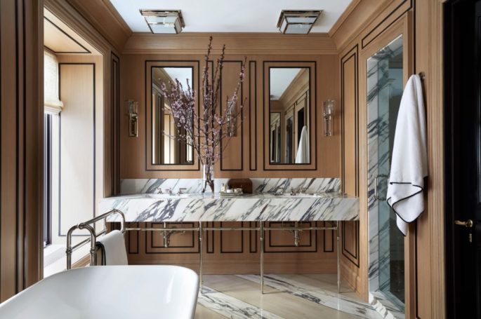
Diagonal swaths of Calacatta Monet marble mix with Breccia stone in the bathroom to distract from the room’s asymmetrical layout, highlighted by Waterworks fixtures and a freestanding tub by Ann Sacks. Oak paneling was detailed with black moulding. Image via ArchitecturalDigest.com
Thornton’s unique approach to details didn’t end there. Hand-painted pinstripes on the ceiling in the living room relate to the painted moulding in the master bath, while a hand-marbled paper provides an unexpected jolt on the ceiling in the plum-hued powder room. A foliage-laden Scalamandre wall covering in the Hellers’ son’s bedroom offers soft contrast to the crisp white edges on display throughout the rest of the apartment.
And violet upholstery on the living room’s slipper chairs picks up on the plum veining that weaves its way around the kitchen benchtops.
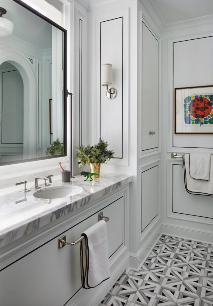
Graphic Ann Sacks tiles lend visual interest to classic finishes to the son’s bathroom including hardware by Waterworks. Image via ArchitecturalDigest.com
Though the boldness of the palette is a deviation from Heller’s masculine, minimalist leanings, he wouldn’t have it any other way. “I love our main house, but I didn’t want to repeat it for a weekend place. This is meant to be more fun, more feminine, and a little edgier because it’s in the city,” he says. “I never could have imagined this for us, but that’s what a good designer does. Sometimes it’s good to step outside of your comfort zone.” *original story taken from ArchitecturalDigest.com
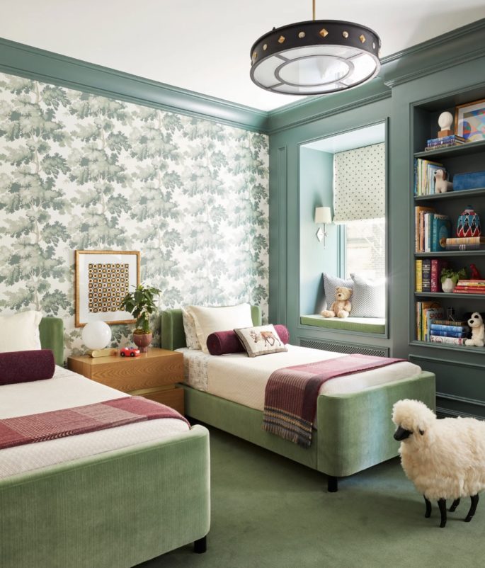
Wallpaper by Scalamandre provides a peaceful backdrop for velvet-upholstered twin beds, a Lawson-Fenning nightstand topped with a CB2 lamp, and a chandelier by Currey & Co. A Roman shade made of Donghia fabric and a sconce from Circa Lighting dress up a cosy window seat. Image via ArchitecturalDigest.com
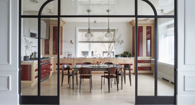
Thornton installed a glass divider to provide a sense of separation between the kitchen and living room while maximizing light and the Lake Michigan views. A custom-blended oxblood paint and richly veined Calacatta Viola marble countertops imbue staid oak cabinetry with personality. Image via ArchitecturalDigest.com
This is an excerpt from the original story in Architectural Digest magazine.
