This month, we’re sharing our favourite ways to make your space look bigger, brighter, better, and more expensive than ever. Discover how to REALLY layer your rooms to feel rich, which colours always look chic, and the cheat’s way to luxe lighting. Plus, how to base your interior on a few timeless staples that mix and match. Also, how to spruce up your front door, transform tired dining chairs, and the visual trickery that will cost far less than a complete overhaul.
This is all practical, no-nonsense advice on the basics of good decorating. Take notes!
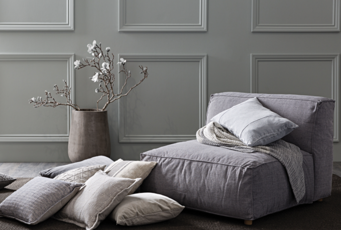
Transform walls with decorative mouldings or wallpaper. And don’t forget your finishing touches like cushions and statement vases. Papaya 2018/19 collection, www.papaya.com.au
1: DYE YOUR SHEETS
It’s a great way to give tired bed linen a new lease of life and your bed a moody makeover. Try Dylon quick dye or take it to a dye specialist, like Spectrum Dyers, (www.spectrumdyers.com), who can custom colour any shade you care to dream up. It’s so easy.
2: GIVE YOUR CEILING A GLOSSY MAKEOVER
Gloss paint will bounce light around the room, and looks slick and contemporary.
3: TRANSFORM WORN DINING CHAIRS
In a flash by stripping and staining old wooden frames. Don’t try and do it yourself, though; instead, commission an expert. Still looking tatty? Reupholster the seat pads with some snazzy new fabric. Spotlight is brimming with great linens, around $10 a metre.
4: SPRUCE UP YOUR FRONT DOOR
It’s the first thing people see as they approach your home and repainting it a new colour as the season changes is quick and simple. Don’t forget to give the wood a light sanding first; a smooth finish is all in the prep-work. Anything from black to navy, or softer neutrals to timeless greys and strong reds can make a statement.
5: CREATE A GRAND ENTRANCE
First impressions count, so as well as a lick of paint, invest in a splendid new door knocker and letterbox. It’s one of the easiest ways to give your door a whole new look, and create instant curb appeal.
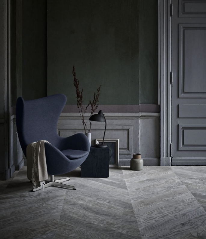
Go for neutral fail-safe tones of grey, kahki, violet, or moss green which have a rich feel. Image via @fritzhansen.
6: MAKE FLOATY SUMMERY CURTAINS
Buy swathes of white muslin and hurl over your curtain poles – it’s amazingly affordable, so you can afford to be generous (less than $10 a metre at your local Spotlight or Lincraft stores). Allow it to drop to the floor, and make sure the muslin is made from pure cotton so that it falls beautifully.
7: GIVE YOUR WALLS SOME PERSONALITY
Design’s coolest, newest wallcoverings are also the most accessible and easy to use, with innovative wall panels (and murals) which you can use to decorate virtually any wall in the house. They’re like works of art, with designs for all tastes.
You don’t have to spend a fortune to get something that will define your look.
8: REFLECT LIGHT AROUND YOUR HOME
Mirror the length of a wall opposite any door or window to bounce more light into a room, reflect views, double your possessions, and enlarge the space. A mirrored wall can make a cramped space feel very grand. An old trick, but it works.
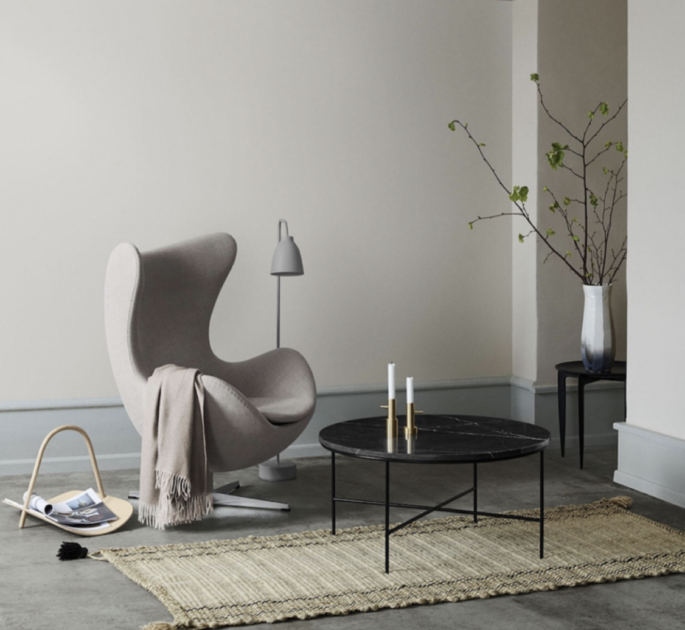
Go for neutral, expensive-looking shades for background areas. Image via @fritzhansen.
9: REPLACE PLASTIC LIGHT SWITCHES
Swapping them for metal versions is a great way to instantly up the sophistication levels of any room. HMP brushed metal coverplate light switches will add a silver glimmer to walls, $8 each, www.bunnings.com.au)
10: FREE UP SPACE ON YOUR BEDSIDE TABLE
Hang a bulb that has a stylish filament, such as a modern Ikea design, from an appealing hook beside your bed.
11: ADD SOME DECORATIVE TOUCHES
You may not have the luxury of original architectural finishes in your house, but that doesn’t mean you need to go without. Try adding decorative mouldings to enhance doorways, walls, ceilings, fireplaces – they can be as discreet or obvious as you desire. Highly effective.
12: SPACE SAVVY SHOWER
If you only have a small space for you shower, opt for a ceiling mounted shower fitting. That way you’re not restricted by the length of the shower arm, which can sometimes stick out too far and leave you hardly any room to stand. Make sure your shower screen is the simplest you can find. The eye usually goes to the fittings, so the sleeker the design, the better your shower will look.
13: EXPENSIVE COLOURS
The palette you choose is always important. When on a budget, go for neutral fail-safe tones of ecru, stone, camel, coffee, kahki, charcoal, or black, which have a rich feel and will blend into the background seamlessly.
Go for neutral, expensive-looking shades for background areas, that will bring depth and structure to a room – then feature one or two strong colours in accessories that can be easily changed.
14: MAKE AN IMPACT USING TILES
Rather than breaking the bank tiling an entire wall or floor, using a small number of tiles or stone to create a ‘zone’. Try adding a slab of marble on a window shelf, or the shower step for instant glamour. Or an area of floor like a hard rug.
15: CHANGE YOUR LIGHTING LEVELS
Freshen up existing lighting; consider hanging pendants at a lower level to give a room a totally different feel. Think pools of light over tables rather than people’s heads.
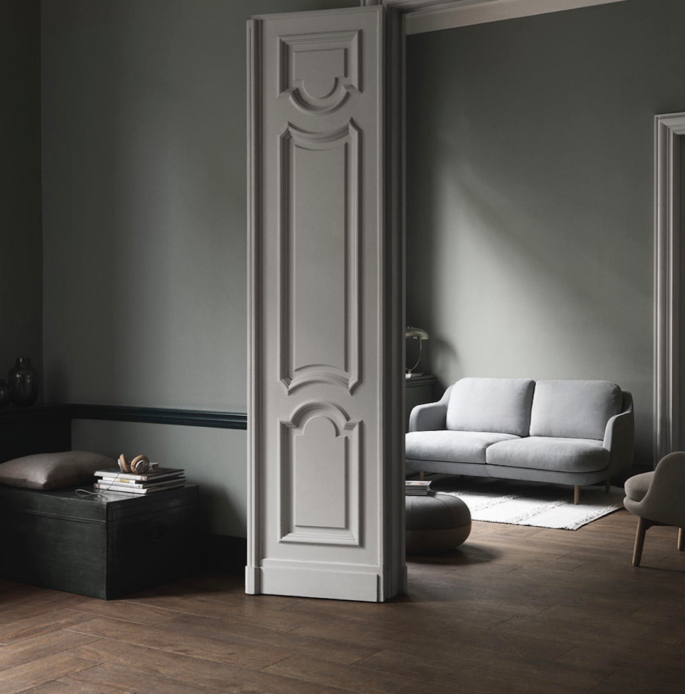
Colour is the quickest way of adding warmth and character to a space. Image via @fritzhansen.
16: CREATE A DISPLAY OF VINTAGE PRINTS AND PHOTOGRAPHS
Update with a wall of black and white photography, sourced from The New York Library’s online archive which allows you to download high-resolution drawings, photos and maps for free (digitalcollections.nypl.org). Bulldog clip your chosen images to a wire or piece of string and hang them across one wall.
17: BESPOKE YOUR BEDHEAD
Get fabric the same colour as your wall, and whip up a a made-to-measure slipcover for your existing bedhead.
18: TRANSFORM WALLS WITH WALLPAPER
Cover up uneven walls or patchy walls using chic, affordable wallcoverings from Bunnings. Faux wallpaper can also be used to add character, texture and colour to any area.
19: GET A HANDLE ON THE DETAILS
Interesting door handles, knobs, pulls and tapware are small, inexpensive details that can make a huge difference, and give a space a high-end sheen. You probably touch them more often than anything else so make it as sensual experience as possible. Avoid cheap plastics.
20: DRINK ME
The most perfectly weighted glasses will make you and your home feel a million dollars.
21: GROW VINES
The grapes might not be very sweet but they look sumptuous. There are a huge range of vines, suitable for house exteriors, that instantly soften architecture, and add green to your garden, however small your plot. Anything from Boston ivy to Virginia creeper, star jasmine, wisteria, grape vine, clematis, and climbing roses.
22: LOWER THE LIGHTING
The biggest mistake when planning lighting is to overdo it. You want your lights to flatter you and your home, not show up every wrinkle and stain. Diffused, balanced light is the most flattering.
Dim everything, and don’t underestimate the power of soft light to create a sense of well-being. Think wall lights, shaded lamps and floor lighting.
23: LAYER UP
Top all beds with comfortable throws and soft down pillows. Each of these layers and textures absorb sound and instantly makes a room feel rich and luxe.
24: WINDOWS ON THE WORLD
Blinds and curtains are another layer of architecture that can quickly help correct less than perfect window shapes. Keep them simple and choose a plain fabric in the same colour family as the wall to extending the space.
25: MIX CHEAP WITH EXPENSIVE
A great rug can make a chainstore sofa look like a million dollars.
26: PAINT
Take years off a tired room with a fresh lick of paint. It’s like makeup. Colour is the quickest way of adding warmth and character to a space, and can help make a room appear bigger, smaller, taller, or wider.
27: SISAL IT
The Natural Floorcovering Centre has the most brilliant 18mm entrance door matting from natural to dark cola. Fab at your front door, we like it inlaid, best. The bigger, the better. It’s an excellent backdrop whatever your look, doesn’t draw attention to itself, and won’t show the dirt – think of all those muddy footsteps and labradors.www.naturalfloorcover.com.au
28: DON’T FORGET THE FINISHING TOUCHES
A few great accessories can overcome cheap furniture. They’re the little touches that make any space your home, and make it look like you’ve spent a lot more than you actually have. Decent, big 60cm square cushions or pair of fabulous table lamps will signal attitude, glamour and luxury.
29: FUNCTIONAL FURNITURE
Your interiors should be based on a few timeless pieces that mix and match. The staples are a dining table that is at the heart of the home, a great sofa, some decent chairs, pretty side tables, a good mirror and elegant table lamps. These are the things you will take through life so they have to be good quality, fad-free classics.
There is a place for personality pieces, and fun updates but they need to be layered lightly on top of the foundation pieces.
30: WHEN IN DOUBT TOSS IT OUT
The biggest single thing you can do to improve the look of your house, and make it look more expensive is to take things out of it. Your interior will instantly look better if you simplify what you own and keep only what is useful and beautiful. Most people keep everything they’ve ever bought or inherited, and then buy more. If you don’t use something, remove it from your life. Bin, bin, bin. That means those witty fridge magnets, (your refrigerator is not a decision pending tray), and that mouldy old Balinese daybed. Now find a proper place for everything that’s left, and be on constant patrol to keep clutter out of your house. Good organisation is invisible. Muddle stares you in the face.
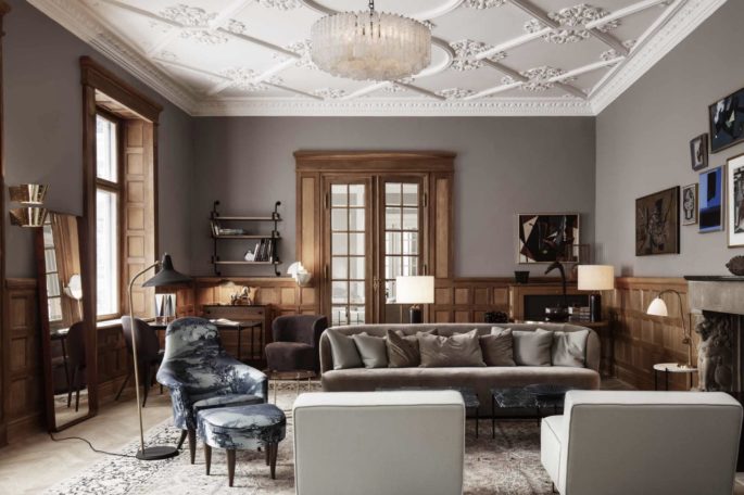
Your interiors should be based on a few timeless pieces that mix and match. Image via www.gubi.com
31: PUT THE TV IN ITS PLACE
Prop your flatscreen TV on an artist’s easel. You’ll need to pick a location with a socket and sufficient floorspace for the easel’s base on which you can base your Freeview box. Ideal for open-plan spaces. You can opt for a timber or metal easel to suit your taste and setting.
32: GET FLOORING RIGHT
Rush or sisal matting is a great flooring option loved by designers, that’s cheap but doesn’t look it.
33: KEEP IT DOWN
Don’t underestimate the power of simplicity. Real style is restrained. To get a top-notch look, quieten everything down, particularly colours and clutter. Remember it’s as much about knowing what not to use.
You’ll make life easier if you keep the basics neutral and introduce strong statements with rugs, paintings, cushions – things that are potent but portable. Keep ideas like less is more in your mind. You’ll save money and be less likely to repeat mistakes.
34: BEWARE OF PATTERNS
Patterns draw your eye. They dominate. They date. And they can ruin everything. When people fall in love with a pattern they tend to go overboard. Instead, your rooms will look like a million dollars by using loads of texture to build up a room’s character: smooth surfaces like mirror, lacquer or satin create a formal environment, while heavier, rougher ones like wood, stone or linen lend themselves to a more relaxed look.
35: WORK WITH TEXTURE
True style is based on texture. Think of texture as a paint palette, sometimes coordinating them, sometimes contrasting them, to build up layers for a sense of depth. And if you must have a pattern, remember they work best in isolation.
36: A FEW DISPLAY IDEAS
Stick to one or two hero pieces in a room and allow them space to shine. A French gilt mirror and antique Swedish bookcase, for example, will feel contemporary when placed in a sparsely decorated room.
37: THE SECRETS OF UPHOLSTERY
Soft furnishings, fabrics, curtains, and cushions are the key to comfort: they make an interior feel right. You can opt for anything, from a cheap cotton to an over-the-top silk, just as long as it feels good and is suitable. If you’re on a budget use special fabrics on small pieces that make a big impact, and cheaper fabrics for curtains. But always use the best quality fabrics you can afford. It’s money well spent. Fabrics more than any other element allow you to express who you are, and be true to yourself, and your house.
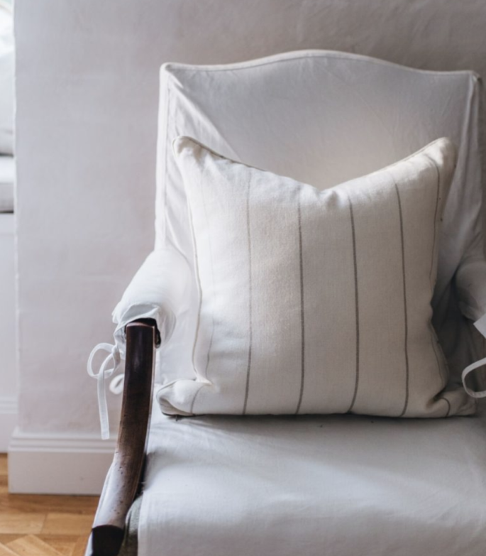
A canvas slip-covered library chair at Melissa’s country house where fabrics, curtains, and cushions are the key to comfort and make everything feel right.
38: IT’S THE LITTLE THINGS
Nothing has to cost a lot but they needs scale and proportion. Use your old coats, boots and hats. They can be better than art, more natural, less try-hard – and make your home look like a Ralph Lauren ad.
39: THINK COMFORT
Your home has to be a sanctuary – as soon as you walk through the door your spirits should lift. Surround yourself with the best you can afford. Even if you live in a shoebox, honour your presence in it. Legendary designers know luxury is a comfortable chair with a good reading lamp and a handy table to pop a drink on. You can have that wherever you live.
40: DON’T SEPARATE A COLLECTION
Keep them together. Copy the world’s best designers, and hang them on the wall, line them along shelves, group on tabletops.
Anything en masse looks good.
41: GOOD GLASSES AND PLATES
These should be your everyday stuff. A good glass (or plate) is one that has great proportions and is well balanced and a joy to use: and is just as likely to be made from plain glass as lead crystal (or stoneware as bone china).
42: DON’T FORGET THE BEDHEADS
Installing a bedhead is the most cost-effective thing you can do in a bedroom.
43: MAINTAIN EVERYTHING
Keep your chrome polished, your glassware gleaming and your flowers fresh. It takes 10 minutes to whip around each morning and put things straight. And it’s such a great way to live.
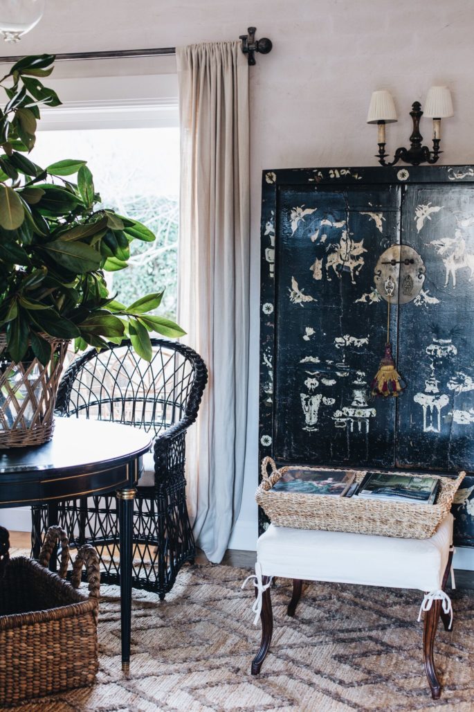
Melissa’s Country Home
44: STRETCH YOUR DOLLARS
Buy great towels and glasses in bulk, especially when they are on sale: twenty is better than twelve, ten is better than six.
45: EASY SHOPPING
When buying inexpensive things, simple things are safest: cheap things usually go wrong when they are tricked up.
46: DON’T FOLLOW FADS
Avoid all Next Big Things, and focus on creating an interior that works for all its inhabitants, both practically and visually.
Only buy pieces that will serve you like a loyal dog – that you love, and it will work. Quality distinguishes style from fashion.
47: CREATE DIY “BUILT-IN’ STRUCTURES
The key to making any piece – from bookshelves to kitchen cabinets – look custom is to have them fit in perfectly. The easiest way to achieve this look is to have them extend from the floor to ceiling. A bookshelf that spans an entire wall will always look more expensive than one that stands alone.
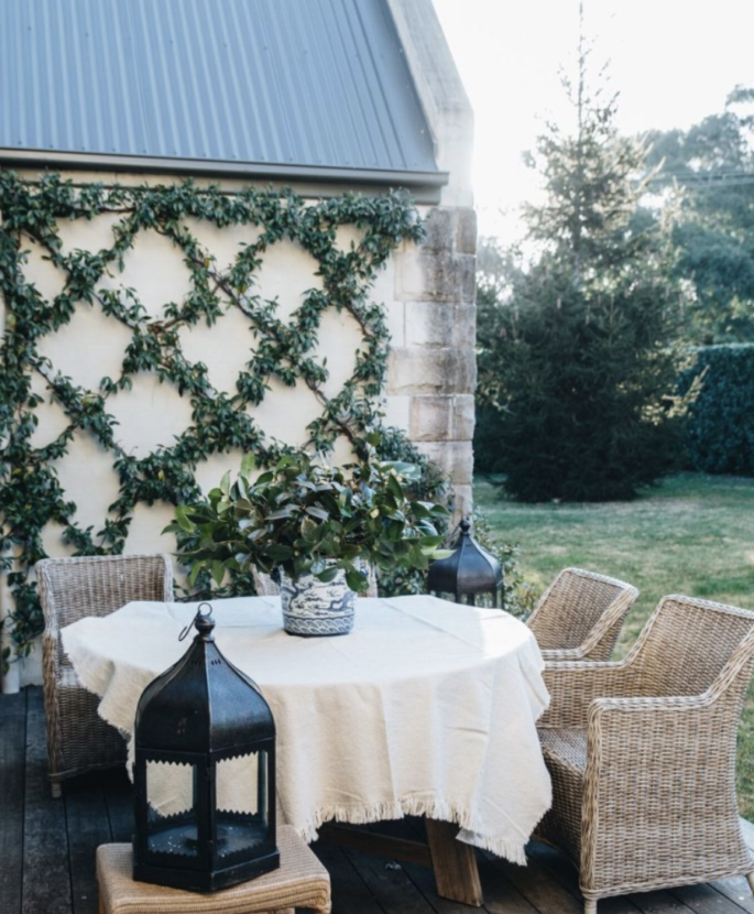
The manicured vines at Melissa’s Country House
48: DECANT MORE
Removing contents into a prettier container isn’t just for wine. Dry-food goods, detergents, even tissues can get a more handsome home.
49: PUT A BACKSPLASH ON IT
A DIY backsplash is great for smartening up a kitchen, bathroom, or laundry without breaking the bank. A slab of marble, looks like a million dollars, and can be installed quickly. If tiling a backsplash is too intimidating, consider creating an accent wall with a great paint.
50: BIN SOMETHING OLD OR UGLY
If a dated light fixture or piece of furniture constantly makes you groan, get rid of it. The project doesn’t have to break the budget: Drab wall colours can easily be painted, and outdated knobs and hardware can be inexpensively replaced. Even dated kitchen cabinets can be painted white and instantly brought out of the ’80s.
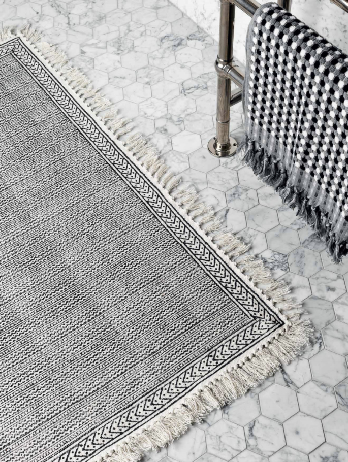
LM Home 2018 Catalogue, www.lmhome.com.au
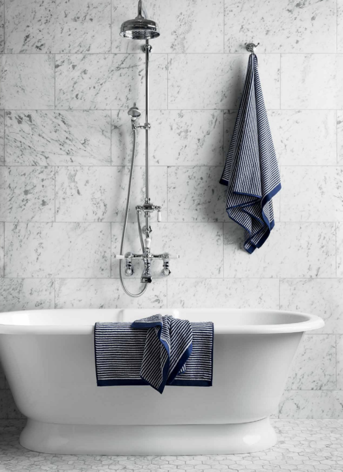
LM Home 2018 Catalogue, www.lmhome.com.au

