Decorating mistakes are easily made: you buy a sofa without measuring your door clearance, you hang a light too low and bump your head on it, or you paint a room in the wrong colour without testing it first. These decorating faux pas are not so easily fixed. But other mistakes can be fixed in 15 minutes or less – from hanging a second hook behind your crooked artwork frames, switching a light bulb, or even rotating a rug 90 degrees.
Don’t delay any longer—your weekend to-do list to a better home is right here.
YOUR ART
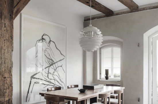
Most people tend to hang art too high, but more than art being hung too high is art that is crooked. To fix a crooked piece of art, there are two options. The easiest is to add a second art hook. To make sure that the addition of the hook does not cause the art to be hung higher or off-centre, you may need to start the hanging process from scratch. When hanging artworks, don’t go too high or too low. Aim for the centre of the piece to be 150cm from the floor, directly at eye level for most of us.
YOUR LIGHTING
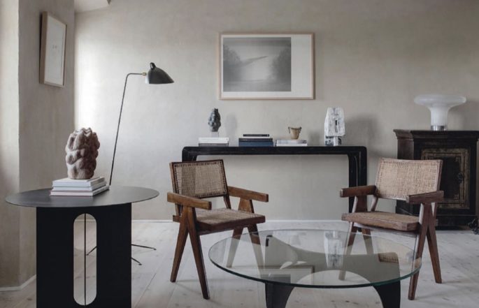
A room often has overhead lighting and that’s it. To make a room really warm and welcoming, the trick is to use lighting at all different heights and angles: overhead lighting, a floor lamp, a table lamp, and the often forgotten uplighting. If your budget is limited, try buying an affordable uplight and popping it behind an object in your living room – you’ll notice how guests start saying how warm and inviting your home is. Placing lights below chin level will cast a flattering light on everyone.
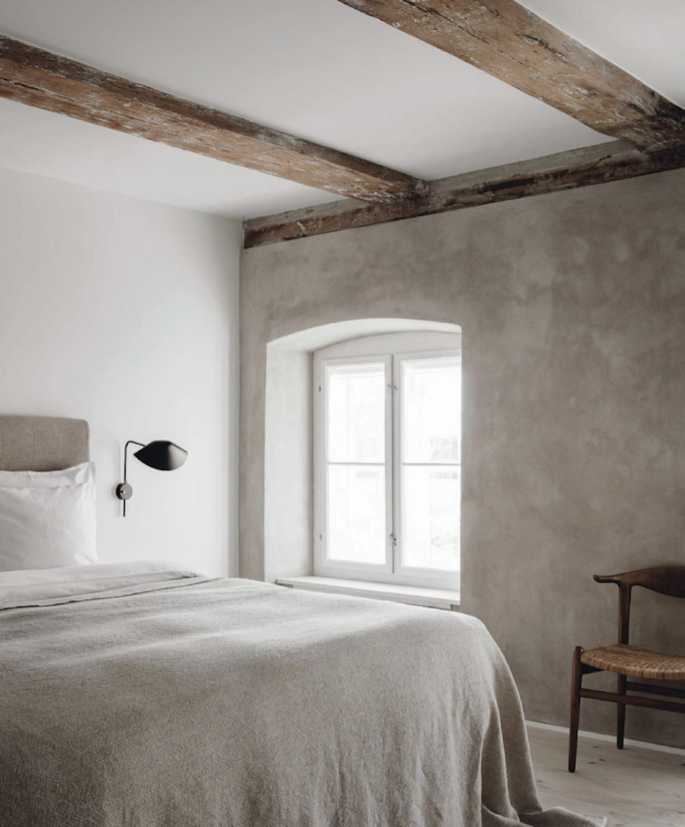
Swapping light bulbs to softer ones, instantly creates a pretty warm glow and atmosphere, where everyone and everything looks good.
YOUR LAYOUT
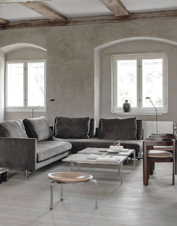
Simply rethinking how a room’s furniture can be arranged can change the entire look and function of the room. Never push all your furniture out to the walls – think of a doctor’s waiting room with its hard-backed chairs lined against a wall, and you get the picture. You want your seating plan to be sociable. Your space will seem larger if you have atleast 5cm of space between your chairs and the walls. It’s good to walk around a piece of furniture, and not have a walkway in the middle of the room but to create a slight obstacle in the space.
YOUR CURTAINS
Beware of ready-made curtains. Cheap curtains, cheap room. If privacy or bright sunlight is not an issue, remove them. And let the outdoors in.
YOUR CLUTTER
Entryways seem to be catchalls, attracting clutter easily and leaving a not very welcome impression on guests – which is why it’s important to decorate with intent. Choose functional pieces like consoles, hooks or ottomans to store keys, shoes, and handbags. Then add interest with a rug or mirror, which open up the space. In the bathroom, baskets, pretty containers, and trays are ideal. They work wonders on washbasin benchtops, and under counters containing clutter in an instant and giving you access to the items you need most. Don’t view open storage or tables as glorified catchalls to amass things. Be discriminating. Use them as a display opportunity.
Curate a well-balanced collection of books, china, glassware, jugs, vases, art, and more to create visual interest, and give your house soul.
YOUR SOFA
A typical three-seater sofa doesn’t need loads of cushions to have a visual impact in a room. Three cushions will do the job with one generous pillow in the middle and one on each side to keep the symmetry off balance. Keep them puffed to full effect – it is one of the fastest ways to create a finished look. Worn out cushions, cheapen the look of a room.
YOUR RUGS
The last mistake you might not have known you were making is placing your rugs in the wrong direction. Rugs should be wider than the area of the furniture they’re framing so they extend past the right, left, and front of the sofa or bed or whatever furniture is resting on it. This rule doesn’t apply to behind furniture.
YOUR BOOKCASES
Take some time on your weekend to make your shelves look good! An unruly bookcase can have a disorganized effect on an entire room, so display them well. Solve the big book problem, by lying lanky volumes on their side, spines out and stacked attractively. Let your books breathe, don’t make every shelf bulge. Consider breaking them up by collections or colours. Cull; don’t let books grow stale or musty. First to go are outdated travel and restaurant guides, self-help, unloved cookbooks, popular light fiction, and anything bought on a plane trip. Be ruthless about yellowing paperbacks. Decide on a look you like and whip those shelves into shape.
YOUR STEPS
If the entrance to your home includes any outdoor steps make sure you regularly give them a good sweeping. Dirt, grass, and leaves can accumulate quickly and turn that area into an eyesore.
*All images featured are of Danish architect Danielle Siggerud’s waterfront home in Holmen, Copenhagen, via UK Elle Decoration.


