In a book written back in 1810, Goethe noted that only savage nations, uneducated people and children enjoyed vivid colours. He is far from the only person to believe intellectual and aesthetic purity are best expressed in monochrome. Le Corbusier, John Pawson and Steve Jobs have all flirted with the idea. So too, Australia’s greatest architects and designers.
And when we asked Dulux to reveal its most popular shades, it is whites and pale tones, neutral and quiet, that rate best. These colours wrap around you, without being overwhelming or attention-seeking. Thomas Hamel, one of Australia’s greatest designers, is also a fan.
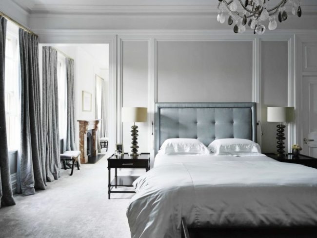
Here are the best Dulux paint colours according to the legendary Australian brand’s colour expert, Andrea Lucena-Orr. Plus more than a few of Hamel’s favourite, all-purpose whites such as the one featured in the blissful bedroom, pictured.
ANTIQUE WHITE USA
It is the white chosen more often than any other. An ochre-based, versatile, universally flattering white, that is the perfect wall colour. We used Antique throughout our Sydney apartment because it has lots of north-eastern light.
NATURAL WHITE
A classic white according to designers such as Poppy O’Neil and Charlotte O’Neil of Poco Design and Charlotte Coote, Coote & Co, who says, “It’s one of the best warm whites around”.
LEXICON
It’s the ultimate white. The top choice for a go-to white loved by our leading designers such as Thomas Hamel, Iain Halliday, Greg Natale, Anna Spiro and Parterre owner, Richard Haigh. If it’s good enough for the the award-winning boutique hotel, Halcyon House, it’s certainly good enough for us.
VIVID WHITE
One of the best whites around, with a cult following in the white world. A bright, cool white. Big names such as Thomas Hamel, Iain Halliday, Poco Design, Anna Spiro, Charlotte Coote, (Coote & Co) and Pamela Makin, (Les Interieurs) all swear by it. It’s a bright, cool white. “It’s my favourite cool white. Half-strength for walls and quarter-strength for ceilings, woodwork, mouldings, and trims,” says Coote.

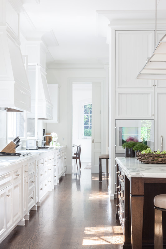
Melbourne kitchen designed by Thomas Hamel features Dulux Vivid White walls in full-strength, low sheen. Architraves in Dulux Lexicon half-strength, semi-gloss and ceiling in Dulux Vivid white full-strength, flat finish.
WHISPER WHITE
The warm white of old, pre-brightend, starched linen. A favourite with big names like Thomas Hamel who used it on the bedroom, featured to offset ceilings and cornice in flat, and woodwork in semi gloss. Cameron Kimber, Walter Herman and Lynda Kerry are also big fans. Use a mix of half and quarter strength.
LEXICON (HALF-STRENGTH)
So popular, it rates in the top 10 best-selling Dulux paints. What more can we say?
HOG BRISTLE (QUARTER-STRENGTH)
A great paint colour marked by its depth and resilience under shifting light conditions.“An oldie, but a goodie. It makes everything look good,” says designer Adelaide Bragg.
TERRACE WHITE
It has a tiny amount of grey and a warmth to it that moves it away from white.
GREY PAIL
It’s suede-like quality that’s not too light or too dark” tone.
SILKWORT
One of the more silvery options on this list. Mixing with a tonal clay shade will result in a room full of atmosphere.
LIMED WHITE
It changes from off-white to beige to soft-grey. It is the perfect background for accent colors while keeping things subdued and sophisticated.
WHITE DUCK
A go-to off-white (ecru) that will warm up any room with its softness. Fresh, versatile, and warm, and it works in any home, whether traditional or modern, that can be made to look more creamy if contrasted with bright whites or fresher and cleaner if contrasted with warm whites. Perfect for country kitchens.
BEIGE ROYAL (HALF-STRENGTH)
“I use it like a white paint, for everything. Everywhere,” says designer Marco Meneguzzi.
TRANQUIL RETREAT
It’s a bit of a chameleon and can look warm in a sunny room or cooler in a north-facing room. It always looks elegant.

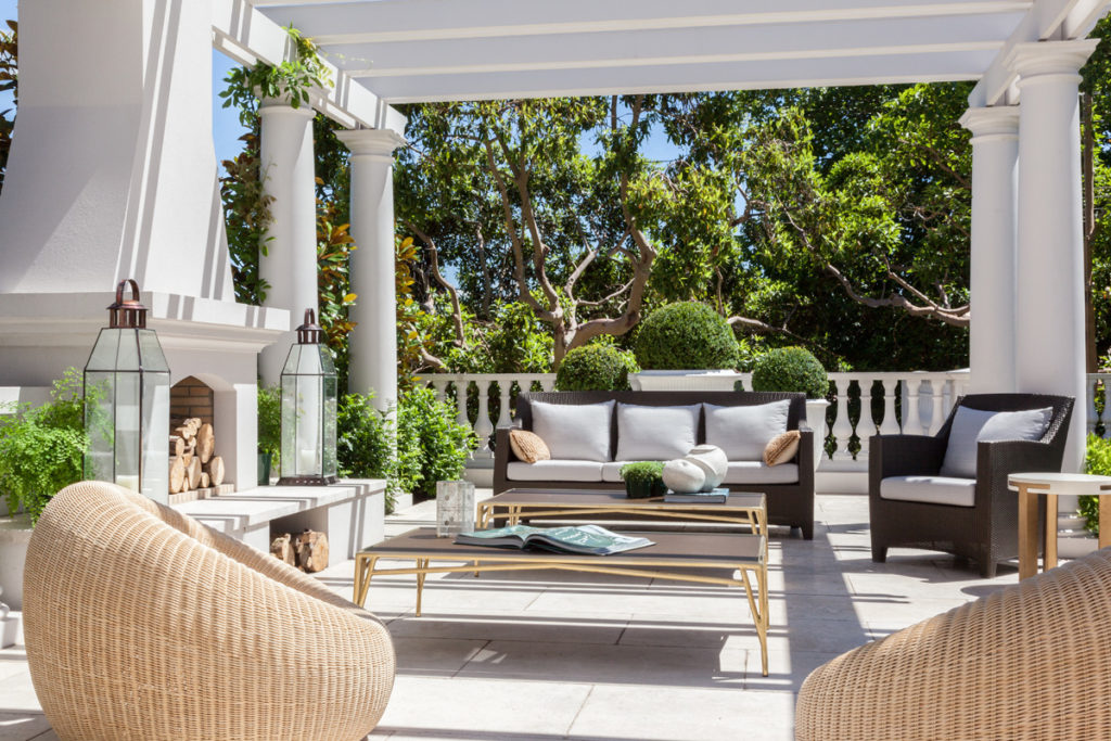
A beautiful Melbourne loggia by Thomas Hamel features Dulux Pearl Ash full strength – at once bold, and understated with warm undertones that work well on most exteriors. Pearl Ash isn’t yet on the top Dulux #20 list but we reckon it’s well worth investigating as a go-to classic white paint.
DIESKAU
It has a sophisticated warmth and adds a timeless elegance to any room.
OLD EAGLE
Michael Love, one of Australia’s greatest, most enduring interior designers painted the common area walls of his beautiful Sydney harbourside house this timeless grey more than 35 years ago, and the walls have remained unchanged. “It has darkened over time, and actually got better.”
TIMELESS GREY
Top designers pick this out again and again and again without even meaning to. “It looks great on exteriors combined with black iron windows, bronze light fittings and a copper roof,” says designer Lynda Kerry.
WARM NEUTRAL
A light, subtle and warm hue that compliments white as well as bolder hues perfectly.
RAKU
It is a versatile grey that goes bluer or browner, depending on the light. A lovely colour that is a great way to give a new wall a bit of depth; and matches natural steel and sheet metal perfectly.
SELF-DESTRUCT
It’s a terrible name, but the best stone shade out there. A colour you’ll want to use it again and again and again. And pick up, without meaning to.
DOMINO
The darkest colour on the list. A beautiful, rich, deep charcoal that strikes the right note every time.


